Cohort Analysis for Marketing: Track User Behaviour Over Time
Table of Contents
What Is Cohort Analysis
Cohort analysis marketing is a technique that groups users by a shared characteristic—typically the date they first interacted with your business—and tracks their behaviour over subsequent time periods. Instead of looking at all users as a single mass, cohort analysis reveals how different groups perform over time.
Imagine you acquired 200 customers in January and 250 in February. Standard analytics might show your overall retention rate is 30 percent. But cohort analysis might reveal that January customers retain at 40 percent while February customers retain at only 22 percent. That difference is invisible in aggregate data but critical for understanding what changed between the two months.
The technique originated in medical research, where scientists tracked patient groups over time. Marketers adopted it because customer behaviour follows similar patterns—acquisition conditions shape long-term outcomes, and the only way to see that relationship is by grouping and tracking cohorts.
Why Cohort Analysis Matters for Marketing
Aggregate metrics lie. They blend the performance of new and old users, hiding trends that could make or break your business. Cohort analysis solves this by letting you see the true trajectory of customer behaviour.

Consider a scenario common among Singapore e-commerce businesses. Your monthly revenue is growing at 10 percent, which looks healthy. But cohort analysis reveals that revenue growth is entirely driven by new customer acquisition—existing customers are buying less each month. Without cohort analysis, you would not spot the retention problem until acquisition growth slows and revenue plateaus.
Cohort analysis also measures the effectiveness of marketing changes over time. If you revamped your onboarding email sequence in March, compare the March cohort’s retention to previous cohorts. This is more rigorous than before-and-after comparisons, which are confounded by seasonality and other variables.
For businesses running growth experiments, cohort analysis provides the longitudinal view that short-term A/B tests miss. An experiment might show a 10 percent lift in initial conversion but no improvement—or even a decline—in long-term retention. Only cohort analysis reveals the full picture.
Types of Cohorts
Cohorts can be defined by any shared characteristic, but three types are most useful for marketing.
Acquisition cohorts: Grouped by the date users were acquired—typically by week or month. This is the most common type and answers the question: “Are the customers we acquire getting better or worse over time?”
Behavioural cohorts: Grouped by an action users took—for example, all users who completed a product demo, downloaded a whitepaper or made a purchase above $100. This answers: “Do users who take specific actions behave differently long-term?”
Channel cohorts: Grouped by acquisition channel—organic search, Google Ads, social media, referral. This answers: “Which channels produce the highest-quality customers?” This question is essential for budget allocation and complements marketing attribution analysis.
You can also create hybrid cohorts by combining dimensions. For example, customers acquired through Google Ads in Q1 who made a purchase above $200. The more specific the cohort, the more targeted your insights—but you need sufficient sample sizes to draw reliable conclusions.
Setting Up Your First Cohort Analysis
You can perform a basic cohort analysis in a spreadsheet. Here is how to set one up step by step.
Step 1—Define the cohort. Decide how you will group users. For most businesses, monthly acquisition cohorts are the best starting point. Each row in your table represents one month’s cohort.
Step 2—Choose the metric. What behaviour will you track? Common choices include: returning to the website, making a repeat purchase, opening an email or renewing a subscription. Pick the metric that most closely relates to your north star metric.
Step 3—Build the table. Create a matrix where rows are cohorts (e.g., Jan 2026, Feb 2026, Mar 2026) and columns are time periods after acquisition (Month 0, Month 1, Month 2, etc.). Each cell contains the percentage of the cohort that performed the target action in that period.
Step 4—Populate with data. Pull the data from your analytics or CRM. For website behaviour, Google Analytics 4 has a built-in cohort exploration report. For purchase data, query your e-commerce database or CRM.
Step 5—Analyse patterns. Look for trends across rows—are newer cohorts retaining better or worse than older ones? Look for drop-off points across columns—is there a common period where retention falls sharply?
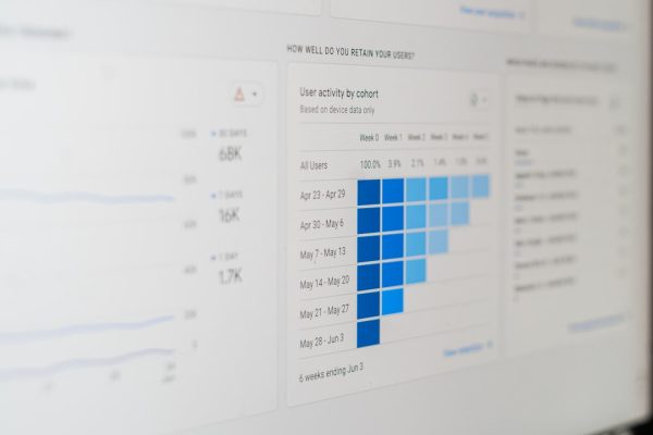
Reading and Interpreting Cohort Tables
A cohort table has three dimensions of insight: rows, columns and diagonals.
Reading across rows: Each row shows how one cohort behaves over time. You can see the retention curve—how quickly users disengage after acquisition. A healthy retention curve flattens after an initial drop, indicating a stable base of engaged users.
Reading down columns: Each column shows how all cohorts perform at the same stage. For example, the “Month 3” column shows what percentage of each cohort is still active three months after acquisition. If this percentage is increasing over time, your product or marketing is improving.
Reading diagonals: Diagonals show what happened across all cohorts during the same calendar period. If all cohorts show a dip in December, it might indicate a seasonal pattern rather than a structural problem.
Colour-code your cohort table using a heat map—darker shades for higher percentages, lighter shades for lower. This visual pattern makes trends immediately obvious. Build these visualisations into your marketing dashboards for ongoing monitoring.
When interpreting results, always ask: “What was different about this cohort?” Review your marketing activities, product changes and external events during that period to explain the data.
Practical Use Cases for Singapore Businesses
Here are specific ways Singapore businesses can apply cohort analysis to improve marketing outcomes.
E-commerce repeat purchase analysis: Group customers by acquisition month and track repeat purchase rates at 30, 60 and 90 days. Identify which acquisition channels produce the most loyal customers and reallocate budget accordingly.
SaaS onboarding optimisation: Group trial sign-ups by week and track conversion to paid plans. If a cohort that received an improved onboarding email sequence converts at a higher rate, you have evidence that the change worked.
Email marketing health: Group subscribers by sign-up month and track open rates over time. This reveals your natural engagement decay rate and helps you determine when to run re-engagement campaigns or clean your list. Use insights to strengthen your content marketing email programme.
Campaign quality assessment: Compare cohorts acquired during a promotional campaign versus organic periods. Promotional campaigns sometimes attract deal-seekers with lower lifetime value—cohort analysis quantifies this trade-off.
Website redesign impact: Compare cohorts before and after a web design overhaul. Track whether the new design improves engagement, conversion and retention metrics across multiple time periods, not just the first visit.
Tools for Cohort Analysis
Several tools support cohort analysis at different levels of complexity.

Google Analytics 4: The Explorations section includes a cohort exploration report. It supports acquisition-date cohorts and lets you track retention, transactions and other events. It is free and sufficient for most Singapore SMEs.
Mixpanel: Purpose-built for product analytics, Mixpanel offers advanced cohort analysis with behavioural cohort support, flexible time windows and automated insights. Pricing starts with a free tier for up to 20 million events.
Amplitude: Similar to Mixpanel, Amplitude excels at behavioural cohort analysis and retention tracking. Its free tier is generous enough for most mid-sized businesses.
Google Sheets or Excel: For businesses with modest data volumes, a manual cohort table in a spreadsheet works perfectly. Export data from your CRM or analytics platform and build the matrix yourself.
SQL and data warehouses: For advanced teams, writing SQL queries against a data warehouse like BigQuery provides maximum flexibility. You can define any cohort, track any metric and handle any data volume. This approach pairs well with a data-driven marketing infrastructure.
Frequently Asked Questions
What is the difference between cohort analysis and segmentation?
Segmentation groups users by static attributes—location, age, device. Cohort analysis groups users by a shared experience and tracks behaviour over time. Segmentation shows who your users are; cohort analysis shows how they behave after a specific event.
How large should a cohort be for reliable analysis?
Aim for at least 100 users per cohort for directional insights and 500 or more for statistically robust conclusions. If your cohorts are too small, consider grouping by week instead of day or by quarter instead of month.
How far back should we look with cohort analysis?
Start with the past six to twelve months. This provides enough data to identify trends without being overwhelmed by historical noise. Extend further if you need to analyse long-term retention or seasonal patterns.
Can we use cohort analysis for B2B marketing?
Absolutely. B2B cohort analysis might track account-level behaviours—demo requests, trial activations or contract renewals—rather than individual user actions. The methodology is identical; only the unit of analysis changes.
How often should we run cohort analysis?
Monthly is sufficient for most businesses. If you are running frequent incrementality tests or growth experiments, consider weekly analysis during active testing periods.
What does a healthy retention curve look like?
A healthy curve drops sharply in the first period—typically losing 60 to 80 percent of users—then flattens into a stable base. If your curve never flattens and continues declining, you have a product-market fit or experience problem.
Can cohort analysis measure the impact of branding?
Indirectly, yes. If a branding campaign improves customer perception, you should see higher retention and lifetime value in cohorts acquired during or after the campaign. Compare these cohorts to pre-campaign cohorts to quantify the effect.
What is the most common mistake in cohort analysis?
Drawing conclusions from cohorts that are too small or too recent. A cohort needs sufficient time to mature before you can assess its long-term behaviour. Avoid judging a cohort’s retention until it has passed at least three time periods.