Visual Content Strategy: Design Graphics That Stop the Scroll
Table of Contents
- Why Visual Content Matters for Marketing
- Types of Visual Content That Drive Results
- Building a Visual Brand Identity
- Planning a Visual Content Calendar
- Design Principles Every Marketer Should Know
- Tools and Workflows for Visual Content Production
- Measuring Visual Content Performance
- Frequently Asked Questions
Why Visual Content Matters for Marketing
A strong visual content strategy is no longer optional for brands that want to compete for attention online. The human brain processes images 60,000 times faster than text, and social media feeds are designed to reward content that catches the eye in a fraction of a second.
For Singapore businesses operating in one of the most digitally connected markets in Asia, the competition for attention is fierce. The average Singaporean spends over two hours daily on social media, scrolling through hundreds of posts. Your visual content needs to earn a pause, a click or a share within that stream.
The data supports the investment. Posts with relevant images receive 94 percent more views than text-only content. Infographics are shared three times more than other content types. Video generates 1,200 percent more shares than text and image content combined. These are not vanity metrics. Higher engagement translates directly into broader reach, lower cost per impression and more opportunities to convert.
Visual content also supports every stage of the marketing funnel. Brand awareness campaigns rely on eye-catching graphics. Consideration-stage content uses explainer videos and comparison charts. Conversion-focused content deploys product visuals, testimonials with customer photos and promotional banners. A comprehensive digital marketing strategy treats visual content as infrastructure, not decoration.
Types of Visual Content That Drive Results
Different formats serve different purposes. Your strategy should incorporate multiple types based on your audience, platforms and objectives.

Static graphics: Social media posts, quote cards, data visualisations, announcements and promotional banners. These are the workhorse of daily content and the easiest to produce at scale. See our guide on social media graphics design for platform-specific best practices.
Infographics: Long-form visual explanations of complex topics, processes or data sets. Infographics are highly shareable and earn backlinks when distributed effectively. They work particularly well for B2B brands establishing thought leadership. We cover this format in depth in our infographic marketing guide.
Photography: Original brand photography and product shots build authenticity that stock images cannot match. For Singapore businesses, local imagery resonates more strongly than generic international stock. Professional brand photography is worth the investment for hero images, team photos and location-specific visuals.
Video content: Short-form clips for social media, longer explainer videos, testimonials and live streams. Video consistently outperforms static content in engagement metrics across every platform.
Motion graphics: Animated versions of static content that add movement and visual interest without the production complexity of full video. Ideal for explaining processes, presenting data and creating branded social content.
Interactive visuals: Quizzes, calculators, interactive infographics and augmented reality experiences. These require more development resources but generate exceptional engagement and dwell time.
Presentation materials: Pitch decks, sales decks and webinar slides that represent your brand in business contexts. These are often overlooked in content strategy but are critical touchpoints for B2B companies.
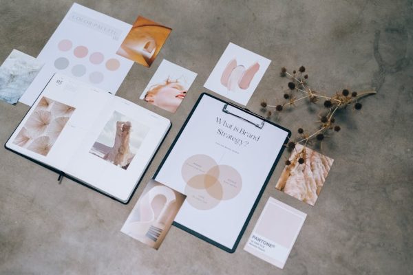
Building a Visual Brand Identity
Consistency is the foundation of effective visual content. Every piece of visual content you produce should be immediately recognisable as belonging to your brand.
Your visual brand identity should define:
- Colour palette: Primary and secondary colours with specific hex codes. Limit your palette to three to five core colours. Document how each colour should be used, including backgrounds, text, accents and calls to action.
- Typography: Select two to three fonts, one for headings, one for body text and optionally one for accents. Specify sizes, weights and spacing for different applications.
- Imagery style: Define the look and feel of photography and illustration. Should images be bright and saturated or muted and minimal? Do you use illustrations, icons or photography? What subjects and compositions align with your brand personality?
- Logo usage: Specify minimum sizes, clear space requirements, acceptable colour variations and placement guidelines.
- Layout patterns: Create templates that define how elements are arranged in common formats like social posts, blog headers and email banners.
Document everything in a brand style guide that your team and any external collaborators can reference. This ensures consistency whether content is created by your marketing manager, a freelance designer or an agency. A well-defined visual identity is a cornerstone of professional branding services.
Review your style guide annually. Visual trends evolve, and your brand identity should feel current without chasing every passing trend.
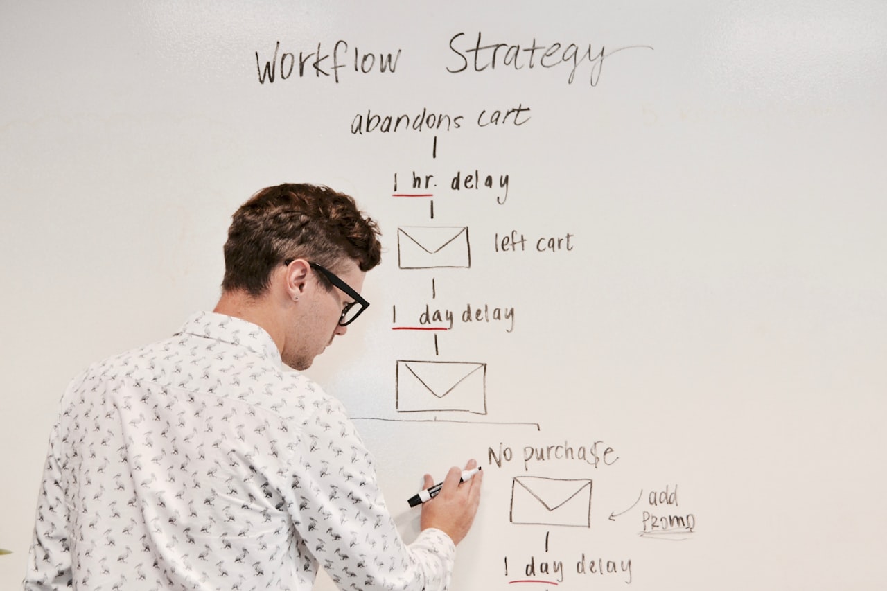
Planning a Visual Content Calendar
Random, reactive visual content wastes resources. A content calendar ensures your visual output is strategic, balanced and sustainable.
Start by mapping your content pillars. These are the three to five core themes your brand consistently addresses. For a Singapore marketing agency, pillars might include SEO tips, social media strategy, case studies, industry news and team culture. Each pillar should have a defined visual style and format mix.
For each month, plan:
- The number of visual assets needed per platform
- The format mix (static, video, carousel, story, infographic)
- Key dates and events (public holidays, industry events, product launches)
- Campaign-specific creative requirements
- Repurposing opportunities from existing long-form content
Batch your production. Rather than creating one graphic at a time, design a week’s worth of content in a single session. This is more efficient and ensures visual consistency across the set. Many teams dedicate one day per week or two days per month to visual content production.
Build a library of reusable templates for recurring content types. Weekly tips, customer testimonials, blog promotion graphics and event announcements should all have pre-designed templates that only need minor text and image swaps. This approach is central to efficient content marketing operations.
Design Principles Every Marketer Should Know
You do not need a design degree to create effective marketing visuals. These fundamental principles will improve every piece of content you produce.
Visual hierarchy: Guide the viewer’s eye to the most important element first. Use size, colour, contrast and position to establish a clear reading order. The headline should be the first thing noticed, followed by the supporting image, then the call to action.
White space: Empty space is not wasted space. It reduces visual clutter, improves readability and makes your design feel professional. Resist the urge to fill every pixel. The most effective ads and social posts often feature generous white space.
Contrast: Ensure sufficient contrast between text and background for readability. Dark text on light backgrounds or white text on dark backgrounds. Avoid placing text over busy image areas without an overlay.
Alignment: Align elements to a consistent grid. Misaligned text, images and shapes look amateur. Most design tools offer snap-to-grid functionality that makes alignment easy.
Repetition: Repeat visual elements like colours, shapes, fonts and spacing patterns across your content to build recognition and cohesion.
Simplicity: Communicate one idea per visual. Especially on social media, you have seconds to deliver your message. Strip away anything that does not directly support the core message.
Accessibility: Ensure your visuals are accessible to all users. Use sufficient colour contrast ratios (WCAG AA standard minimum), add alt text to images, avoid conveying information through colour alone and include captions on video content.
Tools and Workflows for Visual Content Production
The right tools streamline production without sacrificing quality.
Design tools:
- Canva: The most accessible option for teams without dedicated designers. Offers templates, brand kit functionality and team collaboration. We explore this in detail in our Canva for business guide.
- Adobe Creative Suite: Photoshop, Illustrator and InDesign remain the industry standard for professional design work.
- Figma: Excellent for collaborative design, especially when multiple team members need to work on templates simultaneously.
Video and animation tools:
- CapCut: Free and powerful for short-form video editing, especially for TikTok and Reels content.
- Adobe After Effects: The professional standard for motion graphics and animation.
- Lottie: For lightweight web animations that load quickly and scale perfectly.
Asset management:
- Use a digital asset management system or structured cloud storage to organise templates, brand assets, approved images and completed work.
- Implement a clear naming convention and folder structure so team members can find assets without searching.
- Archive old campaign assets rather than deleting them. They can be repurposed or referenced later.
Workflow: Establish a clear process from brief to delivery. A typical workflow includes: creative brief, first draft, internal review, revisions, final approval and scheduled publishing. Use project management tools to track each asset through this pipeline.
Measuring Visual Content Performance
Measure what matters for each content type and platform.

Social media visuals: Track engagement rate (likes, comments, shares and saves divided by impressions), reach, click-through rate and follower growth. Compare performance across formats to understand what your audience responds to. Carousel posts, single images and video clips may perform very differently for your specific audience.
Infographics: Measure shares, backlinks earned, time on page for the host page and referral traffic. Infographics optimised for SEO can drive organic traffic for months after publication.
Video content: Track view count, average watch duration, completion rate and actions taken after viewing (website visits, sign-ups, purchases).
Brand consistency: Conduct quarterly audits of your visual output across all channels. Check for consistency in colour usage, typography, image style and quality. Inconsistencies dilute brand recognition and reduce the cumulative impact of your content.
Build a simple dashboard that tracks your top five visual content KPIs monthly. Over time, you will identify which formats, topics, colours and styles consistently outperform, allowing you to refine your strategy with data rather than guesswork.
The best visual content strategies evolve continuously. Test new formats, analyse results and double down on what works. Treat your content calendar as a living document that adapts to both performance data and emerging platform trends.
Frequently Asked Questions
How often should I post visual content on social media?
For most Singapore businesses, three to five posts per week on your primary platform is a sustainable starting point. Quality consistently outperforms quantity. It is better to publish three well-designed posts than seven rushed ones. Adjust frequency based on your team capacity and the engagement data you observe.
Do I need a professional designer for my visual content?
Not for every piece of content. Tools like Canva enable marketers to create professional-looking graphics using templates. However, investing in a professional designer for foundational assets like your brand style guide, templates and key campaign visuals is worthwhile. Use templates for daily content and professional design for high-impact pieces.
What image sizes should I use for social media?
Sizes change frequently, but as of 2026, the most common formats are: Instagram feed posts at 1080 by 1080 pixels (square) or 1080 by 1350 pixels (portrait), Facebook posts at 1200 by 630 pixels, LinkedIn posts at 1200 by 627 pixels, and TikTok or Stories at 1080 by 1920 pixels. Always check current platform guidelines as they update regularly.
Should I use stock images or original photography?
Original photography is always preferable when the budget allows, especially for brand imagery, team photos and location-specific content. Stock images are acceptable for blog illustrations and supporting graphics, but avoid overused stock photos that audiences immediately recognise as generic. Invest in original photography for content that represents your brand directly.
How do I maintain visual consistency across a team?
Create a comprehensive brand style guide and build templates for every recurring content type. Use a shared brand kit in your design tool so team members automatically access the correct colours, fonts and logos. Implement an approval workflow so at least one person reviews content for brand compliance before publication.
What visual content performs best on LinkedIn?
Data-driven graphics, industry insight carousels, professional photography and infographic excerpts tend to perform strongly on LinkedIn. Avoid overly casual or heavily filtered content that works on Instagram. LinkedIn audiences respond to content that delivers professional value with a clean, authoritative visual style.
How can I repurpose one piece of visual content across platforms?
Start with a long-form asset like a blog post or webinar, then create a carousel summarising the key points, a quote graphic with the most shareable insight, an infographic visualising the data, a short video or animation highlighting the main takeaway, and a story series walking through the topic. One piece of content can generate five to ten visual assets.