Homepage Optimisation: Make Your Homepage Convert First-Time Visitors
Table of Contents
The Role of Your Homepage in 2026
Your homepage is your digital shopfront. For many visitors — especially those arriving from branded search, referrals, or direct traffic — it is the first page they see and the page that shapes their entire perception of your business. This homepage optimisation guide covers the strategies that turn first-time visitors into engaged prospects and paying customers.
The modern homepage serves multiple roles simultaneously. It must communicate what you do, who you serve, and why you are the right choice — all within seconds. It must provide clear paths to deeper content for different audience segments. And it must establish trust quickly enough to keep visitors from hitting the back button.
For Singapore businesses competing in a market where consumers routinely compare three to five options before making a decision, your homepage needs to be compelling enough to earn a spot on that shortlist. Every element should be deliberate, tested, and optimised for conversions.
Hero Section: Your Five-Second Pitch
The hero section — the area visible above the fold when the page first loads — is the most critical real estate on your homepage. Research shows that visitors form their first impression within 50 milliseconds and decide whether to stay or leave within five seconds.

An effective hero section contains four elements: a clear headline that states what you do and who you help, a supporting subheadline that adds specificity or differentiates you from competitors, a primary CTA that tells visitors what to do next, and a visual element that reinforces your message without distracting from it.
Your headline should be benefit-focused, not feature-focused. “Grow Your Singapore Business with Data-Driven Digital Marketing” is more compelling than “Full-Service Digital Marketing Agency.” The first tells visitors what they will gain; the second merely describes what you are.
Avoid hero section sliders or carousels. They dilute your message, slow page load times, and research consistently shows that users rarely interact with slides beyond the first. Commit to one strong message instead of three weak ones. Follow our CTA design principles to make your hero button impossible to miss.
Keep the hero section clean and uncluttered. White space around your headline and CTA draws attention and communicates professionalism. A cluttered hero section overwhelms visitors and signals a disorganised business.
Communicating Your Value Proposition
Below the hero, dedicate a section to clearly articulating your value proposition — the specific reasons a customer should choose you over alternatives.
Use a three or four-column layout to present your key differentiators. Each column should feature a brief heading, a one to two sentence description, and optionally a simple icon. Common differentiators for Singapore businesses include local expertise, proven results, responsive service, and transparent pricing.
Be specific rather than generic. “15 years serving Singapore SMEs” is more credible than “Experienced team.” “Average 3.2x ROI for our clients” is more compelling than “Great results.” Numbers, timeframes, and specifics build trust in ways that adjectives cannot.
Address your target audience directly. If you serve multiple segments — for example, SMEs and enterprise clients — consider including a “Who We Help” section with brief descriptions and links to segment-specific pages. This helps visitors self-identify and find relevant content faster, reducing bounce rates and improving the overall website UX.
Content Structure and Section Flow
Your homepage content should follow a logical narrative flow that mirrors the decision-making process of your target audience. Each section should answer the next question a visitor naturally asks.
A proven homepage structure for Singapore service businesses follows this pattern: hero section (what you do and why it matters), value propositions (why choose you), services overview (how you help), social proof (evidence of results), process explanation (how it works), and final CTA (what to do next).
Each section should be visually distinct with clear headings, consistent spacing, and alternating background colours or treatments to create rhythm. This visual variety keeps visitors engaged as they scroll and prevents the page from feeling monotonous.
Keep homepage content concise. The homepage is not the place for detailed explanations — it is a gateway to deeper pages. Each section should provide enough information to interest visitors and then link to relevant detail pages. Your service pages, blog posts, and case studies should handle the heavy lifting of education and persuasion.
Include a services overview section that briefly describes each core service with a link to its dedicated page. Use consistent formatting — matching card sizes, equal-length descriptions, and uniform CTAs. This section helps visitors quickly understand your full offering and find the specific service they need.
The page should end with a strong closing section that includes a compelling headline, a brief summary of your value proposition, and a clear CTA. Many visitors who scroll to the bottom of your homepage are interested but have not yet committed — this final section gives them the push they need.
Navigation and Conversion Paths
Your homepage must cater to visitors at different stages of the buying journey. Some are ready to enquire immediately, while others need to learn more before they are willing to engage. Effective homepage navigation provides clear paths for both.
Your primary navigation menu should be simple, well-organised, and consistent with user expectations. Avoid creative menu labels — “Services” is universally understood; “Solutions” is vague. Ensure your navigation UX supports rather than hinders the visitor’s journey.
Provide both high-intent and low-intent conversion paths. High-intent visitors want to contact you or get a quote immediately — make this action visible and accessible at all times. Low-intent visitors want to learn more — guide them to case studies, blog posts, or service pages through clear links and internal navigation.
Use in-page anchor links or a sticky sidebar to help visitors navigate long homepages. This is especially useful on mobile where scrolling through a lengthy page can feel overwhelming. Clear section markers help visitors find relevant content without endless scrolling.
Consider the visitor’s likely next step after each homepage section. After the services overview, they might want to see case studies. After social proof, they might be ready to contact you. Structure your internal links to facilitate these natural progressions and support your broader content marketing funnel.
Social Proof on Your Homepage
Social proof on your homepage serves a critical function: it transforms your claims from self-promotion into verified reality. Without social proof, visitors have only your word that you deliver results.
Client logos are the most space-efficient form of social proof. A row of recognisable logos immediately communicates credibility and experience. For Singapore businesses, include a mix of local and international brands if possible. Even SMEs can display logos from industry associations, partnerships, or certifications.
Feature two to three testimonials with full names, job titles, company names, and ideally photos. Video testimonials are even more powerful but require more page real estate. Choose testimonials that speak to specific results — revenue growth, time saved, problems solved — rather than generic praise.
Numerical social proof (client counts, projects completed, years in business) works well in a statistics bar format. “500+ Clients,” “12 Years in Singapore,” “SGD 50M in Revenue Generated for Clients” — these numbers create immediate credibility. Detailed strategies are covered in our social proof placement article.
Position your strongest social proof near decision points. A testimonial near your CTA, client logos near your service descriptions, and case study results near your value proposition — each placement reinforces credibility at the moment it matters most.
Homepage SEO Considerations
Your homepage typically has the highest domain authority of any page on your site, making its SEO optimisation particularly important.
Target your primary brand keyword and one to two high-value service keywords in your homepage title tag and meta description. For a Singapore digital marketing agency, this might mean targeting “digital marketing agency Singapore” alongside your brand name.
Include relevant keywords naturally in your H1 heading and body content, but never at the expense of clarity or user experience. Search engines are sophisticated enough to understand context — keyword stuffing is counterproductive and damages credibility with human visitors.
Ensure your homepage loads quickly. As the most-visited page on your site, it sets the performance expectation for the rest of the experience. Slow homepages increase bounce rates and harm your search rankings. Read our detailed analysis of page speed and conversions for actionable optimisation techniques.
Use schema markup to help search engines understand your business type, location, services, and reviews. LocalBusiness schema is especially valuable for Singapore businesses targeting local search traffic. Partner with an experienced SEO team to implement technical optimisations correctly.
Internal linking from your homepage distributes authority to your most important pages. Ensure every key service page, major content piece, and conversion page receives at least one link from your homepage. This helps search engines understand your site structure and prioritise your most valuable pages.
Frequently Asked Questions
How long should a homepage be?
There is no fixed rule, but most effective homepages are between 1,500 and 3,000 words with clear visual sections. The length should be determined by how much information is needed to communicate your value and drive action. Test different lengths with your audience rather than following arbitrary guidelines.
Should my homepage include a blog feed or latest posts?
A “Latest Insights” section with three to four recent posts can add value if your content is consistently high-quality and relevant. It signals that your business is active and knowledgeable. However, if your blog is updated infrequently, an outdated post section does more harm than good.
How often should I update my homepage?
Review your homepage quarterly and make updates based on performance data, new offerings, and seasonal relevance. Major redesigns should happen every 18 to 24 months, while smaller copy and layout tweaks can be made continuously through A/B testing.
Should I use video on my homepage?
Video can be effective if it is short (under 90 seconds), professionally produced, and does not auto-play with sound. A well-made explainer video can increase conversions, but a low-quality video hurts credibility. Host videos externally (YouTube or Vimeo) to avoid slowing page load speed.
How do I optimise my homepage for mobile?
Simplify your hero section for mobile with a shorter headline, stacked layout, and prominent CTA button. Ensure all touch targets are at least 44 pixels, test forms on actual devices, and consider hiding or collapsing secondary content behind expandable sections. Our mobile UX guide covers this in depth.
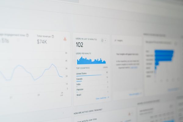
What metrics should I track for homepage performance?
Track bounce rate, time on page, scroll depth, CTA click-through rates, and the percentage of homepage visitors who navigate to key service or conversion pages. These metrics tell you whether your homepage is engaging visitors and guiding them deeper into your site.
Should my homepage target specific keywords?
Yes. Your homepage should target your brand name plus one to two primary service keywords relevant to your business. For example, a Singapore web design agency might target “web design Singapore” alongside their brand name. Avoid targeting too many keywords — focus your SEO strategy on making the homepage rank for your most valuable terms.
Is it better to have a minimalist or content-rich homepage?
The answer depends on your audience and offering. Complex B2B services typically benefit from content-rich homepages that educate visitors. Simple consumer products can succeed with minimalist designs that quickly direct visitors to product pages. Test both approaches and let conversion data guide your decision.