Heatmap Analysis: How to Read Heatmaps and Use Them to Improve Your Website
Table of Contents
What Heatmaps Are and How They Work
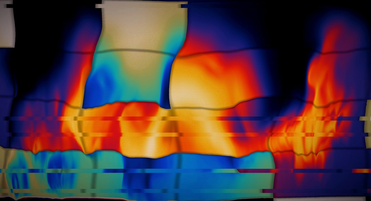
Heat map analysis transforms raw user interaction data into visual overlays that show how visitors behave on your website pages. Warm colours like red and orange indicate areas of high activity, while cool colours like blue and green indicate low activity. This visual format makes complex behavioural data immediately understandable, even for stakeholders who do not work with analytics daily.
Heatmaps work by recording user interactions through JavaScript tracking code installed on your website. As visitors click, scroll, and move their cursors, the tool aggregates this data across hundreds or thousands of sessions to produce a composite picture of behaviour. The resulting visualisation reveals patterns that are invisible in traditional analytics dashboards.
Where GA4 tells you that sixty per cent of visitors bounce from a page, heatmaps show you why. Perhaps visitors scroll past the call to action without noticing it. Perhaps they click on an element that looks interactive but is not. Perhaps the most important content is placed below the fold where only twenty per cent of visitors reach it. This diagnostic power makes heatmaps an essential tool for website optimisation and a natural complement to quantitative analytics.
Types of Heatmaps and What Each Reveals
Click maps record where visitors click on a page. They reveal which elements attract the most interaction, which calls to action are being clicked, and whether visitors are clicking on non-interactive elements like images or text that they expect to be links. Click maps are the most immediately actionable heatmap type because clicks directly relate to conversion behaviour.
Scroll maps show how far down a page visitors scroll before leaving. They display the percentage of visitors who reach each section of the page, revealing where attention drops off. This is critical for understanding whether visitors actually see your key content, calls to action, and conversion elements. If seventy per cent of visitors never scroll past the first two sections, any content below that point reaches only thirty per cent of your audience.
Move maps (or attention maps) track cursor movement on desktop devices. Research shows a correlation between cursor position and eye gaze, making move maps a proxy for where visitors are looking. These maps are less reliable than eye-tracking studies but far more accessible and affordable for regular analysis.
Session recordings, while not technically heatmaps, are a complementary tool offered by most heatmap platforms. Recordings capture individual user sessions as video playback, allowing you to watch exactly how specific visitors navigate your page. Where heatmaps show aggregate patterns, recordings show individual behaviours that explain why those patterns exist.
Reading Click Maps Effectively
Start by identifying whether clicks align with your intended user journey. On a product page, clicks should concentrate on the “Add to Cart” button, product variations, and information tabs. If clicks are dispersed across non-interactive elements or concentrated on navigation rather than conversion elements, the page design is not guiding users effectively.
Look for “rage clicks,” clusters of repeated clicks on the same spot that indicate frustration. Rage clicks often occur on broken links, buttons that appear clickable but are not, or elements that are loading slowly. These frustration points directly contribute to bounce rate and abandoned sessions. Fixing rage click areas typically produces immediate improvements in user experience and conversion.
Compare click maps between desktop and mobile views. Click patterns differ significantly between devices because of different screen sizes, navigation patterns, and interaction methods. An element that receives strong desktop clicks might be invisible or unreachable on mobile. This comparison is essential for identifying device-specific usability issues.
Analyse clicks on navigation elements to understand how visitors move through your site. Heavy clicks on the logo (typically linked to the homepage) from deep pages may indicate visitors are getting lost and resetting their navigation. High click rates on specific navigation items reveal the content visitors most actively seek.
Scroll Map Analysis
The most critical insight from scroll maps is the “fold line,” which is the point on the page visible without scrolling. Content above this line receives the most views but is also the most competitive space. Use it for your primary value proposition and most important call to action.
Identify the major scroll drop-off points. Typical pages see the largest drop-off within the first twenty to thirty per cent of the page. A second significant drop often occurs around fifty to sixty per cent. Place your most important calls to action before these drop-off points to maximise their visibility. If your primary CTA is placed where only thirty per cent of visitors scroll, seventy per cent never see it.
Compare scroll depth against content section placement. If you have a critical testimonial section that only twenty per cent of visitors reach, either move it higher or make the content above it more compelling so users keep scrolling. Scroll map data should directly inform your page layout decisions and content ordering.
Heat map analysis of scroll patterns also reveals content length issues. If visitors consistently abandon a page at the same point, the content may become repetitive, irrelevant, or overwhelming at that location. Consider condensing, restructuring, or adding visual breaks at drop-off points to maintain scrolling momentum. This data supports informed decisions in your conversion rate optimisation programme.
Turning Heatmap Data Into Actionable Changes
Heatmap data becomes valuable only when it drives specific changes. Establish a systematic process for translating heatmap insights into design and content modifications. Start by identifying the top three to five findings from each heatmap analysis and prioritise them by potential impact on conversion.
When heatmaps reveal that users are clicking on non-clickable elements, either make those elements interactive or redesign them to look less like links or buttons. This common finding highlights visual design patterns that confuse users. An image that looks like a button but leads nowhere creates frustration that reduces overall page engagement.
When scroll maps show content is not being reached, restructure the page to prioritise high-value content. Move testimonials, key benefits, or calls to action above the primary scroll drop-off point. Alternatively, use visual design techniques like directional cues, whitespace breaks, and compelling subheadings to encourage continued scrolling.
Combine heatmap findings with A/B test hypotheses. Heatmaps tell you what the problem is; A/B tests validate the solution. If a heatmap shows visitors ignoring the CTA button, develop a hypothesis about why (perhaps its colour blends with the background or its copy is unclear), create a variation, and test it. This evidence-based approach to website improvement consistently outperforms gut-feel redesigns.
Heatmap Tools and Setup
Hotjar is the most widely used heatmap tool for Singapore SMEs, offering click maps, scroll maps, move maps, and session recordings with a generous free tier. Microsoft Clarity is a completely free alternative that provides heatmaps and session recordings with no traffic limits. Both tools install via a simple JavaScript snippet.
Lucky Orange, Crazy Egg, and Mouseflow are paid alternatives with additional features like form analysis, funnel tracking, and real-time visitor monitoring. Pricing typically ranges from $20 to $100 per month for SME-level plans. Choose based on the specific features you need beyond basic heatmaps.
When setting up heatmap tracking, ensure you have adequate sample sizes before drawing conclusions. A heatmap generated from fifty visits may show misleading patterns that do not represent general user behaviour. Aim for at least five hundred to one thousand sessions per page before analysing the data. For low-traffic pages, allow the tool to collect data for two to four weeks.
Segment your heatmap data by traffic source, device type, and visitor type (new versus returning) to reveal differences in behaviour across audiences. Mobile heatmaps should always be analysed separately from desktop because the interaction patterns are fundamentally different. Source-segmented heatmaps can reveal that paid traffic and organic traffic interact with the same page very differently.
Common Analysis Mistakes to Avoid
Drawing conclusions from insufficient data is the most frequent mistake. A heatmap from one hundred sessions may show hot spots that are statistical noise rather than meaningful patterns. Always check the sample size before interpreting results and be sceptical of patterns based on fewer than five hundred sessions.
Confusing correlation with causation leads to misguided changes. A hot spot on a heatmap shows where users click; it does not explain why they click there. A heavily clicked area might indicate interest, confusion, or frustration. Use session recordings and user feedback to understand the motivation behind the behaviour before making changes.
Ignoring mobile heatmaps is a critical oversight given that mobile accounts for the majority of web traffic in Singapore. Desktop heatmaps can look completely different from mobile heatmaps on the same page. Always generate and analyse separate heatmaps for desktop and mobile, and prioritise mobile findings given the traffic distribution.
Analysing heatmaps in isolation without context from other data sources limits their value. A page with heavy clicks on the navigation menu might seem fine in a click map but reveals a problem when combined with GA4 data showing a high bounce rate. Heatmap findings are most powerful when triangulated with analytics data, user feedback, and business metrics from your digital marketing analytics stack.
Frequently Asked Questions
How many visitors do I need for reliable heatmap data?
At least five hundred to one thousand sessions per page for aggregate heatmaps. For segmented analysis (by device, source, or user type), you need this minimum per segment. Low-traffic pages require longer data collection periods to accumulate sufficient sessions.
Do heatmaps slow down my website?
Modern heatmap tools add minimal load time, typically ten to thirty milliseconds. They load asynchronously and do not block page rendering. The performance impact is negligible compared to the insights gained. Tools like Microsoft Clarity are specifically designed for minimal performance impact.
Can heatmaps track single-page applications?
Most modern heatmap tools support single-page applications (SPAs) built with React, Vue, or Angular. However, setup may require additional configuration to track virtual page views and dynamic content changes. Check your tool’s documentation for SPA-specific implementation guidance.
How often should I review heatmap data?
Review heatmaps for key pages monthly. Generate new heatmaps after significant page changes, redesigns, or traffic source shifts. Set up ongoing tracking for your most important pages and review the data as part of your regular conversion optimisation cycle.
Are heatmaps useful for B2B websites?
Absolutely. B2B heatmaps reveal how decision-makers interact with service pages, case studies, and pricing pages. Click maps show which services attract the most interest. Scroll maps reveal whether visitors reach the contact form or testimonials section. These insights are valuable regardless of industry.
What is the difference between a heatmap and a session recording?
Heatmaps aggregate data from many visitors to show overall behaviour patterns. Session recordings capture individual user sessions as video playback. Heatmaps answer “What do most users do?” while recordings answer “What did this specific user do and why?” Use both together for comprehensive analysis.
Can I use heatmaps on checkout pages?
Yes, and checkout page heatmaps are among the most valuable. They reveal where users hesitate, which form fields cause confusion, and at what point users abandon the checkout process. Ensure your heatmap tool does not capture sensitive payment information by configuring field masking.
Do heatmap tools comply with PDPA?
Most heatmap tools can be configured for PDPA compliance. Ensure you include heatmap tracking in your privacy policy, configure the tool to mask sensitive data, and obtain user consent where required. Tools like Hotjar and Microsoft Clarity offer data processing agreements and privacy configuration options.
How do I share heatmap insights with non-technical stakeholders?
Heatmaps are inherently visual and accessible to non-technical audiences. Export heatmap images and annotate them with findings and recommendations. Show session recording clips that illustrate specific usability issues. The visual nature of heatmap data makes it one of the easiest analytics tools to communicate to stakeholders.
Can heatmaps replace A/B testing?
No. Heatmaps identify problems and generate hypotheses; A/B tests validate solutions. Heatmaps might show that users ignore a CTA, but they cannot tell you which alternative CTA design will perform best. Use heatmaps to diagnose issues and inform A/B test hypotheses, then test to confirm improvements.