SaaS Landing Pages: Design Pages That Drive Free Trials and Demos
Table of Contents
- Unique Challenges of SaaS Landing Pages
- Free Trial Landing Pages That Reduce Sign-Up Friction
- Demo Request Pages That Qualify and Convert
- SaaS Pricing Pages as Landing Pages
- Using Product Screenshots and Videos Effectively
- Social Proof Strategies for SaaS Companies
- Landing Pages for Singapore SaaS Companies
- Frequently Asked Questions
Unique Challenges of SaaS Landing Pages
Designing effective SaaS landing pages presents challenges that differ from other industries. SaaS products are intangible, the benefits can be abstract, the buying process often involves multiple stakeholders and the competition is global. Your landing page must overcome all of these hurdles while maintaining the simplicity needed for high conversion rates.
The intangibility challenge means you cannot show a physical product. Visitors cannot hold your software, try it in a shop or see it on a shelf. Your landing page must make the product feel real through screenshots, videos, interactive demos and vivid descriptions of the user experience. The gap between “I understand what this does” and “I want to try this” must be bridged through content, not physical interaction.
SaaS buying decisions often involve multiple decision-makers. The person who finds your landing page may not be the person who approves the purchase. Your page must work for both the end user who cares about features and usability, and the decision-maker who cares about ROI, security and scalability. Including content that addresses both perspectives increases the chances of the page being shared internally.
The competitive landscape for SaaS is intense. Singapore businesses evaluating software solutions typically compare three to five options before deciding. Your landing page must not only present your product but also differentiate it from alternatives. This means clearly communicating your unique value rather than listing generic features that every competitor also claims.
Singapore’s SaaS market is growing rapidly, with businesses across all sectors adopting cloud-based solutions. The opportunity is significant, but so is the noise. Effective digital marketing and well-crafted landing pages are essential for cutting through the competition.
Free Trial Landing Pages That Reduce Sign-Up Friction
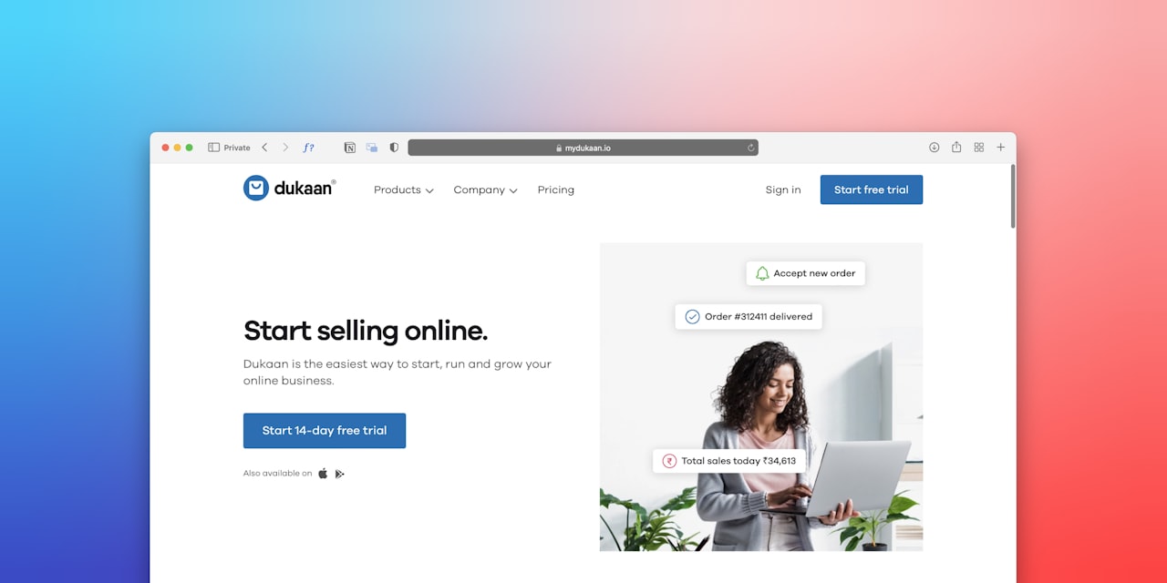
Free trial landing pages are the bread and butter of SaaS growth. The goal is simple: get visitors to start using your product. Every element on the page should reduce friction and increase motivation to begin the trial.
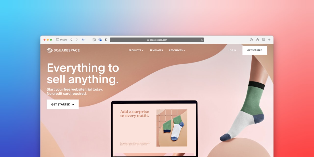
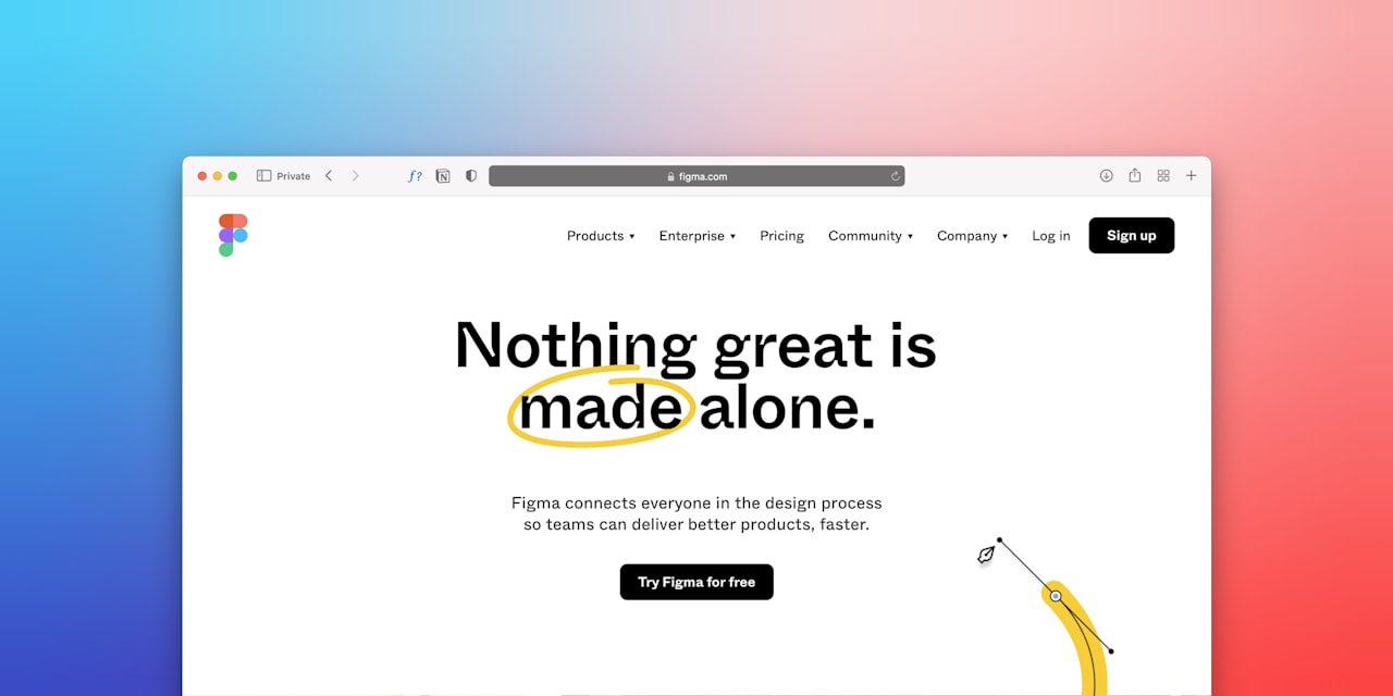
The headline should emphasise the outcome, not the trial itself. “Start Managing Your Projects More Efficiently Today” is more compelling than “Start Your Free Trial.” The trial is the mechanism, but the benefit is what motivates action. Frame the CTA around what the user will achieve, not what they are signing up for.
Clearly communicate the trial terms upfront. “14-day free trial. No credit card required. Cancel anytime.” This triple reassurance addresses the three biggest objections to free trial sign-ups. If you do require a credit card, explain why and reinforce the cancellation policy prominently.
The sign-up form should be as short as possible. For a free trial, email and password may be sufficient. Company name, job title and phone number can be collected during onboarding. Some SaaS companies have increased trial sign-ups by over 50% simply by removing unnecessary form fields.
Single sign-on options using Google, Microsoft or LinkedIn reduce friction further. Many Singapore professionals prefer signing up with their existing work accounts rather than creating new credentials. Offer SSO as the primary option with email sign-up as a fallback.
Show the product immediately after the hero section. A large screenshot or short video demonstrating the product interface gives visitors confidence about what they will experience after signing up. The visual should look clean, modern and easy to use. Cluttered interface screenshots create anxiety about complexity.
Address the time-to-value question. Visitors want to know how quickly they will see results. “Set up in 5 minutes” or “See your first report within an hour” sets expectations and motivates immediate action. This approach aligns with the landing page design principle of reducing perceived effort.
Demo Request Pages That Qualify and Convert
Demo request pages serve a different purpose from free trial pages. They target visitors who want a guided walkthrough, often because the product is complex, enterprise-grade or requires customisation. Demo pages must balance conversion rate with lead qualification because each demo requires a salesperson’s time.
The headline should communicate the value of the demo itself, not just the product. “See How [Product] Can Save Your Team 10 Hours Per Week” positions the demo as valuable time spent rather than a sales pitch endured. Visitors should feel they will gain something from the demo whether or not they buy.
Include qualifying questions in the demo request form, but keep them relevant and respectful. Company size, role, current solution and timeline are reasonable qualifying questions. Budget is important but can feel intrusive at this stage. Use dropdowns rather than open text fields to make qualification painless.
Offer flexible demo formats. Some visitors prefer a live one-on-one demo while others prefer a recorded walkthrough they can watch at their own pace. Providing both options increases overall conversion rates because different people have different preferences and availability constraints.
Calendar integration allows visitors to book a specific demo time immediately rather than submitting a request and waiting for someone to call. Tools like Calendly or HubSpot Meetings embedded directly on the landing page reduce the back-and-forth scheduling and increase show-up rates.
For Singapore enterprise buyers, the demo page should also address security and compliance questions. A brief section covering data residency, SOC 2 compliance, PDPA alignment and enterprise security features reassures IT decision-makers who are often gatekeepers in the buying process.
SaaS Pricing Pages as Landing Pages
Pricing pages are among the most visited pages on any SaaS website, and they function as landing pages whether you designed them that way or not. Many visitors arrive directly on pricing pages from search queries like “project management software pricing Singapore” or from links in comparison articles.
Display pricing clearly and transparently. Singapore businesses appreciate straightforward pricing without hidden fees. Show monthly and annual pricing, highlighting the savings of annual billing. If you offer a Singapore-specific pricing tier or SGD billing, feature it prominently.
Use a three-tier pricing structure whenever possible. The middle tier should be highlighted as the most popular or best value option. This anchoring technique guides visitors toward the tier that offers the best balance of features and margin for your business.
Feature comparison tables should be scannable and honest. Bold the features that differentiate higher tiers and use checkmarks and crosses clearly. Avoid making the comparison deliberately confusing to upsell. Transparency builds trust, and trust drives long-term customer relationships.
Include a CTA on every pricing tier, and make the CTA for your preferred tier the most visually prominent. “Start Free Trial” for self-serve tiers and “Contact Sales” for enterprise tiers set appropriate expectations for next steps.
Add an FAQ section below the pricing table to address common objections. Questions about billing, cancellation, data ownership, support levels and contract terms are typical. Answering these proactively reduces the need for sales conversations about administrative details. Effective pricing page copywriting can significantly impact plan selection and overall revenue.
Using Product Screenshots and Videos Effectively
Since SaaS products are intangible, visual representation is critical for helping visitors understand what they are getting. Screenshots and videos bridge the gap between description and experience.
Product screenshots should be carefully staged. Show the product with realistic data that represents a typical use case, not empty states or demo accounts with obviously fake data. Annotate screenshots with callouts that highlight key features and benefits. A screenshot alone tells visitors what the interface looks like. An annotated screenshot tells them why it matters.
Use browser or device mockups to frame screenshots professionally. A raw screenshot feels like a technical document. The same screenshot placed within a MacBook or iPhone frame feels polished and aspirational. This simple framing technique elevates the perceived quality of your product.
Product demo videos should be concise, ideally 60 to 120 seconds for a landing page. Longer detailed demos can live behind a CTA or on a separate page. The landing page video should provide an overview that creates excitement and answers the question “What does this product look like in action?” without getting bogged down in details.
Interactive demos using tools like Navattic or Storylane allow visitors to click through a simulated version of your product without signing up. These interactive experiences outperform static screenshots and passive videos because they give visitors a sense of using the product. For complex SaaS products, interactive demos can significantly increase trial conversion rates.
Avoid using auto-play videos with sound. They annoy visitors and increase bounce rates. Auto-play with muted video can work if the visual alone is compelling, but always provide clear play controls and captions for accessibility. Professional visual content supports the overall branding of your SaaS company.
Social Proof Strategies for SaaS Companies
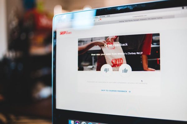
Social proof is the most powerful conversion tool for SaaS landing pages because software purchases involve significant trust. Visitors are entrusting your platform with their data, workflows and business processes. Social proof provides the reassurance they need to make that leap.
Customer logos are the fastest form of SaaS social proof. Display logos of your most recognisable customers prominently on the page. For Singapore SaaS companies, include a mix of local and international brands to demonstrate both local credibility and global capability.
Quantified results from case studies are more persuasive than general testimonials. “Company X increased productivity by 35% and reduced costs by SGD 50,000 annually using our platform” provides specific, verifiable proof. Include the industry and company size to help visitors see themselves in the success story.
Review platform badges from G2, Capterra, TrustRadius or Product Hunt add third-party credibility. “Rated 4.7 on G2 from 500+ reviews” is more trustworthy than self-proclaimed excellence because it comes from an independent source. Include links to your review profiles for visitors who want to read detailed reviews.
User count or growth metrics signal momentum. “Trusted by 10,000+ teams worldwide” or “Growing 300% year over year” tells visitors they are joining a winning platform, not a risky experiment. If your numbers are still small, focus on growth rate or team quality rather than raw user counts.
Integration partner logos demonstrate ecosystem compatibility. Showing that your product integrates with Slack, Salesforce, HubSpot, Xero and other popular tools addresses the concern about whether your software fits into existing workflows. This is especially important for Singapore businesses that have already invested in established platforms.
Industry awards and media mentions add prestige. “Featured in TechCrunch” or “Winner of the Singapore FinTech Award” positions your product as recognised and validated by credible third parties. Display these alongside customer proof for comprehensive social validation.
Landing Pages for Singapore SaaS Companies
Singapore is a growing hub for SaaS companies, with startups and scale-ups serving both the local market and the broader Southeast Asian region. Landing pages for Singapore-based SaaS companies should leverage the unique advantages of the local market.
Data residency is a significant concern for Singapore enterprise buyers. If your servers are located in Singapore or offer Singapore data residency options, highlight this prominently. Government agencies and regulated industries often require local data storage, and this can be a decisive competitive advantage.
PDPA compliance should be explicitly mentioned. Singapore businesses need assurance that your software handles personal data in accordance with local regulations. A brief compliance statement on your landing page addresses this concern without requiring a lengthy legal discussion.
Local customer support and account management appeal to Singapore buyers who value responsive service. If you offer Singapore-based support during local business hours, this is a meaningful differentiator against international competitors operating from distant time zones.
Singapore government grants and subsidies can be powerful conversion tools. If your product qualifies for grants like the Productivity Solutions Grant (PSG) or Enterprise Development Grant (EDG), feature this prominently. “Up to 50% subsidised by IMDA” dramatically changes the pricing equation and can be the deciding factor for SME buyers.
Localised pricing in SGD eliminates currency conversion anxiety. Offer invoicing from a Singapore entity if possible. Many local businesses prefer dealing with local vendors for accounting and compliance simplicity. These operational details may seem minor but they reduce friction in the buying process.
Combine your landing page strategy with strong SEO to capture organic traffic from Singapore-specific software search queries, and use Google Ads to target high-intent keywords in the local market.
Frequently Asked Questions
Should SaaS landing pages focus on features or benefits?
Lead with benefits and support with features. Visitors care first about what your product will do for them, then about how it does it. “Save 10 hours per week on reporting” (benefit) is more compelling than “Automated report generation” (feature). List features after establishing the value they deliver.
How long should a SaaS free trial be?
The most common trial lengths are 7, 14 and 30 days. The right length depends on your product’s complexity and time-to-value. Simple tools can demonstrate value in 7 days. Complex platforms that require data migration and team onboarding may need 30 days. Test different trial lengths and measure conversion to paid.
Should I require a credit card for free trials?
Requiring a credit card reduces trial sign-ups by 50% to 70% but increases trial-to-paid conversion rates significantly. If your product delivers clear value quickly, a no-card trial maximises sign-ups and relies on the product experience to convert. If your product has a longer time-to-value, requiring a card ensures more committed trial users.
What is the best CTA for a SaaS landing page?
The best CTA depends on your conversion goal. “Start Free Trial” is standard for self-serve products. “Get a Demo” works for enterprise sales. “See It in Action” is less committal and works well for awareness-stage visitors. Test multiple CTA variations to find what resonates with your Singapore audience.
How do I handle competitor comparisons on landing pages?
Comparison pages can be effective when done honestly. Focus on genuine differentiators rather than selectively choosing categories where you win. Acknowledge competitor strengths where they exist. Singapore audiences are savvy and will check both sides, so biased comparisons damage credibility more than they help.
Should SaaS landing pages include live chat?
Live chat can increase conversions by 20% to 40% when staffed by knowledgeable team members who can answer questions in real time. However, unstaffed chat widgets or poorly trained agents can harm the experience. Only add live chat if you can provide prompt, helpful responses during Singapore business hours.
What metrics should I track for SaaS landing pages?
Track visitor-to-trial conversion rate, trial-to-paid conversion rate, cost per trial sign-up, cost per paying customer and average revenue per user from each landing page. These metrics connect landing page performance to business outcomes rather than just vanity metrics like traffic and bounce rate.
How important is page speed for SaaS landing pages?
Extremely important. Every additional second of load time reduces conversions by up to 20%. SaaS landing pages often include heavy elements like product screenshots, videos and interactive demos that can slow performance. Optimise aggressively by compressing images, lazy loading media and minimising JavaScript.