Data Visualisation for Marketing: How to Turn Numbers Into Stories That Drive Decisions
Table of Contents
Why Data Visualisation Matters for Marketers
Data visualisation marketing bridges the gap between raw analytics and actionable business decisions. Marketing teams generate vast amounts of data across multiple platforms, but data in spreadsheets and dashboards only creates value when decision-makers understand it and act on it. Visualisation transforms complex datasets into clear, compelling visual stories that drive alignment and action.
The human brain processes visual information sixty thousand times faster than text. A well-designed chart communicates the trend in website traffic over twelve months in a glance, while the same information in a table requires careful row-by-row comparison. For marketing teams presenting to leadership, clients, or cross-functional stakeholders, this speed of comprehension translates directly into faster, more confident decisions.
In Singapore’s data-driven business environment, the ability to visualise marketing performance is increasingly expected. Clients expect clear, visual reporting. Leadership expects dashboards that show real-time performance. Cross-functional teams expect marketing to present data with the same rigour as finance or operations. Mastering data visualisation elevates marketing’s credibility and influence within the organisation and strengthens your overall digital marketing programme.
Choosing the Right Chart for Your Data
The chart type you choose should match the story your data tells. Line charts show trends over time and are ideal for tracking metrics like traffic, revenue, and conversion rates across weeks or months. Use line charts when the x-axis represents time and you want to highlight direction and momentum.

Bar charts compare values across categories. Use them to compare channel performance, campaign results, or regional differences. Horizontal bar charts work well for comparing many categories with long labels, while vertical bar charts suit fewer categories with short labels. Stacked bar charts show composition within each category, such as traffic sources contributing to total monthly visits.
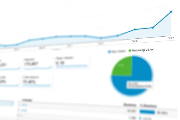
Pie charts show proportion and should be used sparingly. They work for showing how a total breaks into parts, such as traffic source distribution, but become unreadable with more than five segments. Donut charts offer a modern variation with space for a central metric. For most marketing purposes, a horizontal bar chart communicates proportions more clearly than a pie chart.
Scatter plots reveal relationships between two variables. Plot cost per acquisition against customer lifetime value to identify which campaigns deliver the best long-term economics. Funnel charts visualise conversion drop-offs through stages like awareness, consideration, and purchase. Heatmaps (in the data visualisation sense, not website heatmaps) display patterns in tabular data using colour intensity, ideal for showing performance by day of week and hour. Match your chart selection to the specific insight you want to communicate.
Dashboard Design Principles
Effective marketing dashboards follow the principle of progressive disclosure: start with the most important metrics and allow users to drill into detail as needed. The top level should show three to five key performance indicators (KPIs) that answer the question “How is marketing performing right now?” Supporting detail sits below or behind these headline numbers.
Apply visual hierarchy to guide attention. The most important metrics should be largest, highest on the page, and use the strongest visual treatment. Secondary metrics should be smaller and less prominent. Use consistent colour coding: green for positive performance, red for negative, and grey for neutral or contextual data. This coding creates an at-a-glance understanding of overall health.
Limit each dashboard to a single purpose. A campaign performance dashboard, a channel comparison dashboard, and an executive summary dashboard serve different audiences and answer different questions. Combining everything into one view creates overwhelming, unfocused dashboards that serve no audience well.
Include context alongside every metric. A conversion rate of three per cent is meaningless without context. Show the target, the previous period’s rate, and the trend direction. “3.2% conversion rate (target: 3.0%, up from 2.8% last month)” tells a complete story in a single data point. Context transforms numbers into insights that inform decisions within your marketing ROI framework.
Storytelling With Data
Data storytelling combines data, visuals, and narrative to communicate insights persuasively. A chart alone shows what happened. A data story explains why it happened, why it matters, and what should happen next. This narrative layer is what transforms data visualisation marketing from reporting into strategic communication.

Structure your data stories with a clear beginning, middle, and end. Begin with context: what question are we answering, and why does it matter? Present the data with appropriate visualisation in the middle. End with the insight and recommended action. “Our Facebook CPM increased by forty per cent this quarter, suggesting audience fatigue. I recommend refreshing creative assets and testing new audience segments” is a complete data story in three sentences.
Annotate your charts to highlight key moments and explain anomalies. A traffic spike without annotation leaves the audience wondering what caused it. A labelled annotation like “Blog post went viral on LinkedIn” provides immediate understanding. Annotations transform passive charts into active communication tools.
Tailor your data story to your audience. Executives want business impact: revenue, ROI, and strategic implications. Marketing managers want tactical detail: channel performance, campaign metrics, and optimisation opportunities. Technical teams want granular data: conversion funnels, attribution paths, and statistical significance. The same underlying data supports different stories for different audiences.
Visualising Key Marketing Metrics
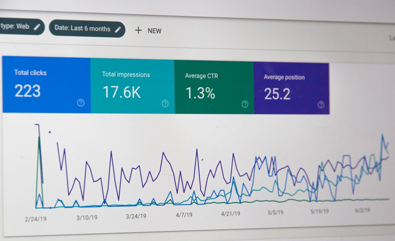
Traffic and acquisition metrics are best shown as line charts with channel breakdown. Display total traffic as the primary line with individual channel lines below. This shows both the overall trend and the contribution of each channel. Add benchmark lines for targets to quickly identify whether performance is on track.
Conversion funnel data should be visualised as a funnel chart or a horizontal bar chart showing the count and conversion rate at each stage. Highlight the stages with the largest drop-offs to focus attention on the biggest improvement opportunities. This visualisation directly supports your conversion rate optimisation efforts.
Channel comparison data works best in grouped bar charts or radar charts. Compare three to five key metrics across channels side by side. This format makes it easy to identify which channels excel in which areas: one channel may drive the most traffic while another delivers the highest conversion rate or lowest cost per acquisition.
Revenue attribution and ROI data should be presented in waterfall charts that show how each channel contributes to total marketing-attributed revenue. Waterfall charts make it visually clear which channels add the most value and help stakeholders understand the relative contribution of each investment.
Tools for Marketing Data Visualisation
Google Looker Studio (formerly Data Studio) is the most accessible tool for Singapore marketing teams. It connects natively to GA4, Google Ads, Google Search Console, Google Sheets, and BigQuery. It is free, collaborative, and produces professional dashboards that update automatically. For most SMEs, Looker Studio covers eighty per cent of visualisation needs.
Tableau and Power BI are enterprise-grade tools for organisations with complex data requirements. Tableau excels in interactive exploration and handles large datasets efficiently. Power BI integrates tightly with Microsoft’s ecosystem and offers strong value for organisations already using Microsoft 365. Both tools have steeper learning curves but provide more sophisticated analysis capabilities.
For presentation-ready visualisations, tools like Canva, Venngage, and Infogram create polished charts and infographics. These tools are designed for visual communication rather than data analysis, making them ideal for client reports, social media content, and executive presentations where aesthetics matter as much as accuracy.
Spreadsheet tools like Google Sheets and Excel remain valuable for ad hoc analysis and simple visualisations. Pivot tables, conditional formatting, and built-in chart types handle basic visualisation needs without additional software. For one-off analyses, a well-formatted spreadsheet chart is often faster to create than configuring a dedicated visualisation tool. Combine these tools with your content marketing workflows to create data-driven content for your audience as well.
Common Visualisation Mistakes to Avoid
Truncated y-axes create misleading impressions of change. A bar chart starting at 95 rather than 0 makes a change from 96 to 98 look like a dramatic increase. Always start bar chart y-axes at zero. Line charts can use truncated axes when the focus is on relative change, but label the axis clearly to prevent misinterpretation.
Overloading charts with too much data obscures the insight. A line chart with fifteen lines is unreadable. A dashboard with thirty metrics provides no focus. Apply the rule of simplicity: each chart should communicate one primary insight. If you need to show multiple dimensions, use multiple charts rather than one overcrowded visual.
Using inappropriate chart types misrepresents data. Three-dimensional charts add visual complexity without informational value. Dual-axis charts can mislead by implying a relationship between unrelated metrics at different scales. Area charts that overlap make it impossible to read individual values. Choose the simplest chart type that accurately communicates your data.
Inconsistent formatting across a report or dashboard creates confusion. Use the same colour for the same metric throughout. Apply consistent date formatting, number formatting, and labelling conventions. If blue represents organic traffic on one chart, it should represent organic traffic on every chart. Visual consistency reduces cognitive load and improves comprehension across your marketing performance reports.
Frequently Asked Questions
What is the best data visualisation tool for marketing teams?
Google Looker Studio is the best starting point for most Singapore marketing teams due to its free pricing, native Google integrations, and collaborative features. Teams with more complex needs or enterprise data requirements should consider Tableau or Power BI.
How often should I update marketing dashboards?
Connect dashboards to live data sources for real-time updates wherever possible. If manual data entry is required, update weekly at minimum. The value of a dashboard diminishes rapidly when data is stale. Automate data connections to ensure dashboards always show current performance.
How many metrics should a marketing dashboard include?
Five to ten key metrics per dashboard. An executive dashboard should show three to five headline KPIs. A channel-specific dashboard can include eight to ten metrics. More than fifteen metrics on a single dashboard indicates the need to split it into focused, purpose-specific views.
How do I visualise data for non-technical stakeholders?
Use simple chart types, minimise jargon, and lead with the insight rather than the data. Large numbers with context (“Revenue up 23% to $450K”) communicate faster than detailed charts. Use annotations to explain what the data means, not just what it shows. Avoid statistical terminology unless your audience is familiar with it.
What is the difference between a report and a dashboard?
A dashboard shows real-time or near-real-time metrics for ongoing monitoring. A report is a point-in-time analysis with narrative context, insights, and recommendations. Dashboards answer “What is happening now?” while reports answer “What happened, why, and what should we do about it?”
How do I create effective data visualisations without design skills?
Use templates provided by tools like Looker Studio, Tableau Public, and Canva. Follow basic design principles: use white space, limit colours to three to five, choose readable fonts, and align elements consistently. The most effective visualisations prioritise clarity over aesthetics. Simple, clean charts communicate better than elaborate ones.
Should I use real-time dashboards or periodic reports?
Both serve different purposes. Real-time dashboards are essential for monitoring paid campaigns and website performance where quick action is needed. Periodic reports are better for strategic analysis where context, interpretation, and recommendations add value. Most marketing teams benefit from having both.
How do I visualise marketing attribution data?
Use Sankey diagrams or flow charts to show how users move through touchpoints to conversion. Stacked bar charts work for comparing attribution models side by side. Waterfall charts effectively show how each channel contributes incrementally to total conversions or revenue.
What are the key principles of good data visualisation marketing?
Clarity over decoration: every visual element should serve a purpose. Accuracy over impact: never distort data to make a point look stronger. Context over numbers: always provide benchmarks, targets, and comparisons. Simplicity over complexity: if a simpler chart can communicate the same insight, use it.
How do I present negative marketing results visually?
Present negative results honestly and pair them with context and a plan. Show the trend, explain the contributing factors, and present the corrective actions being taken. Avoid visual tricks that minimise the negative data. Stakeholders trust marketers who present data honestly and demonstrate they understand the issues and have a plan to address them.