Visual Identity Guide: How to Design a Consistent Look Across Every Brand Touchpoint
Table of Contents
- What Visual Identity Means for Your Business
- Core Elements of a Visual Identity System
- Logo Design Principles That Stand the Test of Time
- Choosing Colours and Typography
- Imagery, Photography Style and Graphic Elements
- Applying Your Visual Identity Across Touchpoints
- Building Brand Guidelines That Teams Actually Follow
- Frequently Asked Questions
What Visual Identity Means for Your Business
Your visual identity is the collection of design elements that represent your brand — logos, colours, typography, imagery and graphic treatments. A strong visual identity guide ensures these elements work together consistently, so your business looks professional and recognisable wherever customers encounter it.
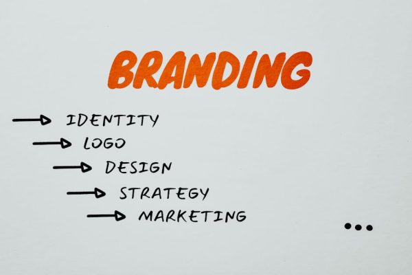
Visual identity is not the same as branding. Branding is the strategic work of defining what your company stands for, who it serves and how it wants to be perceived. Visual identity is the tangible expression of that strategy. Without the strategic foundation, even the most beautiful design work lacks direction and purpose.
For Singapore businesses, visual consistency is particularly important because the market is compact and customers encounter your brand across multiple channels in quick succession. A prospect might see your Google ad, visit your website, check your LinkedIn page and read your proposal within a single day. If the visual experience is inconsistent across those touchpoints, it erodes trust and makes your business look less professional than it is.
Core Elements of a Visual Identity System
A complete visual identity system includes your logo and its variations, your colour palette, typography selections, imagery guidelines, iconography, graphic patterns or textures, and rules for layout and spacing. Together, these elements create a visual language that is uniquely yours.
Each element must be defined with enough specificity to ensure consistency but enough flexibility to work across different contexts. Your logo needs to work on a business card, a billboard and a 16-pixel favicon. Your colour palette must translate well on screen, in print and on merchandise. Rigidity that prevents practical application is as harmful as no guidelines at all.
The best visual identity systems are modular. They provide a toolkit of elements that can be combined in different ways for different contexts while maintaining a consistent overall feel. This modularity allows your marketing team, external agencies and freelancers to create materials that look cohesive without needing approval on every single piece.
Logo Design Principles That Stand the Test of Time
Your logo is the most visible element of your visual identity, but it is not the most important. A strong logo supports the broader identity system; it does not carry the entire burden of brand recognition. The world’s most recognised brands are identified as much by their colours, typography and visual style as by their logos.
Effective logos are simple, distinctive and adaptable. They work in colour and in black and white, at large and small sizes, on light and dark backgrounds. Avoid overly complex designs, trendy effects and excessive detail that will look dated within a few years or become illegible at small sizes.
Every logo should have at least three variations: a primary version, a simplified version for small applications and a single-colour version for situations where colour is limited. Define clear space rules — the minimum empty space around the logo — and minimum size requirements. Document these in your guidelines with specific measurements, not vague instructions.
If your current logo was designed cheaply or hastily, investing in a professional redesign through a branding agency is one of the highest-return investments you can make. You will use the logo on everything for years to come, and it sets the foundation for your entire visual system.
Choosing Colours and Typography
Your colour palette should include primary colours (used most frequently and associated with your brand), secondary colours (supporting the primary palette for variety and hierarchy) and functional colours (for things like error states, success messages and calls to action on your website).
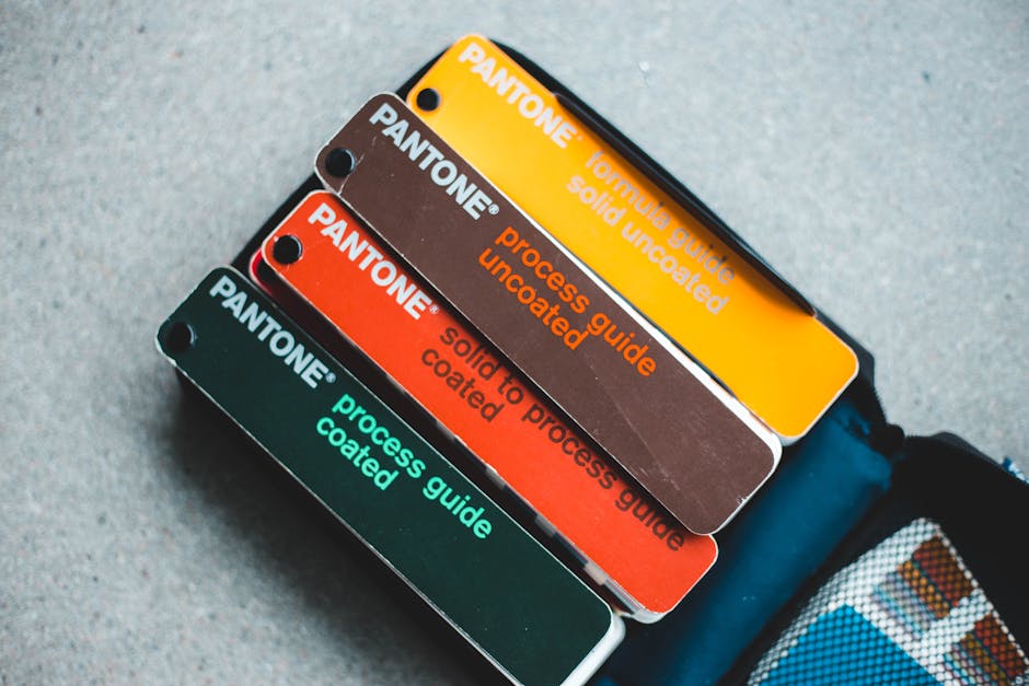
Define each colour with exact specifications: Hex codes for digital, CMYK for print and Pantone references for branded materials. Approximate colours lead to inconsistency. What looks like “our blue” on one screen can look like a completely different shade on another if the values are not specified precisely.
Typography is equally important and often underestimated. Choose a primary typeface for headings and a secondary typeface for body text. Ensure both are legible across devices and available in the formats you need — web fonts for your website, desktop fonts for marketing materials and system font fallbacks for email. A strong web design relies on typography that works across all screen sizes and browsers.
Consider licensing costs and availability. Some premium typefaces require expensive licences for web use. Open-source alternatives from Google Fonts or similar libraries are often excellent and eliminate licensing headaches. Whatever you choose, specify font weights, sizes, line heights and letter spacing for different contexts.
Imagery, Photography Style and Graphic Elements
Define the style of photography your brand uses. Is it natural and candid or composed and polished? Warm and bright or cool and muted? Do you use people in your imagery, and if so, should they reflect Singapore’s multicultural population? These guidelines ensure that stock photography, custom photography and user-generated content all feel like they belong to the same brand.
Illustrations, icons and graphic elements add personality and flexibility to your visual identity. If you use custom illustrations, define the style: line weight, colour usage, level of detail and subject matter. If you use icons, choose or create a consistent set rather than mixing styles from different sources.
Graphic patterns, textures and shapes can become powerful brand identifiers. A distinctive geometric pattern, a signature gradient or a recurring graphic motif adds visual interest and reinforces recognition even when the logo is not present. These elements are especially useful for social media content where scroll-stopping visuals are essential.
Define what your brand should never look like. Including “don’t” examples in your visual identity guide is just as valuable as showing the correct approach. Specify colour combinations to avoid, imagery styles that conflict with your brand and common mistakes that would undermine the visual system.
Applying Your Visual Identity Across Touchpoints
Your website is the primary digital touchpoint and should be the most complete expression of your visual identity. Every design decision — layout, colour usage, typography, button styles, form design — should reflect the visual system. Ensure your web development team has access to the full brand guidelines and implements them accurately.
Social media profiles require adapted versions of your visual identity. Profile pictures, cover images, post templates and story formats all have different dimensions and technical requirements. Create templates for each platform that your team can use consistently. This is where a modular identity system pays dividends — the elements are recognisable even in different formats.
Email marketing is often a weak point for visual consistency. Many businesses use default email templates that bear no resemblance to their website or other materials. Invest time in customising your email templates to match your visual identity, including header design, colour scheme, typography and footer layout.
Print materials — business cards, brochures, proposals, packaging — must also align with the digital identity. Colours may need adjustment for print reproduction, and typography choices should account for print-specific considerations. Produce print-ready templates for commonly used materials so that consistency is maintained even when different team members create documents.
Building Brand Guidelines That Teams Actually Follow
Brand guidelines are only valuable if people use them. The most common reason brand guidelines gather dust is that they are too long, too rigid or too difficult to find. Create guidelines that are practical, accessible and focused on the decisions people actually need to make.
Structure your guidelines around use cases rather than abstract design theory. Instead of a chapter on colour theory, provide specific guidance: “Use primary blue for headings and buttons. Use secondary grey for body text. Use accent green for success messages and positive statistics.” This task-based approach helps non-designers apply the guidelines correctly.
Make the guidelines digital and easily accessible. A shared Google Drive folder, a Notion page or a dedicated section on your company intranet works better than a 60-page PDF that nobody opens. Include downloadable assets — logo files, colour swatches, font files, templates — alongside the guidelines so everything is in one place.
Update the guidelines as your identity evolves. Add examples of new applications as they are created. Include answers to common questions that arise. Brand guidelines should be a living document, not a historical artefact. Assign someone in your organisation to be the guardian of brand consistency and the point of contact for questions about applying the visual identity guide in new contexts.
Frequently Asked Questions
How much does it cost to develop a visual identity in Singapore?
A basic visual identity package (logo, colour palette, typography, simple guidelines) typically costs S$3,000-8,000 from a professional agency. A comprehensive identity system with full brand guidelines, templates and multiple applications ranges from S$10,000-30,000. The investment should be proportional to how prominently your brand faces customers.
How often should a visual identity be updated?
Most brands benefit from a subtle refresh every five to seven years to stay current without losing recognition. Major overhauls should only happen when the business strategy has fundamentally changed or the current identity is genuinely hindering growth. Frequent changes confuse customers and waste the equity you have built.
Can I design my own visual identity using Canva?
Canva is excellent for creating day-to-day marketing materials but is not ideal for developing a professional visual identity system. The strategic thinking, typographic expertise and systematic approach that a professional designer brings are difficult to replicate with templates. Use Canva for execution, but invest in professional help for the foundation.
What file formats should I have for my logo?
At minimum, you need SVG (scalable vector for web and large format), PNG with transparent background (for digital use), PDF (for print), and EPS or AI (for professional designers). Have each format in your primary and single-colour versions. A favicon file (ICO or 32×32 PNG) is also essential for your website.
Should my visual identity look different for different markets?
The core elements — logo, primary colours, typography — should remain consistent across markets. However, imagery, secondary colours and certain graphic elements may need adaptation to resonate with different cultures. Define what is fixed and what is flexible in your guidelines.
How do I ensure consistency when working with multiple agencies?
Provide comprehensive brand guidelines and asset files to every external partner at the start of every project. Include specific examples of correct and incorrect usage. Require brand compliance reviews before materials go live. Assign one internal person as the brand gatekeeper who approves all external-facing materials.
What is the difference between visual identity and brand identity?
Brand identity encompasses everything that defines how your brand presents itself — values, personality, voice, messaging and visual elements. Visual identity is the subset focused specifically on design elements: logo, colours, typography, imagery and graphic style. Visual identity is one component of the broader brand identity.
Do I need a different visual identity for each social media platform?
No. Your visual identity should be consistent across platforms. However, you do need platform-specific adaptations — different image dimensions, video formats and content styles. Create templates for each platform that apply your visual identity within the technical requirements of that channel.
How many colours should be in my brand palette?
A typical brand palette includes two to three primary colours, two to three secondary colours and two to three functional colours. More than ten total colours creates complexity without benefit. Each colour should have a defined role in the system, and the overall palette should work harmoniously across all applications.