UX Writing Guide: How to Write Interface Copy That Improves Usability and Conversions
Table of Contents
- What Is UX Writing and Why It Affects Your Bottom Line
- Principles of Effective UX Copy
- Writing Buttons, CTAs and Navigation Labels
- Error Messages and Form Validation Copy
- Onboarding Flows and Empty States
- Microcopy That Builds Trust and Reduces Friction
- Testing and Iterating on UX Copy
- Frequently Asked Questions
What Is UX Writing and Why It Affects Your Bottom Line
UX writing is the practice of crafting the words users see when they interact with your website, app or digital product. This includes button labels, form instructions, error messages, confirmation text, tooltips, navigation labels and every other piece of text within the interface. A comprehensive UX writing guide treats these words as functional design elements, not afterthoughts.
The business impact of good UX writing is measurable and significant. Google famously changed a button label from “Book a room” to “Check availability” and saw a 17 per cent increase in engagement. Small changes to interface copy can move conversion rates by 10-30 per cent because they directly affect whether users complete desired actions or abandon them.
For Singapore businesses, where most customer interactions happen through digital channels, UX writing quality directly correlates with revenue. If your website visitors cannot understand your navigation, get confused by form labels or are put off by impersonal error messages, they leave. Every word in your interface is either helping users move forward or creating friction that drives them away.
Principles of Effective UX Copy
Clarity is the foundation. Every piece of interface copy should be immediately understandable by your target user. If a user has to stop and think about what a button does or what a form field requires, the copy has failed. Use familiar words, short sentences and simple structures. Aim for a reading level that is accessible to all your users, not just the most educated.
Conciseness matters in interfaces more than anywhere else. Users scan rather than read, and screen space is limited, especially on mobile. Every word must earn its place. “Enter your email address to receive updates” can become “Email for updates.” Cut every word that does not add meaning or clarity.
Consistency creates predictability, and predictability reduces cognitive load. If you call something a “shopping cart” in the header, do not call it a “basket” at checkout. If “Submit” is your standard button label, use it everywhere rather than alternating between “Submit,” “Send” and “Go.” Create a content style guide that documents your preferred terms for common UI elements.
Usefulness means every piece of copy helps the user accomplish their goal. Instructions should explain what to do and why. Error messages should explain what went wrong and how to fix it. Confirmation messages should confirm what happened and what comes next. Copy that only describes the situation without guiding action is a missed opportunity.
Writing Buttons, CTAs and Navigation Labels
Buttons are the most conversion-critical copy on your website. A button label should tell the user exactly what will happen when they click it. “Get My Free Quote” is more effective than “Submit” because it communicates the value the user receives. “Start Free Trial” outperforms “Sign Up” because it sets clear expectations about what comes next.
Use action verbs that match the user’s intent. “Download,” “Start,” “Create,” “View,” “Save” and “Continue” are clear actions. Avoid vague verbs like “Click Here” or “Go” that do not communicate the outcome. Pair the action verb with a benefit or object: “Download the Report,” “Start Your Trial,” “Save My Progress.”
Navigation labels must be descriptive enough to set accurate expectations about the destination page. “Services” is less helpful than “Our Services” which is less helpful than “Marketing Services.” Balance brevity with descriptiveness — test whether users can predict what they will find when they click each navigation item. Good navigation copy is critical to the overall web design experience.
Maintain a hierarchy in your CTAs. Each page should have one primary CTA that stands out visually and linguistically, plus secondary CTAs for users who are not ready for the primary action. “Get Started” might be the primary CTA while “Learn More” serves as the secondary option for users still in research mode.
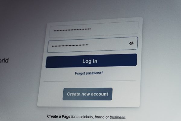
Error Messages and Form Validation Copy
Error messages are where most websites fail their users. The default “Invalid input” or “An error occurred” messages are useless because they do not tell the user what went wrong or how to fix it. Every error message should answer three questions: what happened, why it happened and what the user should do next.
Write error messages in plain language, not technical jargon. “Your password must be at least 8 characters and include a number” is helpful. “Error: Password does not meet minimum complexity requirements” is not. The user should never have to interpret an error message.
Use inline validation that appears as users fill in forms, not just after submission. Show errors next to the relevant field, not in a list at the top of the page. Red text with an icon is the established convention for errors; use green for successful validation. This immediate feedback prevents frustration and reduces form abandonment.
Frame error messages positively where possible. Instead of “You did not enter a valid email address,” try “Please enter an email address in the format [email protected].” The first blames the user; the second guides them toward success. This is a key principle in any UX writing guide — always help the user move forward rather than dwelling on what went wrong.
Onboarding Flows and Empty States
Onboarding copy introduces new users to your product and guides them toward their first success. The goal is to reduce time-to-value — the time between signing up and experiencing the benefit your product promises. Every onboarding screen should move the user closer to that first valuable experience.
Keep onboarding steps short and focused. Each screen should ask the user to do one thing. Explain why each step matters: “Tell us your industry so we can show you relevant templates” is more motivating than “Select your industry.” When users understand the benefit of completing each step, completion rates increase.
Empty states are the screens users see before they have created any content or data in your product. A dashboard with no data, a project list with no projects, a messaging inbox with no messages — these are all empty states. Use these moments to guide users toward their first action with helpful, encouraging copy and clear CTAs.
Avoid empty states that are literally empty. A blank screen with no guidance is a dead end. Instead, use the space to explain what will appear here, how to get started and what the benefit of taking action will be. “You do not have any campaigns yet. Create your first campaign to start reaching customers” is more helpful than a blank table.
Microcopy That Builds Trust and Reduces Friction
Microcopy is the small text that appears at critical moments — next to form fields, below CTAs, near pricing, at checkout. These tiny pieces of text have outsized impact on conversions because they address concerns at the exact moment users are deciding whether to proceed.
“No credit card required” near a free trial button removes a common objection. “You can unsubscribe at any time” near an email signup reduces commitment anxiety. “Your data is encrypted and never shared” near a form builds security confidence. Each of these microcopy elements addresses a specific fear that might otherwise prevent action.
Use microcopy to set expectations. “Takes about 2 minutes” next to a signup form tells users the time commitment. “We will reply within 24 hours” after a contact form submission sets response expectations. “Free delivery for orders over S$50” near the add-to-cart button motivates larger orders. When users know what to expect, they feel more in control and are more likely to proceed.
Leverage microcopy for conversion rate optimisation by systematically testing different messages at key decision points. Even changing a single line of text near a CTA can produce measurable improvements. Maintain a log of what you test and what works so your team builds institutional knowledge about what resonates with your audience.
Testing and Iterating on UX Copy
A/B testing is the most reliable way to evaluate UX copy performance. Test one copy element at a time — a button label, a headline, an error message — and measure the impact on the specific metric that element affects. Run tests long enough to achieve statistical significance, typically two to four weeks depending on your traffic volume.
Usability testing with real users reveals problems that analytics cannot. Watch users interact with your interface and listen to their verbalisation of confusion, hesitation and satisfaction. Five usability tests typically uncover 80 per cent of major UX writing issues. For Singapore businesses, recruit test participants who represent your actual user base in terms of language proficiency and digital literacy.
Heatmaps and session recordings from tools like Hotjar show where users hesitate, click unexpectedly or abandon tasks. These behavioural signals often point to copy problems — users click on text they think is a link, hover over terms they do not understand or repeatedly re-read instructions before proceeding. Use these insights to identify copy that needs improvement.
Analyse your competitors’ interfaces for UX writing patterns. Note the conventions in your industry and the ways competitors communicate similar features and processes. You do not need to copy them, but understanding the established patterns helps you make informed decisions about when to follow conventions and when to differentiate. Document your findings in a UX writing guide that becomes a reference for your entire product and design team.
Frequently Asked Questions
What is the difference between UX writing and copywriting?
UX writing focuses on functional interface text that helps users complete tasks — buttons, forms, error messages, navigation. Copywriting focuses on persuasive text that drives marketing goals — headlines, ads, landing pages, emails. The skills overlap, but UX writing prioritises clarity and usability while copywriting prioritises persuasion and engagement.
How do I prioritise which UX copy to improve first?
Start with the highest-impact, highest-traffic areas: your primary CTAs, checkout or signup flow, form fields and error messages. Use analytics to identify where users drop off and focus your UX writing improvements on those friction points. Small changes at high-traffic decision points produce the largest returns.
Should UX copy be formal or casual?
Match the tone to your brand and your audience’s expectations. A banking app requires more formal language than a social media scheduling tool. In Singapore, lean toward a professional but approachable tone. Avoid being overly stiff, but also avoid slang or overly casual language that might not translate across the multicultural user base.
How long should button text be?
Button text should be two to five words. One word is usually too vague, and more than five creates visual clutter. Use the minimum number of words needed to communicate the action and its benefit. “Get Started” (two words) and “Download Free Template” (three words) are both effective lengths.
Can AI tools help with UX writing?
AI tools can generate draft copy and variations for testing, but UX writing requires deep understanding of user context, brand voice and interface design that AI alone cannot provide. Use AI for brainstorming and generating test variations, then refine with human judgement and validate through testing.
How does UX writing differ for mobile versus desktop?
Mobile UX writing must be even more concise because screen space is limited and users have less patience. Button labels may need to be shorter, instructions more compact and error messages more focused. Test your copy on actual mobile devices to ensure readability and clarity at smaller screen sizes.
Should I localise UX copy for Singapore English?
Use standard British English with Singapore-relevant references. Avoid localisms like “lah” or Singlish in interface copy, as they can alienate international users or feel forced. However, use Singapore-specific terms where appropriate — SGD for currency, local date formats and local examples in instructional text.
How do I maintain UX writing consistency across a large website?
Create a UX content style guide that documents your preferred terminology, tone, formatting conventions and examples for common UI patterns. Store it where everyone on your team can access it. Conduct regular audits to catch inconsistencies, and assign ownership of the guide to one person who keeps it updated.
What metrics should I track for UX writing performance?
Track task completion rates, form abandonment rates, error recovery rates, time-on-task, click-through rates on CTAs and overall conversion rates. Compare these metrics before and after copy changes. Also track qualitative signals like support ticket volume for UX-related confusion and user feedback about clarity.