E-commerce Landing Pages: Product and Collection Pages That Sell
Table of Contents
- Types of E-commerce Landing Pages
- Product Landing Pages That Convert Browsers to Buyers
- Collection and Category Landing Pages
- Using Urgency and Scarcity Without Being Manipulative
- Writing Product Descriptions That Sell
- Reviews and User-Generated Content as Conversion Tools
- E-commerce Landing Page Strategies for Singapore
- Frequently Asked Questions
Types of E-commerce Landing Pages
Not all ecommerce landing pages serve the same purpose. Understanding the different types and when to use each one is fundamental to building an online store that converts traffic into revenue. Each page type serves a different stage of the buyer journey and requires a distinct approach to design and content.
Product landing pages focus on a single product and are designed to drive an immediate purchase decision. These pages are the destination for product-specific ads, search queries and email campaigns. They provide detailed information about one item and include a clear add-to-cart or buy-now action.
Collection or category landing pages showcase multiple products within a theme, category or promotion. These pages are ideal for broader search terms like “running shoes” or campaign themes like “Chinese New Year gift sets.” They help visitors browse and discover products within a curated selection.
Promotional landing pages are built around specific campaigns, sales events or product launches. They typically feature limited-time offers, exclusive bundles or seasonal promotions. These pages have a shorter lifespan but often drive the highest conversion rates due to urgency and specificity.
Brand story landing pages serve as conversion entry points for visitors who arrived through brand awareness campaigns. They combine brand storytelling with product showcasing, building an emotional connection before guiding visitors toward product pages. These work well for DTC brands competing against established retailers in Singapore’s crowded e-commerce market.
Regardless of the type, all e-commerce landing pages benefit from professional web design that prioritises speed, clarity and mobile-first experiences.
Product Landing Pages That Convert Browsers to Buyers
Product landing pages are where purchase decisions happen. The page must provide everything a buyer needs to feel confident about adding to cart: clear product images, detailed specifications, honest descriptions, pricing, availability and trust signals.
Product images are the most critical element. Since online shoppers cannot physically inspect products, your images must compensate. Include multiple angles, close-up details, lifestyle context shots and size reference images. Use high-resolution images with zoom functionality. For fashion and accessories, include images of the product being worn or used by real people.
Pricing should be immediately visible and unambiguous. Display the price in SGD prominently near the product title. If the product is on sale, show both the original price and the discounted price with the savings clearly calculated. Include information about shipping costs, GST and any additional fees to avoid cart abandonment surprises.
The add-to-cart button must be the most prominent element on the page. Use a colour that contrasts strongly with the page background. Position it above the fold on both desktop and mobile. Consider adding a sticky add-to-cart bar that remains visible as visitors scroll through product details.
Product specifications should be comprehensive but organised. Use tabs or accordion elements to present detailed specifications, care instructions, size charts and shipping information without cluttering the main product view. Visitors who need details can expand these sections while casual browsers see a clean layout.
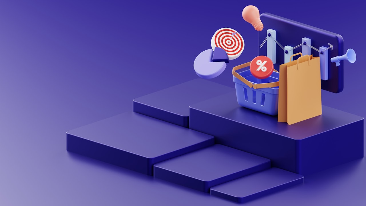
Cross-sell and upsell recommendations should be present but not dominating. “Customers also bought” and “Complete the look” sections increase average order value. Position these below the main product information so they enhance rather than distract from the primary purchase decision. This approach aligns with smart digital marketing strategies that maximise customer lifetime value.
Collection and Category Landing Pages
Collection pages serve visitors who know what type of product they want but have not decided on a specific item. These pages must balance product discovery with conversion efficiency, helping visitors find the right product quickly without overwhelming them with choices.
Filtering and sorting options are essential. Allow visitors to filter by price, colour, size, brand, rating and other relevant attributes. Make filters easily accessible and show the number of results for each filter option. For mobile visitors, a filter button that opens a clean filter panel works better than displaying all options on the page.
Product grid layout should show enough information for visitors to make initial comparisons without clicking into each product. At minimum, display the product image, name, price and rating. Quick-view functionality that lets visitors see more details in a popup without leaving the collection page speeds up the browsing process.
Collection page headers should include a brief introduction with relevant keywords for SEO while communicating the theme or value of the collection. “Premium Running Shoes for Singapore’s Climate” is more engaging than just “Running Shoes” and provides context that helps visitors confirm they are in the right place.
Pagination versus infinite scroll is a design decision that affects both user experience and conversion rates. Infinite scroll keeps visitors engaged but can make it difficult to return to previously viewed products. Paginated layouts with “Load More” buttons offer a compromise that works well for most e-commerce applications.
Featured or promoted products within the collection page can guide purchasing decisions. Highlighting bestsellers, new arrivals or staff picks gives visitors a starting point when faced with a large selection. Badge labels like “Best Seller,” “New” or “Limited Edition” draw attention to specific products and help visitors navigate the collection.
Using Urgency and Scarcity Without Being Manipulative
Urgency and scarcity are powerful psychological triggers that drive purchase decisions. When used honestly, they help shoppers overcome procrastination and make timely decisions. When used deceptively, they erode trust and damage brand reputation.
Genuine urgency comes from real deadlines. Sale end dates, limited-time promotions, event-based offers and seasonal availability are all legitimate forms of urgency. Display countdown timers for genuine promotions and ensure the timer reflects reality. If the sale actually extends past the deadline, your urgency messaging loses all credibility with repeat visitors.
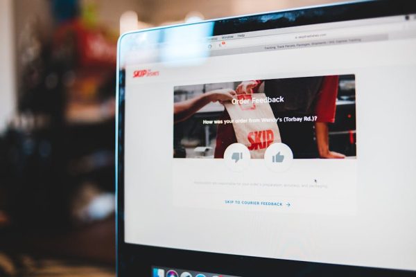
Genuine scarcity reflects actual inventory levels. “Only 3 left in stock” is honest and helpful when it is true. It gives shoppers important information about availability while creating natural urgency to act. Low-stock indicators are one of the most effective conversion tools in e-commerce when they reflect real inventory data.
Social proof urgency shows real-time activity. “12 people are viewing this right now” or “Sold 47 times in the last 24 hours” demonstrates demand without creating artificial pressure. These indicators work because they are informational rather than manipulative.
Avoid fake urgency tactics. Countdown timers that reset when the page is refreshed, permanently inflated “original prices” and artificially restricted stock levels are manipulative practices that Singapore consumers increasingly recognise and resent. The Competition and Consumer Commission of Singapore also takes a dim view of misleading pricing practices.
Free shipping thresholds create positive urgency. “Free shipping on orders over SGD 50 – You are SGD 15 away!” encourages adding more items to the cart. This tactic increases average order value while providing genuine value to the customer.
Writing Product Descriptions That Sell
Product descriptions do the selling job that a store assistant would do in a physical shop. They must inform, persuade and reassure, all while being scannable and engaging. The best product descriptions balance practical information with emotional appeal.
Lead with the benefit, not the feature. “Stay cool and comfortable during Singapore’s hottest days” is more compelling than “Made with moisture-wicking polyester blend.” The feature supports the benefit, but the benefit is what motivates the purchase. Use the feature as evidence for the benefit claim.
Address the sensory gap. Online shoppers cannot touch, smell, try on or test your product. Use descriptive language that helps them imagine the experience. “Buttery soft leather that moulds to your hand within days” is more evocative than “Genuine leather construction.”
Anticipate and answer questions within the description. What size should I order? Is it machine washable? Will it work with my existing setup? How long will it last? Every unanswered question is a potential reason to not buy. Include practical details that a buyer would ask about in a physical store.
Use bullet points for key features and specifications. Scannable formatting helps visitors find the information they need quickly. Lead each bullet with the most important word or phrase. Keep bullets consistent in length and structure for a clean visual presentation.
SEO matters for product descriptions. Include relevant keywords naturally within the description to help product pages rank for search queries. But never sacrifice readability for keyword density. A description that reads naturally and converts visitors is more valuable than one that ranks slightly higher but fails to sell. Strong product copy connects to broader landing page copywriting principles that drive conversions.
Reviews and User-Generated Content as Conversion Tools
Product reviews are the most influential form of social proof in e-commerce. Research consistently shows that products with reviews convert at rates 20% to 40% higher than products without reviews. For Singapore online shoppers who cannot physically inspect products, reviews from other buyers provide essential reassurance.
Display review counts and average ratings prominently near the product title and price. A “4.7 stars from 128 reviews” indicator immediately signals product quality. Make the rating clickable to scroll down to the full reviews section for visitors who want more detail.
Feature a mix of positive and constructively critical reviews. Exclusively five-star reviews feel curated and untrustworthy. A few four-star reviews with minor criticisms actually increase trust because they demonstrate authenticity. Visitors know that no product is perfect and a perfect score suggests filtered reviews.
Review photos and videos submitted by customers are extremely persuasive. They show the product in real-world settings, on real people, in real lighting. Encourage customers to submit photos by offering small incentives like loyalty points or future discount codes.
User-generated content extends beyond reviews. Instagram posts, TikTok videos and social media mentions featuring your products can be embedded on product pages to create a community feel. Social proof from real users in Singapore context is more persuasive than any professional product photography.
Respond to negative reviews publicly and constructively. A thoughtful response to criticism demonstrates that your brand cares about customer satisfaction. Potential buyers who see negative reviews handled well often feel more confident about purchasing because they know the brand will stand behind its products. Reputation management connects to overall branding strategy.
E-commerce Landing Page Strategies for Singapore
Singapore’s e-commerce landscape has unique characteristics that influence landing page strategy. Understanding local consumer behaviour, payment preferences and competitive dynamics is essential for maximising conversions.
Payment method variety is critical. Singapore shoppers expect multiple payment options including credit cards, PayNow, GrabPay, bank transfers and buy-now-pay-later services like Atome, Pace and ShopBack PayLater. Displaying available payment methods on product pages and collection pages reassures visitors that their preferred payment method is accepted.
Delivery speed and costs are major purchase factors. Singapore consumers expect fast, affordable delivery. Display estimated delivery dates prominently on product pages. Offer same-day or next-day delivery if possible. Free shipping thresholds should be set at levels that are achievable but encourage slightly larger orders.
Returns policy visibility reduces purchase anxiety. Singapore’s e-commerce regulations require clear return and refund policies. Display your returns policy summary on product pages, not just in the footer. A generous, clearly stated returns policy can increase conversion rates by 15% to 30%.
Mobile commerce dominates in Singapore, with over 60% of e-commerce transactions occurring on smartphones. Ensure product images load quickly on mobile, add-to-cart buttons are thumb-friendly, forms are optimised for mobile input and the checkout flow requires minimal typing.
Seasonal campaigns aligned with Singapore’s calendar drive significant revenue spikes. Create dedicated landing pages for Chinese New Year, Hari Raya, National Day, 11.11, 12.12 and Christmas. These seasonal pages should feature curated product selections, themed design elements and time-limited promotions.
Leverage SEO to capture organic traffic from product-related searches, and use Google Shopping Ads to appear in product search results with images, prices and reviews directly in the search engine.
Frequently Asked Questions
What is the most important element of an e-commerce landing page?
Product images are the most important element because online shoppers rely entirely on visuals to evaluate products. High-quality, multiple-angle images with zoom functionality consistently have the biggest impact on e-commerce conversion rates. Invest in professional product photography before optimising any other element.
How do I reduce cart abandonment from product pages?
Display all costs upfront including shipping, taxes and fees. Show stock availability and estimated delivery dates. Add trust signals like secure payment badges and return policy summaries. Include customer reviews for social proof. Offer multiple payment methods. Each of these elements addresses a common reason shoppers abandon their carts.
Should e-commerce landing pages have long or short descriptions?
It depends on the product complexity and price. Low-cost, simple products need short, scannable descriptions. High-cost, complex products benefit from detailed descriptions that address technical specifications, use cases and comparison points. Use tabs or expandable sections to accommodate both quick browsers and thorough researchers.
How many products should a collection page display?
Display 12 to 24 products per page view on desktop and 8 to 12 on mobile as an initial load. Use a “Load More” button or pagination for additional products. Showing too many products at once overwhelms visitors, while showing too few limits discovery. Include robust filtering to help visitors narrow the selection quickly.
Do I need separate landing pages for different traffic sources?
For paid traffic, yes. Visitors from Google Shopping expect a product page. Visitors from a Facebook ad featuring a collection expect to see that collection. Visitors from an email about a sale expect to see the sale. Matching landing pages to traffic source context increases conversion rates significantly.
How important are product videos for e-commerce?
Product videos can increase purchase likelihood by 60% to 80%. They are especially valuable for products where movement, scale, texture or usage is difficult to convey through static images. Short 15 to 30 second videos showing the product in use are most effective for e-commerce landing pages.
What is the ideal product page load time?
Under two seconds for the initial content to display and under four seconds for full page load. Every additional second of load time reduces e-commerce conversion rates by up to 20%. Optimise images, use lazy loading for below-fold content and minimise third-party scripts to achieve target load times.