

Table of Contents
- Why Looker Studio Belongs in Your Marketing Stack
- Connecting Data Sources Step by Step
- Building Your First Marketing Dashboard
- Choosing the Right Charts and Visualisations
- Adding Filters and Interactive Controls
- Calculated Fields for Custom Marketing Metrics
- Sharing Reports and Scaling with Templates
- Frequently Asked Questions
Why Looker Studio Belongs in Your Marketing Stack
If your Monday mornings start with copying numbers from Google Analytics into spreadsheets, this Looker Studio tutorial will change your workflow permanently. Google Looker Studio is a free data visualisation platform that transforms raw marketing data into live, interactive dashboards. Reports update automatically whenever underlying data changes, eliminating the manual reporting cycle that consumes hours every week across marketing teams in Singapore.
The platform connects natively to Google Analytics 4, Google Ads, Google Search Console, Google Sheets and BigQuery. Through partner and community connectors, you can pull data from Facebook Ads, LinkedIn, HubSpot, Shopify and hundreds of other platforms. For Singapore businesses running multi-channel campaigns, this means consolidating performance data from every source into a single view that stakeholders can access anytime.
For agencies offering digital marketing services, Looker Studio dashboards are an efficient way to demonstrate value and maintain client transparency. For in-house teams, they replace static PDF reports with interactive tools that let managers explore data themselves. The investment in building a proper dashboard pays for itself within the first month through reduced reporting time and faster decision-making.
Connecting Data Sources Step by Step
Every Looker Studio tutorial begins with data sources. Navigate to lookerstudio.google.com and sign in with the Google account that has access to your marketing platforms. Click Create and select Data source. Google’s own connectors appear first, followed by partner and community options.
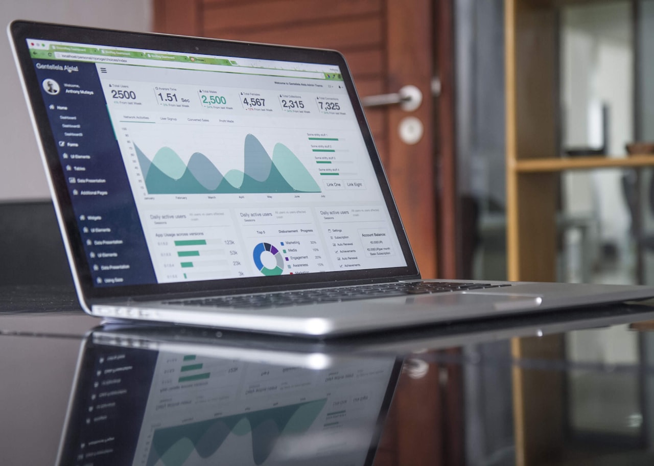
For Google Analytics 4, select the GA4 connector and choose the appropriate account, property and data stream. For Google Ads, pick the account or MCC you want to report on. For Search Console, select your verified property. Once connected, Looker Studio displays all available dimensions and metrics. Rename fields for clarity — change “sessionSource” to “Traffic Source” for cleaner reporting. Click Connect and the data source is ready for use across any report.
For platforms without native Google connectors, such as Facebook Ads or TikTok Ads, use third-party connectors from providers like Supermetrics, Funnel or Windsor.ai. These require separate subscriptions but are worthwhile for agencies managing multi-channel campaigns. A single Supermetrics licence can connect dozens of data sources, making it a cost-effective investment for Singapore teams tracking performance across Google Ads, Meta, LinkedIn and organic channels simultaneously.
Building Your First Marketing Dashboard
With data sources connected, create your first report by clicking Create and selecting Report. Looker Studio starts with a blank canvas. Adjust the canvas size under Page settings — 1200 by 900 pixels works well for desktop dashboards, while 1920 by 1080 suits presentation formats.
Add a branded header with your report title, company logo and reporting period. Use a coloured rectangle behind the header to create a professional banner. Before adding any charts, plan your layout. A typical marketing dashboard includes a top row of scorecards showing headline KPIs, a middle section with trend charts and breakdowns and a bottom section with detailed tables. This hierarchy ensures stakeholders see the most important numbers first.
Add your first element by clicking Insert and selecting a scorecard to display a key metric like total sessions, conversions or revenue. Configure the metric and date range in the properties panel. Enable the Comparison date range option to show percentage change versus the previous period, giving instant context on performance direction. Build outward from this first scorecard, adding trend lines, breakdowns and detail tables that progressively deepen the story.
Keep the layout clean. Align charts to a grid, use consistent colour coding — green for positive metrics, red for negative — and apply the same font throughout. Match your brand design guidelines to create reports that look professional and reinforce credibility with clients or management.
Choosing the Right Charts and Visualisations
Selecting the appropriate chart type for each data story determines whether your dashboard gets used or ignored. Scorecards are ideal for headline numbers — total conversions, revenue, cost per acquisition, ROAS. Time series charts show trends over days, weeks or months using line or area formats. For SEO tracking, a time series of organic clicks and impressions from Search Console is particularly valuable.

Bar and column charts work well for comparisons — traffic by channel, monthly revenue across quarters, conversions by campaign. Stacked bar charts show composition breakdowns effectively. Pie and donut charts should be used sparingly, only for showing parts of a whole with no more than five or six segments. They work for traffic source distribution or device category breakdown but become unreadable with too many slices.
Tables are essential for detailed data. Create tables showing top landing pages with sessions, bounce rate and conversions. Add conditional formatting to highlight rows where bounce rate exceeds 70 per cent in red or conversion rate exceeds five per cent in green. Tables with heatmap formatting are excellent for keyword performance reports. Geo maps visualise geographic data — for Singapore businesses targeting regional markets, a map showing sessions or conversions by country across Southeast Asia provides immediate spatial insight.
Adding Filters and Interactive Controls
Filters transform static reports into interactive dashboards that stakeholders can explore independently, reducing the number of ad-hoc data requests your team receives.
Insert a Date range control prominently at the top of your dashboard so viewers can change the reporting period without editing the report. Set a sensible default — last 30 days or current month. Add Drop-down list controls for key dimensions like campaign name, traffic source, device category and country. For a Singapore e-commerce client, a product category filter lets them view performance for specific product lines without waiting for a custom report.
Advanced filter controls let viewers type search terms to filter data — useful for dashboards with hundreds of keywords or landing pages. Checkbox filters work well for dimensions with few values like device type. To apply a filter to specific charts rather than the entire page, group the relevant charts and apply the filter to that group only. This technique creates independent filtering sections where paid media data filters separately from organic data on the same page.
Calculated Fields for Custom Marketing Metrics
Calculated fields create custom metrics and dimensions that do not exist in your raw data — the KPIs your Singapore business actually cares about rather than the generic metrics platforms provide by default.
Create a conversion rate field with the formula Conversions divided by Sessions, set to Percent output. Calculate cost per lead with Cost divided by Conversions. Compute ROAS with Revenue divided by Cost. These derived metrics are invaluable for Google Ads reporting where you need single figures that combine spend and results into actionable indicators.
Use CASE statements for content grouping. Group pages into categories — blog, product pages, service pages — using regex matching against page paths. Create custom date dimensions like day of week to analyse which days generate the most traffic or conversions. These custom fields elevate your dashboard from a data display into a decision-support tool that surfaces insights automatically.
Sharing Reports and Scaling with Templates
Click Share to manage access by email address, setting Viewer or Editor permissions. For client reporting, Viewer access lets clients interact with filters and dates without modifying the layout. Schedule automated email delivery to send PDF snapshots weekly — set it for Monday mornings so your Singapore team starts each week with fresh performance data.
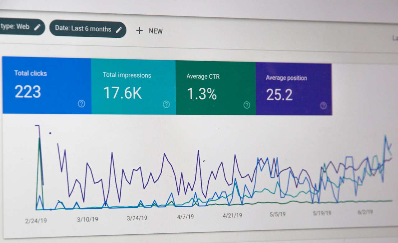
Embed reports on your company intranet or client portal using the iframe code from File, Embed report. Turn successful dashboards into reusable templates by copying them and swapping data sources when prompted. This standardises reporting across clients or brands while saving hours of setup time for each new engagement.
Looker Studio’s template gallery contains pre-built dashboards for common use cases. Search for marketing, e-commerce or SEO templates to accelerate your starting point. Customise branding, metrics and layout to match your requirements. For agencies managing multiple clients, a library of tested templates combined with content marketing analytics views creates a scalable reporting infrastructure.
Frequently Asked Questions
Is Google Looker Studio free to use?
Yes, Looker Studio is completely free with unlimited reports and data sources. The only potential cost comes from third-party connectors like Supermetrics, which charge a subscription to connect non-Google data sources such as Facebook Ads or LinkedIn.
Can I connect multiple data sources to one report?
Absolutely. A single report can use multiple data sources and you can blend data from different sources within the same chart — for example, combining Google Ads cost data with GA4 conversion data in a unified performance view.
How often does Looker Studio refresh data?
By default, data caches for 12 hours for most connectors. You can manually refresh using the button in the report header. For Google Sheets, data updates whenever the spreadsheet changes and the cache expires.
What is the difference between free and Pro versions?
Looker Studio Pro adds enterprise features including team workspaces, admin controls, SLAs and Google Cloud support. For most Singapore SMEs and agencies, the free version provides everything needed for comprehensive marketing reporting.
Can I use Looker Studio for SEO reporting?
Yes. Connect Google Search Console to report on organic impressions, clicks, average position and CTR. Combine with GA4 data to track organic traffic, engagement and conversions. This setup is standard for agencies providing SEO services in Singapore.
How do I create multi-page reports?
Click Page then New page in the menu bar. Rename pages, reorder them and duplicate existing pages to maintain consistent formatting. Use separate pages for SEO, paid media, social media and email marketing so stakeholders can navigate directly to their area of interest.
Can Looker Studio replace my agency’s reporting tool?
For most Singapore agencies, yes. Looker Studio handles data visualisation, automated delivery and interactive exploration at no cost. It lacks built-in white-labelling on the free tier, but branded headers and custom styling achieve a professional look. Agencies with ten or more clients often find that Looker Studio plus a connector subscription is more cost-effective than dedicated reporting platforms.
What are the limitations of Looker Studio?
Dashboard load times can be slow with many charts or large data volumes. Data blending has restrictions on join types and row limits. Real-time data is not available — the 12-hour cache means dashboards reflect recent but not live performance. For high-frequency monitoring, pair Looker Studio with platform-native dashboards that offer near-real-time data.
How do I make dashboards load faster?
Limit charts per page, avoid unnecessarily large default date ranges, use data extracts for sources with millions of rows and consider BigQuery exports with scheduled queries for high-traffic GA4 properties. Splitting a 20-chart single-page report into a four-page report with five charts each typically halves load times.
Can I track offline conversions in Looker Studio?
Yes, by importing offline conversion data into Google Sheets or BigQuery and connecting that source to your report. This allows you to blend online campaign data with offline outcomes like phone leads or in-store purchases, providing a complete view of marketing performance for Singapore businesses with both digital and physical customer touchpoints.