Microcopy and UX Writing: Small Words That Make a Big Difference in Conversions
Table of Contents
- What Is Microcopy and Why Does It Matter?
- Buttons and CTAs: Writing Words That Get Clicked
- Form Microcopy That Reduces Abandonment
- Error Messages That Help Instead of Frustrate
- Onboarding Copy and Tooltips
- Trust and Reassurance Microcopy
- Testing and Optimising Your Microcopy
- Frequently Asked Questions
What Is Microcopy and Why Does It Matter?
Microcopy refers to the small pieces of text that guide users through a digital experience: button labels, form instructions, error messages, tooltips, confirmation messages, placeholder text and navigation labels. While these words may seem insignificant compared to your headlines and body copy, microcopy ux writing has a disproportionate impact on whether visitors complete desired actions on your website.
Consider this: a visitor has read your landing page, been convinced by your value proposition and decided to enquire. They click the contact button. The form asks for “Subject” without context, the submit button says “Submit,” and when they miss a required field, a red “Error” appears with no explanation. Each of these small friction points erodes motivation. Enough of them, and the visitor abandons the form entirely.
Now imagine the same scenario with thoughtful microcopy. The form field says “How can we help you?” instead of “Subject.” The submit button reads “Get My Free Consultation.” The validation message says “Please enter your email address so we can send your consultation details.” Each micro-interaction feels helpful rather than obstructive.
For Singapore businesses competing for conversions, microcopy is a high-leverage optimisation opportunity. Most competitors neglect it entirely, relying on default form labels and generic error messages. Investing in thoughtful microcopy gives you a quiet but measurable advantage. It is one of the most impactful elements of professional web design.
Buttons and CTAs: Writing Words That Get Clicked
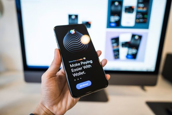
Buttons are the most important microcopy on your website. They are the gateway to every conversion, every sign-up and every purchase. Yet most Singapore business websites still use “Submit,” “Click Here” or “Learn More” as button text.
Effective button copy follows a simple principle: it should complete the sentence “I want to…” from the user’s perspective. “Get My Free Quote” completes the sentence naturally. “Submit” does not. “Start My Free Trial” feels like a benefit. “Register” feels like an obligation.
First-person language on buttons consistently outperforms second-person in testing. “Get My Report” outperforms “Get Your Report” by a measurable margin across multiple studies. The first person creates a sense of ownership and personal action. This insight directly supports effective conversion copywriting.
Action verbs drive clicks. Start every button with a verb: Get, Start, Download, Join, Discover, Claim, Book, Reserve, Try, Access. Avoid passive labels like “Information,” “Details” or “More.” The button should feel like it does something when clicked.
Add value context when space allows. “Download” is acceptable. “Download Free SEO Checklist” is better because it reminds the user what they are getting. This is especially important for secondary CTAs lower on the page where the user may have forgotten the specific offer.
Size and visual hierarchy matter alongside the words. Your primary CTA should be the most visually prominent element in its section. Secondary CTAs should be clearly subordinate. If every button on the page screams for attention equally, none of them stands out. Pair your strongest copy with your strongest visual treatment.
For service businesses, consider the emotional temperature of your CTA. “Buy Now” implies immediate financial commitment. “Get Started” implies a beginning with room to explore. “Let’s Talk” implies a conversation without obligation. Match the CTA’s emotional weight to the user’s likely readiness to commit.
Form Microcopy That Reduces Abandonment
Forms are where conversions either complete or collapse. Form abandonment rates in Singapore typically range from 60 to 80 percent, and poor microcopy is a significant contributor.
Field labels should be clear and specific. “Name” is acceptable but “Full Name” or “Name (as you’d like us to address you)” removes ambiguity. For Singapore’s multilingual context, specifying “Name in English” avoids confusion for users whose legal names may differ from their preferred names.
Placeholder text inside form fields should show the expected format, not repeat the label. If the label says “Phone Number,” the placeholder should show “+65 9XXX XXXX” rather than “Enter your phone number.” The format example reduces errors and speeds up completion.
Helper text below fields addresses hesitation. Under an email field, “We’ll send your quote here within 2 hours” tells the user exactly what to expect and why you need their email. Under a phone field, “For a quick follow-up call, usually under 5 minutes” reduces the fear of lengthy sales calls. These small assurances directly connect to objection handling principles.
Required field indicators should be clear but not aggressive. Instead of red asterisks and “Required” warnings, consider noting “Optional” on fields that are not required. This positive framing reduces the feeling of obligation across the entire form.
Progress indicators for multi-step forms reduce abandonment by showing users where they are and how much remains. “Step 2 of 3” or a progress bar sets expectations and creates a completion motivation. Once users have invested effort in steps one and two, they are more likely to complete step three.
Post-submission confirmation copy is often neglected but matters greatly. Replace “Form submitted successfully” with “Thanks, [name]. We’ve received your enquiry and will get back to you within 2 business hours. Check your email for a confirmation.” Specific, warm and informative confirmation copy validates the user’s decision and reduces post-submission anxiety.
Error Messages That Help Instead of Frustrate
Error messages are the microcopy users encounter at their most frustrated moments. Getting them right can save conversions; getting them wrong guarantees abandonment.
The cardinal rule of error messages is: tell the user what to do, not just what went wrong. “Invalid email” is accusatory and unhelpful. “Please check your email address. It should look like [email protected]” is constructive and specific. The second version turns an error into a guided correction.
Use human language, not technical jargon. “Error 422: Unprocessable Entity” means nothing to most users. “Something went wrong on our end. Please try again, or call us at 6XXX XXXX if the problem persists” is clear, takes responsibility and provides an alternative path.
Position error messages next to the relevant field, not at the top or bottom of the form. Users should not have to hunt for which field caused the problem. Inline validation that shows errors as the user completes each field is even better, as it catches mistakes early before they accumulate.
Tone matters enormously. Avoid blaming the user. “You entered an invalid phone number” creates defensiveness. “This phone number looks a bit short. Singapore mobile numbers have 8 digits” is helpful and specific to the local context. The Singapore-specific detail shows attention to your audience.
404 page copy deserves special attention. Every website has broken links and mistyped URLs. Your 404 page should be helpful, not a dead end. “We couldn’t find that page, but here’s what might help” followed by links to your most popular pages, a search bar and your contact information turns a frustrating moment into a navigation opportunity.
Payment error messages require extra care because money is involved and anxiety is high. “Payment failed” triggers panic. “Your payment couldn’t be processed. This usually means the card details need to be re-entered. Your card has not been charged” provides reassurance and a clear next step.
Onboarding Copy and Tooltips
When users encounter your product, platform or service for the first time, microcopy guides them from confusion to competence.
Welcome messages set the tone for the entire experience. “Welcome to your dashboard” is functional. “Welcome, [name]. Let’s set up your account in three quick steps so you can start seeing results” is motivating and sets clear expectations. Personalisation and specificity make onboarding feel curated rather than generic.
Tooltips should answer the question “What does this do?” or “Why does this matter?” in one or two sentences. Avoid technical explanations unless your audience is technical. A tooltip on a “Quality Score” metric might read: “Quality Score rates your ad relevance from 1-10. Higher scores mean lower costs and better positions.” Clear, concise and actionable.
Empty states are often overlooked onboarding opportunities. When a user sees their empty dashboard, inbox or project list for the first time, that blank space should contain helpful microcopy. “No campaigns yet. Create your first campaign to start reaching Singapore customers” is better than a blank screen or a generic “No data available.”
Instructional microcopy should be progressive. Do not overwhelm users with every feature on day one. Reveal guidance contextually as they explore. When they hover over the reporting section for the first time, a brief tooltip explaining what reports are available is more helpful than a comprehensive manual they will never read.
For Singapore businesses using their website as a primary digital marketing channel, onboarding microcopy also applies to the website experience itself. First-time visitors need different guidance than returning ones. Cookie consent banners, newsletter pop-ups and chat widget greetings are all onboarding microcopy that shapes first impressions.
Trust and Reassurance Microcopy
Small trust signals placed at key decision points can significantly impact conversion rates. These micro-reassurances work because they address fleeting concerns at the exact moment they arise.
Near email fields, add “We respect your privacy. No spam, ever” or “Unsubscribe anytime with one click.” These statements address the universal hesitation about sharing email addresses. In Singapore where PDPA regulations govern data usage, referencing compliance adds another layer of trust.
Near pricing, phrases like “No hidden fees,” “Cancel anytime” or “Price locked for 12 months” address financial anxiety. If your pricing page shows monthly rates, adding “Billed monthly, no annual lock-in” clarifies terms and reduces commitment fear.
Near checkout or final conversion steps, security badges and copy like “256-bit SSL encrypted” or “Secure payment powered by Stripe” address security concerns. For Singapore e-commerce, adding “Ships within Singapore in 1-2 business days” addresses delivery uncertainty.
After a user takes action, confirmation microcopy should reinforce their decision. “Great choice. You’ll receive your free audit within 24 hours” validates the action and sets expectations. This post-conversion moment is also an opportunity to reduce buyer’s remorse and build enthusiasm for the next interaction.
Social proof microcopy works as trust reinforcement at scale. “Join 2,400 Singapore businesses” near a sign-up form, “Rated 4.9/5 by 300+ clients” near a CTA or “Trusted by companies like [names]” near pricing all provide micro-doses of reassurance. Your brand credibility is reinforced through these small, strategically placed statements.
Guarantee microcopy near CTAs reduces conversion anxiety. “100% satisfaction guarantee” or “Full refund within 30 days, no questions asked” next to your primary button addresses the fear of making the wrong decision. In a culture where face and reputation matter, guarantees provide a psychological safety net.
Testing and Optimising Your Microcopy
Microcopy changes are among the easiest and most impactful tests you can run because they require no design changes, no development resources and minimal risk.
Start by auditing your current microcopy. Go through every page of your website and document every button label, form instruction, error message and tooltip. Identify instances of generic copy (“Submit,” “Click Here,” “Error”), missing microcopy (no helper text, no confirmation messages) and inconsistencies (different button labels for the same action).
Prioritise testing by conversion impact. Button labels on your highest-traffic pages should be tested first because improvements affect the most visitors. Form microcopy on your contact page should be tested before tooltip text in rarely visited sections.
A/B test one microcopy element at a time. Change your CTA button text from “Submit” to “Get My Free Quote” and measure the impact on form completion rates. If the improvement is significant, make it permanent and move to the next test. Your Google Ads landing pages are ideal testing grounds because they receive consistent, measurable traffic.
Use heatmaps and session recordings to identify microcopy problems. If users hover over a form field repeatedly before typing, they may be confused by the label. If users click a button and immediately look lost, the button copy may not have set the right expectation. These behavioural signals reveal issues that analytics alone cannot.
Monitor form analytics for field-level abandonment. If 40 percent of users drop off at a specific field, the microcopy around that field likely needs improvement. Perhaps the label is confusing, the format is unclear or there is no reassurance about why the information is needed.
Create a microcopy style guide for your website. Document your voice and tone for different contexts (normal operations, errors, celebrations), standard button conventions, form label formats and trust signal placements. Consistency across your entire digital presence builds familiarity and trust. This guide also ensures quality is maintained as your content scales.
Track microcopy performance over time. What works today may need refreshing as user expectations evolve. Review your conversion data quarterly and update your microcopy to reflect changing patterns, seasonal needs and new insights from user research.
Frequently Asked Questions
What is the difference between microcopy and UX writing?
Microcopy specifically refers to the small text elements within a user interface: buttons, labels, error messages and tooltips. UX writing is a broader discipline that encompasses microcopy along with larger content strategy decisions about information architecture, content structure and narrative flow across the entire user experience.
How much impact can microcopy changes really have?
Individual microcopy changes can lift conversion rates by 5 to 30 percent depending on the element and the baseline. A button text change from “Submit” to a value-driven label routinely produces double-digit conversion improvements. Across an entire website, cumulative microcopy optimisation can transform overall performance.
Should microcopy be formal or casual for Singapore audiences?
It depends on your brand and audience. Professional services and B2B businesses typically use a polished but approachable tone. Consumer brands can be more casual. The key is consistency. Whatever tone you choose, apply it uniformly across all microcopy. Avoid being so formal that microcopy feels robotic or so casual that it feels unprofessional.
How do I write microcopy for a multilingual Singapore audience?
Default to clear, simple English that avoids idioms and cultural references specific to any one language group. Use universal symbols alongside text where possible. If your audience includes non-native English speakers, test your microcopy with representative users to ensure clarity. Consider offering language options for critical conversion paths.
What are the most common microcopy mistakes?
Using generic button labels like “Submit” and “Click Here,” writing error messages that blame the user, omitting helper text on form fields, using technical jargon in user-facing messages and failing to provide confirmation after important actions. Most of these mistakes are easily fixed once identified.
Do I need a dedicated UX writer?
Not necessarily. Many Singapore businesses can improve their microcopy significantly by auditing existing copy, applying best practices from guides like this one and testing changes systematically. However, for complex digital products or high-traffic e-commerce sites, a dedicated UX writer can drive substantial revenue improvements through sustained microcopy optimisation.
How does microcopy relate to SEO?
Microcopy has minimal direct impact on SEO rankings since search engines primarily evaluate heading tags, body content and meta data. However, microcopy significantly affects user behaviour metrics like bounce rate, time on site and conversion rate, which indirectly influence search rankings. A website that converts well also tends to engage users longer.
What tools help with microcopy testing?
Google Optimize or VWO for A/B testing button labels and form copy, Hotjar or Microsoft Clarity for heatmaps and session recordings, and form analytics tools like Formisimo or Zuko for field-level abandonment tracking. Start with free tools and upgrade as your testing programme generates measurable returns.