Marketing KPI Dashboard Template: Track What Matters in 2026
Most marketing dashboards fail not because they lack data, but because they display too much of it. When every metric is treated as equally important, nothing stands out, and the dashboard becomes a wall of numbers that stakeholders glance at without gaining any actionable insight. The purpose of a KPI dashboard is not to show everything that is measurable but to surface the metrics that directly connect to business outcomes and require attention.
In Singapore’s fast-moving digital marketing landscape, a well-designed KPI dashboard gives marketing teams and business leaders a real-time pulse on performance. It eliminates the need to log into five different platforms, run custom reports, and manually compile data. Instead, it provides a single view that answers the essential question: are our marketing efforts working?
This article provides a complete marketing KPI dashboard template, covering how to choose the right KPIs for each channel, how to layout your dashboard for maximum clarity, which tools to use for building and maintaining it, relevant benchmarks for Singapore businesses, and how often to update and review your data. Whether you manage SEO, paid search, social media, or a full-service digital marketing programme, this guide will help you build a dashboard that drives better decisions.
Choosing the Right KPIs by Channel
The most important decision in building a KPI dashboard is selecting which metrics to display. The temptation is to include everything, but a dashboard with 50 metrics is worse than no dashboard at all. Focus on 15 to 20 KPIs total across all channels, with 3 to 5 KPIs per active channel. Each KPI should pass a simple test: if this metric changes significantly, will it trigger a specific action?
Top-level business KPIs (always include):
| KPI | Definition | Why It Matters |
|---|---|---|
| Total marketing-qualified leads | Leads generated through marketing that meet quality criteria | Directly measures marketing’s contribution to the sales pipeline |
| Cost per acquisition (CPA) | Total marketing spend divided by total conversions | Measures acquisition efficiency across all channels |
| Marketing ROI or ROAS | Revenue attributed to marketing divided by marketing spend | Demonstrates marketing’s commercial value |
| Total website conversions | All goal completions across the website | Aggregate measure of website effectiveness |
| Revenue from marketing | Revenue directly attributed to marketing efforts | The ultimate measure of marketing impact |
SEO KPIs:
- Organic sessions (total and trend)
- Organic conversions and conversion rate
- Number of keywords ranking in the top 10
- Average position for target keywords
- Organic click-through rate from Search Console
Google Ads KPIs:
- Total spend versus budget
- Conversions and conversion rate
- Cost per conversion
- Return on ad spend (ROAS)
- Impression share for key campaigns
Social media KPIs:
- Engagement rate (by platform)
- Follower growth (net new per period)
- Link clicks and website traffic from social
- Social conversions (tracked via UTM parameters)
Email marketing KPIs:
- Open rate and click-through rate
- Email-attributed conversions
- List growth rate
- Revenue per email sent
The specific KPIs you select depend on your business model and marketing objectives. An e-commerce business will prioritise revenue-related KPIs like ROAS and average order value, while a B2B services firm will focus on lead generation KPIs like cost per lead and lead quality scores.
Dashboard Layout and Structure
A well-structured dashboard follows the principle of progressive disclosure: the most important information is visible immediately, with supporting detail available on demand. Design your dashboard in layers so stakeholders can get the overview in seconds and drill down into specifics only when needed.
Recommended dashboard layout:
Layer 1: Executive scorecard (top of dashboard)
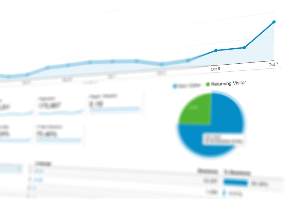
Display 4 to 6 top-level business KPIs as large scorecard tiles. Each tile shows the current value, comparison to previous period (percentage change), and comparison to target (on track, at risk, or off track). Use green, amber, and red colour coding for instant visual assessment. This row answers the question “how are we doing overall?” in under 5 seconds.
Layer 2: Channel performance section (middle of dashboard)
Below the executive scorecard, create a section for each active marketing channel. Each section contains a trend chart showing the primary KPI over time (e.g., organic sessions for SEO, conversions for Google Ads) and a small metrics table with 3 to 5 channel-specific KPIs. Arrange channels from left to right or top to bottom in order of investment or strategic priority.
Layer 3: Campaign and tactical detail (bottom of dashboard or separate tabs)
The lowest layer provides granular detail for tactical decision-making. This includes individual campaign performance tables, keyword ranking movements, top-performing content, ad-level metrics, and any other operational data the marketing team needs for day-to-day optimisation.
Layout template for a Looker Studio dashboard:
| Position | Element | Size |
|---|---|---|
| Top bar | Date range selector and filter controls | Full width, narrow height |
| Row 1 | Executive KPI scorecards (5-6 tiles) | Full width, one row |
| Row 2 left | Total traffic trend line chart | Half width |
| Row 2 right | Conversions by channel bar chart | Half width |
| Row 3 left | SEO performance section | Half width |
| Row 3 right | Google Ads performance section | Half width |
| Row 4 left | Social media performance section | Half width |
| Row 4 right | Email marketing performance section | Half width |
| Row 5 | Campaign details table | Full width |
Keep the dashboard to a single page for the overview level. If more detail is needed, use separate tabs or pages within the dashboard tool rather than extending the main page. Stakeholders should never need to scroll extensively to find key information.
Tools for Building Your Dashboard
The right tool depends on your data sources, technical capabilities, budget, and audience. Here are the most common options for building marketing KPI dashboards in 2026, with their strengths and limitations.
Google Looker Studio (free):
Looker Studio is the most widely used dashboard tool for digital marketing in Singapore, and for good reason. It is free, integrates natively with Google Analytics 4, Google Ads, Google Search Console, and Google Sheets, and produces professional-looking, interactive dashboards. You can share dashboards via link, embed them on websites, or schedule email deliveries. For most Singapore businesses running Google-centric marketing stacks, Looker Studio is the logical choice.
Limitations: Non-Google data sources (Meta Ads, LinkedIn, TikTok, email platforms) require third-party connectors like Supermetrics, Funnel, or Fivetran, which have associated costs. Complex data transformations are difficult within Looker Studio itself. Performance can slow with very large datasets.
Google Sheets with data connectors:
For teams that prefer spreadsheet-based analysis, Google Sheets combined with data-pulling add-ons (Supermetrics, Google Analytics add-on) provides a flexible, familiar environment. You can build custom calculations, pivot tables, and charts, then share the sheet or export to PDF. This approach works well for teams that need to manipulate data before visualising it.
Agency reporting platforms (AgencyAnalytics, DashThis, Databox):
These purpose-built platforms offer pre-built integrations with dozens of marketing tools, white-label branding, automated report generation, and client-facing dashboards. They are ideal for agencies managing multiple clients who need consistent, professional reporting at scale. Pricing typically ranges from $50 to $500 per month depending on the number of clients and data sources.
Business intelligence tools (Tableau, Power BI, Metabase):
For enterprise organisations with complex data environments, BI tools offer advanced visualisation, data blending, and analysis capabilities. These tools can connect to CRM systems, data warehouses, and custom databases, enabling marketing dashboards that integrate with sales, finance, and operations data. They require more technical expertise to set up and maintain but provide significantly more analytical power.
Choosing the right tool:
| Scenario | Recommended Tool | Why |
|---|---|---|
| Small business, Google-focused | Looker Studio | Free, native Google integrations, easy to set up |
| Agency with multiple clients | AgencyAnalytics or DashThis | Multi-client management, white-labelling, automation |
| Multi-channel with non-Google platforms | Looker Studio + Supermetrics | Flexibility with broad data source support |
| Enterprise with data warehouse | Tableau or Power BI | Advanced analytics, cross-department data integration |
| Team comfortable with spreadsheets | Google Sheets + connectors | Familiar interface, custom calculations |
Singapore Marketing Benchmarks
Benchmarks provide critical context for KPI evaluation. Without them, you cannot determine whether your metrics represent strong, average, or poor performance. The following benchmarks are based on 2025-2026 Singapore market data and should be used as directional guidance, as actual benchmarks vary significantly by industry, business size, and competitive landscape.
Google Ads benchmarks (Singapore):
| Metric | Search Ads | Display Ads | Notes |
|---|---|---|---|
| Average CTR | 3-6% | 0.4-0.8% | Higher for branded terms |
| Average CPC | $1.50-$8.00 | $0.30-$1.50 | Varies widely by industry |
| Conversion rate | 3-7% | 0.5-1.5% | Depends on landing page quality |
| Cost per conversion | $20-$120 | $30-$150 | B2B typically higher than B2C |
SEO benchmarks (Singapore):
| Metric | Good | Average | Needs Work |
|---|---|---|---|
| Organic CTR (position 1) | 25-35% | 15-25% | Below 15% |
| Month-over-month organic growth | Above 10% | 3-10% | Flat or declining |
| Organic conversion rate | Above 3% | 1-3% | Below 1% |
| Pages indexed to total pages ratio | Above 90% | 70-90% | Below 70% |
Social media benchmarks (Singapore):
| Platform | Average Engagement Rate | Average Reach Rate (Organic) |
|---|---|---|
| 1.5-3.5% | 15-25% of followers | |
| 0.5-1.5% | 5-10% of followers | |
| 2-4% | 8-15% of followers | |
| TikTok | 3-8% | 15-30% of followers |
Email marketing benchmarks (Singapore):
| Metric | B2C | B2B |
|---|---|---|
| Open rate | 18-28% | 22-32% |
| Click-through rate | 2-4% | 2.5-5% |
| Unsubscribe rate | 0.2-0.5% | 0.1-0.3% |
| Bounce rate | Below 2% | Below 1.5% |
Include relevant benchmarks directly on your dashboard next to the corresponding KPIs. This allows stakeholders to instantly contextualise performance without needing to look up industry averages separately. Update benchmarks annually as market conditions evolve.
Update Cadence and Review Process
A dashboard is only useful if the data is current and regularly reviewed. Establish a clear cadence for data updates and performance reviews that matches your reporting cycle and decision-making rhythm.
Recommended update cadence:
| Dashboard Level | Update Frequency | Review Frequency | Primary Audience |
|---|---|---|---|
| Executive scorecard | Daily (automated) | Weekly | Marketing leadership, C-suite |
| Channel performance | Daily (automated) | Weekly | Marketing managers, channel leads |
| Campaign detail | Real-time or daily | Daily to bi-weekly | Campaign managers, specialists |
| Strategic dashboard | Monthly | Monthly or quarterly | Senior leadership, board |
Automate data updates wherever possible. Looker Studio and most dashboard tools can refresh data automatically, eliminating the need for manual data entry. Set refresh schedules to run overnight so the dashboard shows updated data when the team arrives each morning.
Review process template:
- Daily glance (2 minutes): Check the executive scorecard for any red indicators or significant changes. If everything is green, move on. If something is red, investigate.
- Weekly review (15-30 minutes): Review channel-level performance, identify trends, and note any actions needed. Discuss findings in the weekly marketing team meeting.
- Monthly deep dive (1-2 hours): Analyse the full dashboard with channel-by-channel performance, identify insights, prepare the monthly report, and set priorities for the next month.
- Quarterly strategic review (half day): Evaluate overall marketing effectiveness, assess progress toward annual goals, adjust KPI targets if needed, and present findings to senior leadership.
Set up automated alerts for critical threshold breaches. For example, trigger an email notification if daily ad spend exceeds 120% of budget, if website traffic drops by more than 25% compared to the previous week, or if conversion tracking stops recording events (which indicates a technical issue). These alerts ensure you catch problems early rather than discovering them at the next scheduled review.
Common Dashboard Pitfalls
Building an effective KPI dashboard requires avoiding several common mistakes that reduce its usefulness or, worse, lead to poor decisions.
Too many metrics. This is the most common pitfall. A dashboard with 40+ metrics provides a false sense of comprehensiveness while actually making it harder to identify what matters. Limit your dashboard to 15-20 KPIs. If a metric does not directly inform a decision, move it to a supplementary report or remove it entirely.
No context or comparisons. A number in isolation is meaningless. “1,247 organic sessions” tells you nothing unless you know whether that is up or down, above or below target, and how it compares to the previous period. Every KPI on your dashboard should show at least one comparison point: previous period, same period last year, or target.
Vanity metrics dominating. Impressions, page views, and follower counts are easy to display and tend to trend upward, which feels reassuring. But they rarely connect directly to business outcomes. Ensure your dashboard prioritises conversion-oriented metrics (leads, sales, revenue, ROI) over vanity metrics. Our article on understanding click-through rate explains how to look beyond surface-level metrics.
Stale data. A dashboard showing data from two weeks ago is not a dashboard; it is a report. If your data is not updating automatically, fix the integration or switch to a tool that supports real-time or daily updates. Stale data erodes trust in the dashboard and leads stakeholders to stop checking it.
No clear ownership. Someone needs to own the dashboard: maintaining data connections, fixing broken integrations, updating visualisations, and ensuring KPIs remain relevant. Without an owner, dashboards gradually degrade until they become unreliable and unused.
Inconsistent definitions. If “conversions” means something different in your dashboard than in your monthly report, stakeholders lose trust in both. Define each KPI precisely, document where the data comes from, and ensure consistent definitions across all reporting outputs.
Advanced Dashboard Features
Once your basic dashboard is functioning well, consider adding advanced features that enhance its analytical power and usability.
Date range comparison: Allow users to select custom date ranges and compare them to previous periods. This enables ad hoc analysis without creating separate reports. Most dashboard tools, including Looker Studio, support date range controls natively.
Segmentation filters: Add filter controls that let users segment data by channel, campaign, device, geography, or audience. For Singapore businesses operating across multiple markets (e.g., Singapore, Malaysia, Indonesia), a geographic filter is especially valuable.
Goal progress tracking: Add visual indicators that show progress toward annual or quarterly targets. A simple progress bar showing “65% of annual lead target achieved as of Q3” provides powerful strategic context.
Conversion funnel visualisation: Display the marketing funnel stages from awareness to conversion, showing volumes and drop-off rates at each stage. This highlights where the funnel is leaking and where optimisation efforts should focus. Understanding the marketing funnel is essential for building this feature effectively.
Automated annotations: Some dashboard tools allow you to add annotations that automatically mark significant events such as campaign launches, budget changes, algorithm updates, or seasonal periods. These annotations help explain data movements without requiring separate documentation.
Predictive indicators: If you have sufficient historical data, add trend projections that forecast where key metrics are heading based on current trajectory. This helps identify potential shortfalls early and enables proactive adjustments. Simple linear projections in Google Sheets, connected to your dashboard, can provide this functionality.
These advanced features should be added incrementally. Start with a clean, simple dashboard and add complexity only when the additional features serve a clear analytical need. A sophisticated dashboard that nobody uses is worse than a simple one that everyone checks daily.
Frequently Asked Questions
How many KPIs should be on a marketing dashboard?
Aim for 15 to 20 KPIs total across all channels, with 4 to 6 top-level business KPIs and 3 to 5 KPIs per active channel. This provides enough coverage to monitor performance without creating information overload. If you find yourself exceeding 25 KPIs, critically evaluate whether each one directly informs a decision. Move supplementary metrics to detailed reports or separate dashboard tabs.
What is the best free tool for building a marketing dashboard?
Google Looker Studio is the best free option for most Singapore businesses. It integrates natively with GA4, Google Ads, and Google Search Console, and offers professional visualisation capabilities. For data sources outside the Google ecosystem (Meta Ads, LinkedIn, email platforms), you will need paid connectors like Supermetrics (starting around $40 per month) or free alternatives with more limited functionality.
How often should dashboard data be updated?
Dashboard data should update daily at minimum, with real-time updates preferred for paid advertising metrics where budget pacing matters. Looker Studio and most dashboard tools can refresh data automatically on a schedule. Avoid manual data entry, which introduces delays and errors. The value of a dashboard diminishes significantly if the data is more than 24 hours old for operational metrics.
Should I build separate dashboards for different audiences?
Yes, when the audiences have fundamentally different needs. An executive dashboard should show high-level business KPIs with minimal detail. A channel manager’s dashboard should show granular operational metrics for their specific channel. A client-facing dashboard should be clean, branded, and focused on results rather than activities. Using tabs within a single dashboard tool is an efficient way to serve multiple audiences without duplicating work.
What should I do if a KPI consistently misses its target?
First, verify that the target is realistic by comparing it against industry benchmarks and historical data. If the target is appropriate, investigate the root cause of underperformance through deeper analysis. Is it a strategic issue (wrong channel or audience), a tactical issue (poor ad copy or landing page), or an external factor (market change or new competitor)? Adjust your strategy based on the diagnosis rather than simply lowering the target. If investigation shows the target was unrealistic, revise it with documented justification.
How do I handle data that comes from multiple platforms?
Use a data connector tool like Supermetrics, Funnel, or Fivetran to pull data from multiple platforms into a single location (Looker Studio, Google Sheets, or a data warehouse). Define a primary source for each metric to avoid discrepancies. For example, use GA4 as the source of truth for website traffic and conversions, Google Ads for ad spend and ad-level metrics, and native platforms for social media engagement. Document these source assignments so everyone on the team knows where each number comes from.