Marketing Dashboard Guide: Build Dashboards That Drive Better Decisions in 2026
A marketing dashboard is only as valuable as the decisions it enables. Too many dashboards become data graveyards — beautifully designed screens full of numbers that nobody acts on. The best dashboards distil complexity into clarity, presenting exactly the right information to the right audience at the right time.
For Singapore businesses managing multiple marketing channels simultaneously — SEO, Google Ads, social media, email — a well-built dashboard is the command centre that keeps everything visible and accountable. Without one, performance data remains siloed across platforms, making it nearly impossible to see the full picture or spot problems early.
This guide covers the different types of marketing dashboards, the key widgets and metrics each should contain, the tools available to build them, and the layout principles that separate useful dashboards from decorative ones. Whether you are building your first dashboard or redesigning an existing one, these frameworks will help you create something your team actually uses.
Types of Marketing Dashboards
Not all dashboards serve the same purpose. Before you open any tool, you need to answer two questions: who is this dashboard for, and what decisions should it support?
Marketing dashboards generally fall into three categories:
- Executive dashboards provide a high-level summary of marketing performance for senior leadership. They focus on business outcomes — revenue, ROI, cost per acquisition — and should be scannable in under 60 seconds.
- Channel dashboards dive deep into a single marketing channel (SEO, paid search, social media, email). They are designed for channel specialists who need granular data to optimise day-to-day performance.
- Campaign dashboards track the performance of a specific marketing campaign or initiative from launch to completion. They are temporary by nature and focus on campaign-specific KPIs and targets.
Most Singapore businesses need at minimum one executive dashboard and one or two channel dashboards. Campaign dashboards are created as needed. The mistake most teams make is trying to cram all three purposes into a single dashboard, which serves no audience well.
The Executive Dashboard
The executive dashboard is the most important and most misunderstood dashboard type. Its purpose is to give leadership a quick, accurate read on whether marketing is delivering against business objectives.
What to include:
- Total marketing-sourced revenue: The headline number. How much revenue can be attributed to marketing activities this month or quarter?
- Marketing ROI or ROAS: Return on investment or return on ad spend, showing the efficiency of marketing expenditure.
- Cost per acquisition (CPA): What it costs to acquire a new customer through marketing channels.
- Lead volume and quality: Total leads generated, broken down by marketing-qualified leads (MQLs) and sales-qualified leads (SQLs).
- Channel contribution: A high-level breakdown showing how much each channel (organic, paid, social, email, referral) contributes to overall results.
- Trend indicators: Month-on-month and year-on-year comparisons that show whether performance is improving or declining.
What to exclude: Granular metrics like individual keyword rankings, ad group performance, email subject line tests or social media post engagement. These belong in channel dashboards, not executive summaries.
The golden rule for executive dashboards: if a metric requires explanation to be understood, it does not belong here. Every number should be self-evident to someone who is not a marketing specialist.
Channel-Specific Dashboards
Channel dashboards serve the marketing practitioners who manage day-to-day operations. Here are the key metrics for each major channel:
SEO Dashboard
- Organic sessions and users (GA4).
- Keyword rankings for target terms (Semrush, Ahrefs or Google Search Console).
- Organic click-through rate from search results.
- Pages indexed and crawl errors.
- Backlink profile growth.
- Organic conversion rate and revenue.
Paid Search Dashboard
- Total spend, impressions, clicks and conversions.
- Cost per click (CPC) and cost per conversion.
- ROAS by campaign and ad group.
- Quality Score trends.
- Search impression share and lost impression share.
- Top-performing keywords and ads.
Social Media Dashboard
- Follower growth by platform.
- Post engagement rate (likes, comments, shares, saves).
- Reach and impressions.
- Link clicks and website referral traffic.
- Top-performing content by format and topic.
- Paid social performance (if running ads).
Email Marketing Dashboard
- Subscriber list size and growth rate.
- Email deliverability rate.
- Click-through rate by campaign.
- Conversion rate from email.
- Unsubscribe rate.
- Revenue per email sent.
Campaign Dashboards
Campaign dashboards are purpose-built for tracking a specific initiative — a product launch, a seasonal promotion, a lead generation campaign or a brand awareness push. Unlike channel dashboards that run continuously, campaign dashboards have a defined start and end date.
Essential elements of a campaign dashboard:
- Campaign objective and KPI targets: Display the goal prominently so everyone viewing the dashboard understands what success looks like.
- Progress towards target: A clear visual (progress bar, gauge chart or scorecard) showing how close you are to hitting your target.
- Budget spend vs plan: How much of the campaign budget has been spent versus how much was planned. This prevents over- or under-spending.
- Channel-level breakdown: If the campaign runs across multiple channels, show each channel’s contribution to the campaign goal.
- Daily or weekly trend: A time-series chart showing performance over the campaign period. This helps identify when momentum shifts and when interventions are needed.
For a Singapore business running a Chinese New Year campaign across Google Ads, social media and email, a campaign dashboard consolidates performance across all three channels into a single view, making it easy to reallocate budget mid-campaign if one channel is outperforming others.
Essential Dashboard Widgets and Visualisations
The right visualisation makes data instantly comprehensible. The wrong one obscures it. Here are the most effective widget types for marketing dashboards:
Scorecards: Single-number displays with trend indicators (up/down arrows, percentage change). Use for headline KPIs like total revenue, total leads or CPA. These should be the first thing viewers see.
Line charts: Best for showing trends over time — daily traffic, weekly leads, monthly revenue. Always include comparison periods (previous month or previous year) for context.
Bar charts: Ideal for comparing performance across categories — channel comparison, campaign comparison, regional performance. Horizontal bar charts work well for ranking items.
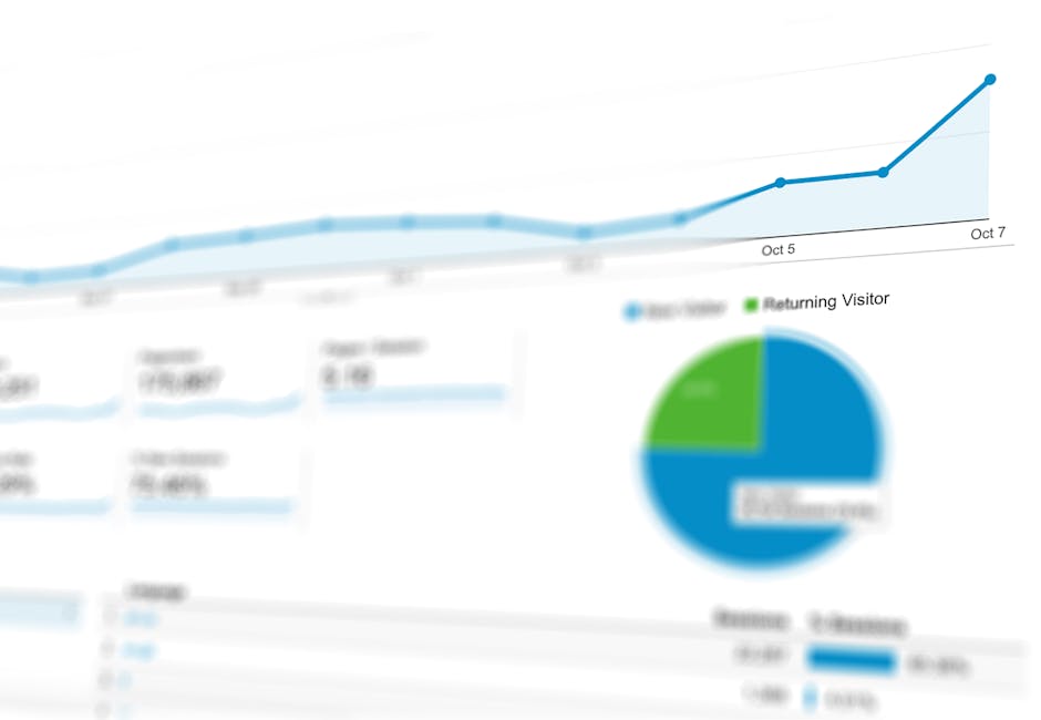
Pie and donut charts: Use sparingly and only for showing composition (channel mix, traffic source breakdown). Never use more than five or six segments — beyond that, switch to a bar chart.
Tables: The most efficient way to display detailed data. Use tables for keyword rankings, top-performing pages, ad group performance and other data that needs precision over visual appeal.
Geo maps: For Singapore businesses targeting multiple regions (South-East Asia, Asia-Pacific), map visualisations show geographic performance patterns at a glance.
Funnel charts: Show conversion progression through stages — visitors to leads, leads to MQLs, MQLs to customers. Useful for identifying where the biggest drop-offs occur.
Dashboard Tools: Looker Studio, Databox and Alternatives
The dashboard tool you choose should match your data sources, technical capability and budget:
Google Looker Studio (Free)
Formerly Data Studio, Looker Studio is the go-to free dashboard tool for most Singapore businesses. It integrates natively with GA4, Google Ads, Google Search Console and Google Sheets. Community connectors extend its reach to Facebook Ads, LinkedIn, HubSpot and hundreds of other platforms. Looker Studio is highly customisable but requires some learning to build polished dashboards.
Best for: Businesses already in the Google ecosystem. Marketing teams with some technical comfort. Agencies managing multiple client accounts.
Databox (Freemium)
Databox connects to over 100 data sources and offers pre-built dashboard templates that reduce setup time. Its mobile app provides real-time performance alerts. The interface is more user-friendly than Looker Studio, making it accessible to non-technical marketers.
Best for: Teams wanting quick setup with minimal configuration. Managers who need mobile-friendly dashboards. Businesses tracking KPIs from many different platforms.
Other Notable Tools
- HubSpot Dashboards: Built into HubSpot’s marketing platform. Excellent if HubSpot is your CRM and marketing automation tool.
- Tableau / Power BI: Enterprise-grade business intelligence tools for complex data analysis. Overkill for most SMEs but powerful for larger organisations.
- Klipfolio: A mid-market option that balances customisability with ease of use.
- AgencyAnalytics: Designed specifically for digital marketing agencies managing multiple client dashboards.
Layout Principles for Effective Dashboards
A dashboard’s layout determines whether it gets used or ignored. Follow these principles to create dashboards people actually consult:
Principle 1 — Inverted pyramid structure. Place the most important, highest-level metrics at the top. Put supporting details and granular data further down. This mirrors how people naturally scan information — headline first, details on demand.
Principle 2 — Group related metrics together. Create logical sections for different aspects of performance. Use headers, dividers or background colours to separate sections visually. For example, group all acquisition metrics together, all conversion metrics together, and all revenue metrics together.
Principle 3 — Include context with every number. A standalone number is meaningless without context. Always show comparison periods (vs last month, vs last year), targets (actual vs goal) or benchmarks. A conversion rate of 3 per cent means nothing in isolation — but “3 per cent vs 2.1 per cent last month” tells a clear story.
Principle 4 — Limit to one screen. The most effective dashboards fit on a single screen without scrolling. This forces you to prioritise and prevents information overload. If you have more data to show, create a second dashboard rather than extending the first one into a scrollable page.
Principle 5 — Use consistent formatting. Same date ranges, same colour coding, same number formatting across all widgets. Green should always mean good, red should always mean bad. Consistency reduces cognitive load and prevents misinterpretation.
Principle 6 — Design for your audience. An executive dashboard should look and feel different from a channel specialist’s dashboard. Match the level of detail, the terminology and the visualisation complexity to the audience who will use it. If your leadership team is not data-savvy, keep it extremely simple.
Real-Time vs Periodic Dashboards
Not every dashboard needs to update in real time. Choosing the right refresh frequency depends on how quickly you need to act on the data:
Real-time dashboards update continuously or every few minutes. They are essential for:
- Monitoring paid advertising campaigns during launch periods when budgets can be spent quickly.
- Tracking website performance during high-traffic events (sales, product launches).
- E-commerce businesses during peak shopping periods like 11.11, Black Friday or Chinese New Year sales.
- Social media crisis monitoring.
Daily dashboards update once per day, typically overnight. Suitable for:
- Ongoing paid campaign management.
- SEO performance tracking.
- Email campaign monitoring.
- Lead generation tracking.
Weekly or monthly dashboards are refreshed on a set schedule. Best for:
- Executive reporting.
- Strategic planning reviews.
- Content performance analysis.
- Year-on-year trend analysis.
For most Singapore SMEs, a combination of daily-updated channel dashboards and weekly executive dashboards provides sufficient visibility without creating unnecessary noise. Real-time dashboards should be reserved for situations where delayed action has a direct cost — such as a paid campaign overspending its daily budget.
To understand which metrics deserve a spot on your dashboard, refer to our guide to marketing KPIs. And for a broader view of your measurement infrastructure, see our marketing analytics guide.
Frequently Asked Questions
How many metrics should a marketing dashboard contain?
An executive dashboard should contain no more than 8 to 12 metrics. Channel dashboards can include 15 to 20 metrics because they serve specialists who need granular data. If your dashboard has more than 20 metrics, it is trying to do too much — split it into multiple dashboards for different audiences or purposes.
How long does it take to build a marketing dashboard?
A basic Looker Studio dashboard connected to GA4 and Google Ads can be built in two to four hours. A comprehensive multi-channel dashboard with custom data connections, calculated fields and polished design typically takes one to two weeks. Factor in additional time for stakeholder feedback and iterations.
Should I use a template or build a custom dashboard?
Templates are an excellent starting point, especially for common setups like GA4 performance dashboards or Google Ads campaign reports. Most tools (Looker Studio, Databox, HubSpot) offer free templates you can customise. Start with a template and modify it to match your specific KPIs and branding. Custom builds are worth the investment when your reporting needs are unique or when you need to combine unusual data sources.
How do I get my team to actually use the dashboard?
Build the dashboard around the questions your team already asks — “How are we doing this month?”, “Which channel is performing best?”, “Are we on track to hit our target?” If the dashboard answers real questions, people will use it. Set it as the default browser tab, include it in meeting agendas, and reference dashboard data in every marketing discussion. Adoption is a habit, not a feature.
Can I automate dashboard reporting?
Yes. Looker Studio allows scheduled email delivery of dashboard snapshots. Databox sends automated performance alerts and daily/weekly digests. HubSpot can schedule recurring reports. Automating delivery ensures stakeholders see the data without having to remember to check the dashboard. For executive dashboards, a weekly automated email summary works well.
What is the biggest mistake people make with marketing dashboards?
Including too many metrics and too little context. A dashboard full of numbers without trend lines, targets or comparison periods is just a spreadsheet in disguise. The second most common mistake is building a dashboard and never updating it — dashboards should evolve as your marketing strategy and KPIs change. Review and refresh your dashboard design at least quarterly.