Checkout Optimisation: Remove Friction and Increase Completed Purchases
Table of Contents
Why Checkout Is Where You Win or Lose Sales
This checkout optimisation guide addresses the most critical stage of the e-commerce conversion funnel. Shoppers who reach your checkout have already found a product they want and decided to buy it. Yet industry data shows that 20% to 30% of shoppers who begin checkout never complete their purchase. This means you are losing customers who have already committed to buying, which represents the most frustrating and preventable form of lost revenue.
Checkout optimisation differs from broader e-commerce conversion rate optimisation because the audience is already past the discovery and consideration phases. These shoppers are not weighing whether to buy. They are trying to complete a transaction, and anything that slows them down, confuses them, or makes them reconsider is a direct threat to your revenue.
Every element in your checkout exists for a reason, or it should not exist at all. Each form field, each page transition, each piece of information requested creates a micro-decision point where the shopper might pause, get frustrated, or leave. The discipline of checkout optimisation is the discipline of ruthless simplification, keeping only what is absolutely necessary and making those necessary elements as effortless as possible.
For Singapore e-commerce businesses, checkout optimisation carries particular importance because local shoppers have been trained by platforms like Shopee and Lazada to expect fast, seamless checkout experiences. If your store’s checkout feels cumbersome by comparison, shoppers will notice and may return to a marketplace instead.
Common Checkout Friction Points to Eliminate
Identifying and removing friction points is the foundation of checkout optimisation. Here are the most common issues that cause Singapore shoppers to abandon checkout.
Mandatory account creation forces shoppers to invest time and share personal information before they can complete a purchase they have already decided to make. Always offer guest checkout as a prominent option. You can encourage account creation after the purchase is complete by framing it as a way to track their order and speed up future checkouts.
Too many form fields overwhelm and fatigue shoppers. Audit every field in your checkout and remove any that are not strictly necessary for processing the order. Do you really need a phone number? Is the company name field relevant for consumer purchases? Can you derive the city and state from the postal code? Every field you remove increases your completion rate.
Surprise costs revealed at checkout are the single biggest cause of abandonment. Shoppers who discover unexpected shipping fees, handling charges, or tax additions at the final step feel deceived and leave. Display all costs transparently throughout the shopping journey, not just at checkout. Our guide to cart abandonment strategies covers this issue in depth.
Slow page loading during checkout creates anxiety. Shoppers worry that their payment information might be lost or that they might be double-charged. Optimise checkout pages for maximum speed, and display loading indicators when processing takes more than a second.
Confusing error messages frustrate shoppers who make mistakes in forms. Replace generic error messages like “Invalid input” with specific, helpful guidance like “Please enter a valid Singapore postal code (6 digits).” Highlight the exact field that needs correction and do not clear other correctly filled fields when displaying errors.
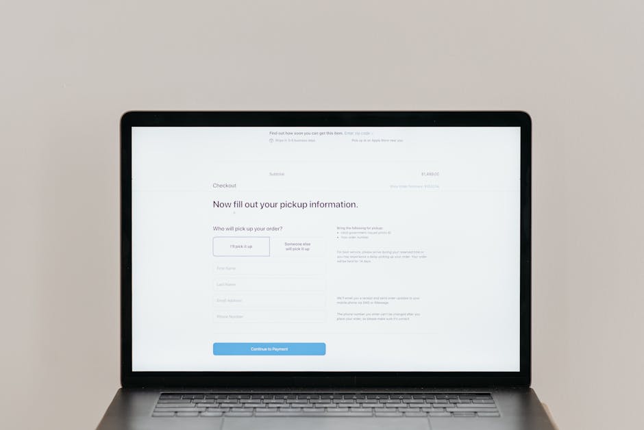
Lack of order summary visibility creates uncertainty about what the shopper is actually buying. Display a clear, persistent order summary showing product images, names, quantities, individual prices, and the running total throughout the checkout process.
Streamlining the Checkout Flow
The ideal checkout flow is short, logical, and predictable. Every additional step increases the chance of abandonment, so consolidation is your primary objective.
Consider single-page checkout as the gold standard. Displaying all checkout information, including shipping address, delivery options, and payment details, on a single scrollable page eliminates page transitions and gives shoppers a complete view of what is required. This format works particularly well for mobile users who are accustomed to vertical scrolling.
If multi-step checkout is necessary for your platform, limit it to three steps maximum: shipping information, delivery method, and payment. Display a clear progress indicator showing the current step and remaining steps. Allow shoppers to navigate backward without losing entered information.
Implement smart defaults that pre-fill information wherever possible. For Singapore addresses, auto-populate the block, street name, and building name when the shopper enters their postal code. For returning customers, pre-fill everything from their last order. For new customers, use browser auto-fill attributes on form fields to leverage stored information.
Offer express checkout options that bypass the standard flow entirely. PayNow, GrabPay, Apple Pay, and Google Pay all enable one-tap or scan-to-pay checkout that reduces the entire process to seconds. Prominent placement of express checkout buttons at the top of the checkout page captures shoppers who prefer this streamlined experience.
Remove all navigation elements and distractions from checkout pages. The header, footer, sidebar, and any promotional content should be stripped away, leaving only the checkout form and essential trust signals. The only links available should be back to cart, terms and conditions, and privacy policy. This focused environment keeps shoppers on task and reduces exit points. Strong web design principles demand this kind of intentional simplification.
Payment Options for Singapore Shoppers
Singapore’s diverse payment ecosystem means that offering the right mix of payment methods directly impacts your checkout completion rate. Each missing option potentially excludes a segment of shoppers who prefer that method.
Credit and debit cards remain the most widely used online payment method in Singapore. Accept Visa, Mastercard, and American Express at minimum. Display card logos prominently and ensure your payment processor supports 3D Secure for fraud protection without adding excessive friction.
PayNow enables instant bank transfers using a QR code or phone number. It is widely used in Singapore and offers the advantage of immediate payment confirmation with no chargeback risk for merchants. Display a PayNow QR code alongside card payment options for shoppers who prefer this method.
GrabPay and other mobile wallets have growing adoption in Singapore, particularly among younger demographics. Integrating GrabPay adds a familiar, trusted payment option and enables one-tap checkout for users with stored payment credentials.
Buy-now-pay-later services like Atome, Pace, and Grab PayLater have become increasingly popular in Singapore, especially for mid to high-value purchases. Offering BNPL options can increase average order value by 20% to 30% by making larger purchases more accessible through instalment payments.
Bank transfer and internet banking options serve shoppers who are uncomfortable entering card details online or who do not have credit cards. While these methods add processing complexity, they can capture sales that would otherwise be lost.
Display accepted payment methods clearly at the start of checkout, not just at the payment step. When shoppers see their preferred payment method available upfront, they proceed with confidence knowing they can pay the way they want.
Trust and Security at Checkout
Checkout is the moment of highest vulnerability for online shoppers. They are about to share sensitive financial information, and any doubt about security can cause immediate abandonment.
Display SSL certificate indicators visibly on checkout pages. While browsers show padlock icons in the address bar, many shoppers do not notice these. Add visual trust badges showing that the connection is secure, particularly near the payment information fields where anxiety is highest.
Show recognisable security and compliance logos including PCI DSS compliance, verified payment processor badges, and any relevant industry certifications. These signals communicate that your store meets established security standards and that customer data is protected.
Use professional, polished design for your checkout pages. A checkout that looks hastily assembled or inconsistent with the rest of your site raises subconscious red flags. Consistent branding, clean typography, aligned form elements, and professional styling all reinforce trust at this critical moment.
Provide clear links to your privacy policy and terms of service. Shoppers should be able to verify how their data will be used without leaving the checkout flow. Open these links in new tabs or modal windows to prevent shoppers from accidentally navigating away from checkout.
Display your customer service contact information on checkout pages. A phone number, email address, or live chat option gives shoppers confidence that help is available if something goes wrong with their order. Even if few shoppers actually use it, the presence of support options reduces anxiety.
Include a brief money-back guarantee or satisfaction guarantee statement near the payment button. This final reassurance can tip hesitant shoppers toward completing the purchase. Phrases like “100% satisfaction guaranteed” or “Easy returns within 30 days” address last-second doubt.
Designing for Mobile Checkout
Mobile checkout presents unique challenges due to smaller screens, on-screen keyboards, and touch-based interaction. Given that over 70% of Singapore e-commerce traffic is mobile, optimising for these constraints is not optional.
Use large, clearly labelled form fields that are easy to tap and type into. Set appropriate input types so that the correct keyboard appears automatically, including a numeric keyboard for phone numbers and postal codes, an email keyboard with the @ symbol for email addresses, and a text keyboard for names and addresses.
Implement a single-column layout for mobile checkout. Side-by-side form fields that work on desktop become cramped and error-prone on mobile. Stack everything vertically with generous spacing between interactive elements to prevent mis-taps.
Make the primary CTA button span the full width of the screen and position it prominently. Use clear, action-oriented text like “Place Order” or “Pay $89.90” rather than generic labels. Consider making the button sticky at the bottom of the screen on the payment step so it remains accessible regardless of scroll position.
Minimise typing requirements wherever possible. Use dropdown selectors for predictable inputs like country selection and month/year expiry dates. Enable camera-based credit card scanning. Auto-format inputs like phone numbers and card numbers as they are typed to help shoppers verify accuracy.
Test your mobile checkout on actual devices across different screen sizes and operating systems. Emulators miss many real-world issues including keyboard overlap with form fields, touch target sizes, and scroll behaviour. Test on both iOS and Android devices popular in Singapore including recent iPhone and Samsung Galaxy models.
The Post-Purchase Experience
Checkout optimisation does not end when the shopper clicks the payment button. The post-purchase experience influences customer satisfaction, return rates, and lifetime value.
Display a clear, informative order confirmation page immediately after payment. Include the order number, itemised summary, shipping address, estimated delivery date, and next steps. Provide options to create an account, share the purchase on social media, or continue shopping for complementary items.
Send an immediate order confirmation email with the same details. This email serves as the customer’s receipt and reference document. Include a direct link to order tracking, customer service contact information, and a summary of your return policy.
Provide proactive shipping updates through email or SMS. Notify customers when their order is confirmed, packed, shipped, out for delivery, and delivered. Each update builds confidence and reduces inbound customer service inquiries. These communications also present opportunities for email marketing engagement, such as suggesting complementary products or inviting reviews.
Make the return and exchange process as smooth as the purchase process. Clear instructions, prepaid return labels, and hassle-free refund processing encourage future purchases by eliminating the risk of buying online. A smooth return experience often converts a potentially negative situation into long-term customer loyalty.
Use the order confirmation page and follow-up emails as opportunities for upselling and cross-selling. Suggest accessories, warranties, or complementary products that enhance the purchased item. Post-purchase recommendations convert at higher rates than pre-purchase suggestions because the buyer has already established trust with your store.
Frequently Asked Questions
How many checkout steps should my store have?
Aim for a single-page checkout or no more than three steps. Studies show that checkout forms with more than three pages have significantly higher abandonment rates. If your platform requires multiple steps, clearly display a progress indicator so shoppers know how many steps remain.
Should I offer guest checkout?
Absolutely. Forced account creation is one of the top causes of checkout abandonment. Offer guest checkout prominently and encourage account creation after the purchase is complete. Many shoppers will create an account post-purchase when offered benefits like order tracking and faster future checkouts.
What payment methods should Singapore e-commerce stores offer?
At minimum, accept Visa, Mastercard, and PayNow. Adding GrabPay, American Express, and buy-now-pay-later options like Atome captures additional customer segments. Monitor your analytics to see which payment methods your customers use most and prioritise accordingly.
How do I reduce checkout errors?
Use inline validation that checks fields as they are completed rather than waiting for form submission. Pre-format inputs like phone numbers and card numbers. Auto-populate address fields from postal codes. Show clear, specific error messages that tell the shopper exactly what needs to be corrected.
Should I show a progress bar during checkout?
Yes, if your checkout has multiple steps. A progress bar reduces uncertainty by showing shoppers where they are in the process and how many steps remain. Label each step clearly, such as “Shipping,” “Delivery,” and “Payment.” Avoid vague labels like “Step 1” and “Step 2.”
How do I handle GST display at checkout?
Display prices inclusive of GST throughout the shopping experience to avoid price shocks at checkout. If you display exclusive prices, clearly label them as “before GST” and show the inclusive total before shoppers reach the payment step. Transparency is key to maintaining trust.
What is the impact of adding a coupon code field?
Coupon code fields can actually increase abandonment because shoppers without codes feel they are missing a discount and leave to search for codes. If you must include a coupon field, keep it collapsed behind a text link rather than displaying a prominent empty field. Auto-apply promotions whenever possible.
How do I test checkout changes safely?
Use A/B testing to compare your current checkout against proposed changes with a subset of traffic. Monitor both conversion rate and average order value, since some changes might increase completion rate while decreasing order value. Run tests for at least 2 weeks to account for day-of-week variations.