Corporate Identity Design: What It Includes and How to Build Consistent Brand Presence
Table of Contents
What Is Corporate Identity Design?
Corporate identity design is the visual and tangible expression of a brand — the system of visual elements that represents a company and distinguishes it from others. It encompasses the logo, colour palette, typography, imagery style, and all the rules governing how these elements are applied across every touchpoint, from business cards to websites to vehicle livery.
Corporate identity is not the same as brand identity, though the terms are often conflated. Brand identity is the broader concept — it includes values, personality, voice, and customer experience. Corporate identity is the visual subset — how the brand looks and is visually recognised. A strong corporate identity translates brand identity into a consistent visual language that people can see, recognise, and remember.
For Singapore businesses, professional corporate identity design is a competitive necessity. In a market where consumers and clients have abundant choice, visual professionalism signals credibility, attention to detail, and trustworthiness. A poorly designed or inconsistent corporate identity — mismatched colours, amateur logo, different fonts on every document — communicates the opposite.
Whether you are a startup establishing your first visual identity, an established company undergoing a rebrand, or a growing business that needs to systematise its visual presence, understanding what corporate identity design includes and how to implement it consistently is essential.
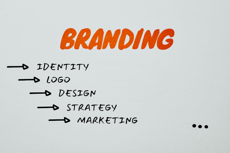
Core Elements of Corporate Identity
A complete corporate identity system comprises several interconnected visual elements that work together to create a recognisable, cohesive brand presence.
Logo: The primary visual identifier of your brand. It appears on everything — your website, business cards, signage, packaging, social media, and all marketing materials.
Colour palette: A defined set of primary and secondary colours that represent your brand. Colours carry psychological associations and emotional weight — blue conveys trust, red conveys energy, green conveys growth.
Typography: The fonts used across all brand communications. A typography system typically includes a primary typeface for headlines, a secondary typeface for body text, and usage rules for sizing, spacing, and hierarchy.
Imagery style: Guidelines for photography, illustration, and graphic elements. This might specify that the brand uses warm-toned, candid photography rather than cold, staged studio shots, or that illustrations follow a specific artistic style.
Iconography: A consistent set of icons used across digital interfaces, documents, and presentations. Icons should share a uniform style — line weight, corner radius, size, and visual approach.
Graphic elements: Patterns, textures, shapes, and decorative elements that support the visual identity. These secondary elements add visual interest and recognition without competing with the logo.
Stationery: Business cards, letterheads, envelopes, and other business stationery that carry the corporate identity into professional correspondence.
Brand guidelines: The comprehensive document that codifies all the above elements and provides rules for their application. Brand guidelines ensure consistency whether collateral is created by internal teams, external agencies, or partners.
Logo Design: The Centrepiece of Identity
The logo is the most visible element of corporate identity and often the first thing people associate with a brand. Effective logo design for Singapore businesses follows several principles.
Simplicity: The most recognisable logos in the world are simple. Apple, Nike, Singapore Airlines — all instantly recognisable through minimal design. Simple logos are easier to remember, reproduce across different sizes and media, and recognise at a glance.
Versatility: Your logo must work across vastly different applications — from a tiny social media avatar (as small as 32×32 pixels) to a large outdoor banner. It must work in full colour, single colour, black, and white. Design responsive logo variations: a primary logo, a simplified version, and an icon-only version for different contexts.
Relevance: The logo should feel appropriate for your industry and audience. A children’s brand and a law firm require fundamentally different visual approaches. The logo does not need to literally depict what you do (Apple does not sell apples), but it should feel congruent with your brand positioning.
Timelessness: Avoid trendy design elements that will look dated in a few years. Classic design principles — clean geometry, balanced proportions, and restrained detail — create logos that age well. Redesigning a logo is expensive and disruptive to brand recognition.
Distinctiveness: Your logo must be different enough from competitors and other brands to avoid confusion. Before finalising, check for visual similarities with existing brands in your industry and conduct trademark searches to ensure legal distinctiveness.
Professional logo design in Singapore typically costs SGD 1,000 to SGD 10,000 depending on the designer’s experience and the scope of the project. This is an investment in your brand’s most visible asset and should not be handled by the cheapest option available.
Colour Palette and Typography Systems
Colour and typography are the workhorses of corporate identity design — they appear in every application and do the heavy lifting of creating visual consistency and emotional impact.
Building your colour palette:
Primary colours (1-2 colours): These define your brand’s visual signature. They appear in your logo, primary headings, and key interface elements. Choose colours that are distinctive in your competitive landscape and carry appropriate emotional associations.
Secondary colours (2-4 colours): Supporting colours used for backgrounds, accents, and variety. They complement the primary colours without competing for attention.
Neutral colours (2-3 colours): Black, white, greys, or warm neutrals used for text, backgrounds, and structural elements. Neutrals provide the canvas against which your brand colours stand out.
Functional colours: Colours designated for specific functions — success (green), error (red), warning (amber), information (blue). These are particularly important for digital interfaces.
Document your colours in all relevant formats: HEX values for web, RGB for screen, CMYK for print, and Pantone references for precise colour matching in professional printing.
Typography system:
Select a primary typeface for headlines and a secondary typeface for body text. Ensure both are available for web use (Google Fonts offers free web fonts; alternatively, license commercial typefaces for both web and print). Define a type scale — specific sizes for H1, H2, H3, body text, captions, and small text — along with line height and spacing rules.
For web design, choose typefaces that load quickly, render well on screens, and maintain readability at small sizes. For print, you have more flexibility with decorative or detailed typefaces that screen rendering may not handle well.
Building Comprehensive Brand Guidelines
Brand guidelines — also called a brand manual or style guide — document your entire corporate identity system and provide rules for its application. This is the reference document that ensures consistency regardless of who creates brand materials.
What to include:
Brand overview: Mission, values, personality, and positioning statement. This context helps creators understand the brand’s intent, not just its visual rules.
Logo usage: Primary logo, variations, minimum sizes, clear space requirements, placement rules, and examples of incorrect usage. Show explicitly what not to do — do not stretch, rotate, change colours, or place on incompatible backgrounds.
Colour specifications: Full colour palette with values in all formats (HEX, RGB, CMYK, Pantone), usage proportions, and colour combination rules.
Typography: Typeface selections, type scale, hierarchy, line height, and spacing. Include both digital and print specifications.
Imagery guidelines: Photography style, illustration approach, iconography, and graphic elements with examples of appropriate and inappropriate usage.
Application examples: Show the identity applied across key touchpoints — business cards, letterheads, website screenshots, social media profiles, email signatures, presentation slides, signage, and vehicle livery.
Tone of voice: Writing style guidelines that complement the visual identity. How the brand sounds should be as consistent as how it looks.
Make your brand guidelines accessible and practical. A beautiful but impractical 100-page PDF that no one reads serves no purpose. Consider a digital brand portal that allows users to download assets, reference rules, and find answers quickly.
Digital Applications of Corporate Identity
In 2026, digital touchpoints represent the majority of brand interactions. Your corporate identity must be designed with digital applications as a primary consideration, not an afterthought.
Website: Your website is the most comprehensive digital expression of your corporate identity. Every element — header, navigation, buttons, forms, footer — should reflect your brand colours, typography, and visual style. Consistency between your website and other materials reinforces brand recognition.
Social media profiles: Profile images, cover photos, story templates, and post designs across LinkedIn, Instagram, Facebook, TikTok, and other platforms should maintain your corporate identity. Create platform-specific templates that adapt your identity to each platform’s dimensions and usage context.
Email: Email templates for marketing campaigns, transactional emails, and internal communications should carry your corporate identity. HTML email has specific constraints — limited font support, variable rendering across email clients — that require adapted design approaches.
Digital advertising: Paid advertising creative across Google Display Network, social media platforms, and programmatic channels should be instantly recognisable as your brand. Create a set of advertising templates in standard sizes that maintain brand consistency across all ad placements.
Presentations: Google Slides and PowerPoint templates branded with your corporate identity ensure that every presentation, whether internal or client-facing, represents the brand consistently.
Mobile applications: If your business has a mobile app, the corporate identity should extend to the app icon, splash screen, interface elements, and overall visual design. Apps offer an opportunity for an immersive brand experience within a controlled environment.
Implementation and Rollout Strategy
Creating a beautiful corporate identity is only half the challenge. Implementing it consistently across all touchpoints requires a structured rollout strategy.
Audit existing materials: Before rolling out a new or updated identity, catalogue all existing branded materials — digital assets, print collateral, signage, uniforms, vehicles, and more. This audit reveals the full scope of implementation required.
Prioritise high-visibility touchpoints: Update the most visible touchpoints first — website, social media profiles, email signatures, and business cards. These are the materials that stakeholders and customers encounter most frequently. Lower-visibility items like internal document templates can follow in subsequent phases.
Create an implementation timeline: Set realistic deadlines for updating each touchpoint. A phased rollout over two to three months is more manageable than attempting to change everything simultaneously. Assign responsibility for each item to specific team members or departments.
Distribute assets and guidelines: Ensure everyone who creates branded materials — internal teams, external agencies, printing vendors, and partners — has access to the updated guidelines and digital assets. Provide logo files in all required formats (SVG, PNG, EPS, PDF), colour specifications, font files, and templates.
Train your team: Hold briefing sessions for all departments that create or use branded materials. Marketing, sales, HR, and operations all interact with the corporate identity in different ways. Each team should understand the guidelines relevant to their work.
Monitor and enforce: After rollout, monitor compliance. Off-brand materials inevitably appear — a team member using the old logo, a vendor printing with incorrect colours, a social media post using the wrong font. Establish a review process and designate a brand guardian who ensures ongoing compliance.
A well-executed corporate identity rollout creates immediate visual impact. When every touchpoint — from your digital marketing to your physical office — speaks the same visual language, the cumulative effect on brand perception is substantial.
Frequently Asked Questions
What is corporate identity design?
Corporate identity design is the creation of a cohesive visual system that represents a company across all touchpoints. It includes the logo, colour palette, typography, imagery style, and brand guidelines that ensure consistent visual presentation on everything from business cards to websites.
How much does corporate identity design cost in Singapore?
Costs vary based on scope and designer experience. A logo-only project might cost SGD 1,000 to SGD 5,000. A comprehensive corporate identity package — including logo, colour palette, typography, brand guidelines, stationery, and digital templates — typically costs SGD 5,000 to SGD 30,000 from a professional design agency in Singapore.
What is the difference between corporate identity and brand identity?
Brand identity is the broader concept encompassing values, personality, voice, customer experience, and visual design. Corporate identity is the visual component of brand identity — the logos, colours, fonts, and design rules that make the brand visually recognisable. Corporate identity is a subset of brand identity.
How often should a company update its corporate identity?
A well-designed corporate identity should remain effective for 7 to 15 years with minor refinements. Major overhauls should only occur when the brand strategy changes significantly, the design looks dated, or the business has evolved beyond what the current identity represents. Frequent changes disrupt brand recognition.
What files should I receive from my designer?
At minimum, you should receive logo files in SVG (scalable vector), PNG (transparent background, various sizes), EPS (for print), and PDF formats. You should also receive a complete brand guidelines document, colour specifications in all formats, font files (or Google Fonts references), and editable templates for key applications.
Can I design my corporate identity using Canva or similar tools?
DIY tools can produce basic visual materials, but professional corporate identity design requires expertise in typography, colour theory, visual systems, and print production that these tools alone cannot provide. For a startup with extremely limited budget, DIY tools can serve as a temporary solution, but plan to invest in professional design as the business grows.
What is a brand style guide?
A brand style guide (also called brand guidelines or brand manual) is a document that defines how your corporate identity should be applied across all touchpoints. It includes logo usage rules, colour specifications, typography standards, imagery guidelines, and application examples to ensure consistency.
Do I need different logos for different platforms?
You need responsive logo variations — a primary logo (full version), a simplified version (for smaller spaces), and an icon version (for social media avatars and app icons). These are not different logos but different expressions of the same logo designed for different contexts.
How do I ensure brand consistency across my team?
Provide comprehensive brand guidelines, create easy-to-use templates for common materials, centralise brand assets in an accessible location, train all relevant team members, and designate a brand guardian who reviews materials for compliance. Consistency requires both clear documentation and active enforcement.
Should my corporate identity work in both English and Chinese?
For Singapore businesses targeting multilingual audiences, yes. Your corporate identity should include guidelines for Chinese (and potentially Malay and Tamil) typography, ensuring that translated materials maintain the same visual quality and brand consistency as English materials. Chinese typography requires different typeface selections and spacing considerations.