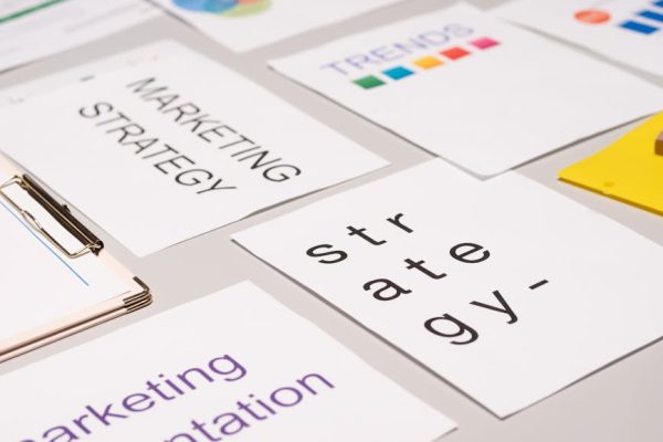
Colour Psychology in Marketing: How Colours Influence Buying Decisions
Walk through any Singapore shopping mall and notice how colour works on your attention. The bold red signage of a Chinese restaurant feels inviting and auspicious. The clean whites and soft blues of a banking branch communicate trust and professionalism. The vibrant oranges and yellows of a bubble tea chain signal fun and energy. None of this is accidental. Colour is one of the most immediate and powerful communication tools in marketing — research suggests that up to 90 per cent of snap judgements about products are based on colour alone, and colour increases brand recognition by approximately 80 per cent.
Colour psychology in marketing is not simply about choosing attractive colours. It is about understanding how different colours trigger specific emotional responses, how cultural context shapes colour associations, and how strategic colour use can guide attention, communicate brand values, and drive conversions. In Singapore’s multicultural society — where red means luck and prosperity to the Chinese community, green holds significance for the Malay community, and white can signify mourning in several Asian cultures — getting colour right requires cultural intelligence alongside design skill.
This guide explores the science and practice of colour psychology for Singapore marketers in 2026. From understanding fundamental colour associations to selecting brand palettes, optimising CTA button colours, and running rigorous A/B tests, you will learn to use colour as a strategic marketing tool that resonates across Singapore’s diverse consumer base.
The Science of Colour Psychology
Colour psychology sits at the intersection of neuroscience, cultural studies, and behavioural economics. Understanding the science behind colour perception helps you make informed decisions rather than relying on myths and oversimplifications.
How the brain processes colour. Colour perception begins when light hits the retina and activates cone cells sensitive to different wavelengths. This information travels to the visual cortex and simultaneously triggers responses in the limbic system — the brain’s emotional centre. This dual processing means colour is both seen and felt, which is why colours can trigger emotional responses before we consciously register what we are looking at.
Learned vs innate associations. Some colour responses appear to be biologically influenced — red can increase heart rate and arousal, while blue tends to produce calming effects. However, most colour associations are learned through cultural exposure, personal experience, and contextual conditioning. This is why colour psychology cannot be reduced to a simple chart of “red means X, blue means Y” — context and culture always mediate the response.
The isolation effect. One of the most reliable findings in colour psychology is the isolation effect (also known as the Von Restorff effect): an item that visually stands out from its surroundings is more likely to be remembered and acted upon. This principle is directly applicable to call-to-action buttons, promotional banners, and key marketing messages. The “best” colour for a CTA button is not universally red or green — it is whatever colour contrasts most strongly with the surrounding design.
Understanding these fundamentals helps you apply colour strategically across your digital marketing channels rather than following generic colour rules that may not apply to your specific context.
Colour Associations and Their Marketing Applications
While colour associations are culturally influenced, certain patterns are widespread enough to serve as useful starting points for marketing decisions. Here are the major colours and their most common marketing applications.
Red
Red is associated with energy, urgency, passion, and excitement. It increases heart rate and creates a sense of immediacy. In marketing, red is used for clearance sales, food brands, impulse purchases, and CTAs that require immediate action. In Singapore, red carries additional significance as a symbol of luck and prosperity, making it particularly effective for festive marketing and auspicious occasions.
Blue
Blue communicates trust, reliability, professionalism, and calm. It is the most universally favoured colour across cultures. Financial institutions (DBS, OCBC, UOB all use blue prominently), technology companies, and healthcare brands gravitate towards blue because it reduces anxiety and builds confidence. In marketing, blue works well for brands that want to communicate stability and dependability.
Green
Green represents nature, health, growth, and sustainability. It is used extensively by organic food brands, environmental organisations, and wellness companies. In Singapore’s increasingly sustainability-conscious market, green signals eco-friendliness and responsible business practices. Green is also associated with money and financial growth, making it suitable for investment and fintech brands.
Yellow and Orange
Yellow conveys optimism, warmth, and attention-grabbing energy. Orange combines the urgency of red with the friendliness of yellow, creating a sense of enthusiasm and approachability. Both colours are effective for brands targeting younger demographics, food and beverage businesses, and any marketing that needs to feel energetic and accessible. Shopee’s orange branding in Singapore leverages these associations effectively.
Black and White
Black communicates luxury, sophistication, and exclusivity. Premium brands from fashion to automotive to fine dining use black to signal high-end positioning. White represents purity, simplicity, and modern minimalism. Apple’s use of white space has influenced an entire generation of design. In combination, black and white create a timeless, elegant aesthetic used by luxury retailers on Orchard Road.
Purple
Purple is associated with creativity, luxury, wisdom, and individuality. It is less commonly used in mainstream marketing, which makes it effective for brands wanting to differentiate visually. Beauty, education, and creative industry brands frequently use purple to signal innovation and premium quality.
Cultural Colour Meanings in Singapore
Singapore’s multicultural society means that colour carries layered cultural meanings that marketers must navigate carefully. A colour that resonates positively with one community may carry very different associations for another.
Red in Singapore
Red is arguably the most culturally significant colour in Singapore. For the Chinese community, which makes up approximately 75 per cent of the population, red symbolises luck, prosperity, happiness, and celebration. Red is essential during Chinese New Year (ang baos, decorations, clothing), weddings, and auspicious occasions. Marketing campaigns that use red during festive periods tap into deep cultural resonance. However, avoid red for contexts associated with danger warnings or errors where the cultural meaning could create confusion.
White and Mourning
In Chinese, Malay, and Indian cultures in Singapore, white is associated with mourning and funerals. White flowers, white clothing, and white decorations carry funeral connotations that differ sharply from Western associations of purity and celebration. Singapore marketers should be cautious about using predominantly white designs for celebratory occasions, gift packaging, or congratulatory messaging. This does not mean avoiding white entirely — it means being aware of context and combining white thoughtfully with other colours.
Green and the Malay Community
Green holds particular significance for Singapore’s Malay-Muslim community as a colour associated with Islam, paradise, and divine blessing. During Hari Raya Aidilfitri, green features prominently in decorations and marketing materials. Brands marketing to the Malay community can use green to signal cultural awareness and respect.
Saffron and Yellow in Indian Culture
Saffron and deep yellow are sacred colours in Hindu culture, associated with purity and spirituality. During Deepavali and other Hindu celebrations, these colours feature prominently. Gold, closely related to yellow and saffron, symbolises prosperity and is universally positive across Singapore’s communities.
Practical Multicultural Guidance
For mass-market campaigns in Singapore, red and gold are the safest culturally positive colours. Blue is universally neutral and professional. Be cautious with all-white designs, particularly for celebratory or gift contexts. When running community-specific campaigns, incorporate the culturally significant colours for that community. And when in doubt, test with representatives from your target demographic before launching. Integrate these cultural considerations into your social media marketing creative guidelines.
Choosing Brand Colours Strategically
Selecting brand colours is one of the most consequential design decisions a Singapore business will make. Your brand colours will appear on your logo, website, packaging, signage, social media, and every customer touchpoint for years — potentially decades.
Differentiation Through Colour
The most effective brand colour strategy often starts with competitive analysis. What colours dominate your industry? If every competitor uses blue, a thoughtfully chosen non-blue palette can create immediate visual differentiation. In Singapore’s banking sector, where blue dominates, a challenger brand using green or purple would stand out in advertising, social media, and search results.
Colour and Brand Personality
Align your colour choice with the personality you want your brand to communicate:
- Trustworthy and professional — Blue, navy, or dark grey
- Energetic and youthful — Orange, bright green, or coral
- Luxurious and premium — Black, gold, or deep purple
- Natural and sustainable — Green, earth tones, or muted pastels
- Innovative and tech-forward — Electric blue, gradient palettes, or vibrant accent colours
Primary, Secondary, and Accent Colours
A complete brand colour system includes a primary colour (your main brand identifier), one or two secondary colours (for supporting visual elements), and an accent colour (for CTAs, highlights, and points of emphasis). The accent colour should contrast strongly with the primary and secondary colours to draw attention where needed. Work with your web design team to ensure your colour system works effectively across all digital touchpoints.
Colour Consistency Across Channels
Ensure your brand colours are defined in specific colour codes (HEX for digital, CMYK for print, Pantone for precise reproduction) and used consistently across every channel. Inconsistent colour use — slightly different shades on your website versus your social media versus your printed materials — subtly undermines brand recognition and professionalism.
CTA Button Colours and Conversion
The colour of your call-to-action buttons is one of the most tested and debated elements in conversion optimisation. The short answer is that there is no universally best CTA colour — but there are principles that consistently guide effective choices.
Contrast Is King
The most important principle for CTA button colour is contrast. Your CTA button should visually pop against its surrounding design. A green button on a green page is invisible. A red button on a predominantly blue page is impossible to miss. The isolation effect means the colour that stands out most from the page design will attract the most attention and clicks.
Common CTA Colour Findings
While context always matters, recurring patterns emerge from thousands of A/B tests across Singapore and global markets:
- Red and orange CTAs — Consistently perform well for urgency-driven actions (buy now, limited-time offers, sign up before deadline). The warmth and energy of these colours align with immediate action.
- Green CTAs — Often perform well for actions that feel safe and positive (proceed, continue, get started). Green’s associations with safety and go-signals make it effective for low-risk actions.
- Blue CTAs — Work well for trust-dependent actions (submit payment, create account, start free trial). Blue’s trust associations reduce anxiety at commitment-heavy moments.
- Black CTAs — Effective for premium and luxury positioning. High-end e-commerce and fashion brands use black CTAs to maintain their sophisticated aesthetic.
CTA Colour for Singapore E-Commerce
Singapore’s major e-commerce platforms provide useful colour benchmarks. Shopee uses orange for primary CTAs, Lazada uses blue and orange, Amazon uses gold/yellow for “Add to Cart” and orange for “Buy Now,” and Carousell uses red. These platforms have tested extensively, but their choices are optimised for their specific designs — do not copy their CTA colours without testing them in your own design context.
The only way to know which CTA colour works best for your specific Google Ads landing pages and website is to test. Which leads to the next section.
Colour in Digital Advertising
Colour choices in digital advertising — from display banners to social media ads to video thumbnails — directly affect ad performance metrics including click-through rate, engagement, and conversion.
Social Media Ad Colour Strategy
Each social media platform has a dominant colour (Facebook is blue, Instagram is gradient, TikTok is black) that affects how your ad colours are perceived in context. Ads that contrast with the platform’s native colour scheme tend to stop the scroll more effectively.
- On Facebook and LinkedIn (blue platforms) — Warm colours like red, orange, and yellow in ad creative stand out against the blue interface.
- On Instagram (varied interface) — Bold, saturated colours and high-contrast images perform well in the visual-first feed. Avoid muted, pastel ads that blend into the aesthetic content around them.
- On TikTok (dark interface) — Bright, vibrant colours pop against TikTok’s dark mode interface. High-contrast thumbnails with bold text earn more initial views.
Display Advertising Colour
Display ads compete for attention in cluttered web environments. The principles for effective display ad colour include using high contrast between background and text, choosing colours that stand out against common website backgrounds (white and light grey), and ensuring the CTA button is the most visually prominent element in the ad.
Video Thumbnail Colours
For YouTube and video marketing, thumbnail colour choices significantly affect click-through rates. Yellow, red, and bright blue thumbnails consistently outperform muted or dark thumbnails. Faces with high colour contrast and bold text overlays attract more clicks than subtle, artistic thumbnails. Integrate colour-optimised thumbnails into your content marketing video strategy.
A/B Testing Colour for Data-Driven Decisions
Colour psychology provides useful hypotheses, but only data can tell you what works for your specific audience, product, and design context. A/B testing removes guesswork and replaces assumptions with evidence.
What to Test
- CTA button colour — The highest-impact colour test. Change only the button colour, keeping all other elements identical, and measure click-through and conversion rates.
- Background colour — Test different page or section background colours to see how they affect time on page, scroll depth, and conversion.
- Headline colour — Test whether coloured headlines (versus black or dark grey) affect engagement and scroll behaviour.
- Ad creative colour — Test different colour schemes in social media and display ads, measuring CTR and conversion rate.
A/B Testing Best Practices
Test one variable at a time. If you change the button colour and the button text simultaneously, you cannot attribute any performance difference to colour alone. Isolate the colour variable for clean, actionable results.
Ensure statistical significance. Do not conclude a test after 50 clicks. For reliable results, you need sufficient sample size — typically several hundred conversions per variation. Use a statistical significance calculator to determine when you have enough data to declare a winner.
Account for seasonality. Running a colour test during Chinese New Year may produce different results than during a regular period, because red takes on heightened cultural significance. Test during representative periods and consider running seasonal-specific tests.
Test across segments. A colour that works for one audience segment may not work for another. Where possible, segment your test results by demographics, device type, and traffic source to uncover nuanced insights.
Tools for Colour A/B Testing
Google Optimize (or its successor), VWO, Optimizely, and built-in testing features in platforms like Shopify and WordPress allow you to run colour tests without developer involvement. For email marketing, most platforms including Mailchimp and ActiveCampaign support A/B testing of email button colours and design elements.
Accessibility and Inclusive Colour Design
Approximately 8 per cent of men and 0.5 per cent of women have some form of colour vision deficiency. In Singapore, this means tens of thousands of potential customers may perceive your colours differently from your design intent. Accessible colour design is not just ethically important — it is commercially smart.
Colour Contrast Requirements
The Web Content Accessibility Guidelines (WCAG) require a minimum contrast ratio of 4.5:1 for normal text and 3:1 for large text. Many aesthetically pleasing colour combinations — light grey text on white backgrounds, pastel buttons, low-contrast colour schemes — fail these requirements and exclude users with visual impairments.
Do Not Rely on Colour Alone
Never use colour as the only way to communicate information. Error messages should include text and icons, not just red highlighting. Form validation should use text labels alongside colour indicators. Charts and graphs should use patterns or labels in addition to colour differentiation.
Testing for Colour Accessibility
- Use contrast checking tools — WebAIM’s Contrast Checker and Stark’s Figma plugin verify whether your colour combinations meet WCAG standards.
- Simulate colour blindness — Tools like Coblis and browser extensions let you view your designs as they appear to people with different types of colour vision deficiency.
- Test with real users — Include users with colour vision deficiencies in your usability testing to catch accessibility issues that automated tools miss.
Accessible colour design aligns with Singapore’s push towards digital inclusivity and the Infocomm Media Development Authority’s (IMDA) accessibility guidelines. It also ensures your marketing reaches the widest possible audience — a simple business case for inclusive design.
Frequently Asked Questions
What is the best colour for a CTA button?
There is no universally best CTA button colour. The most effective CTA colour is the one that creates the strongest visual contrast with your page design. Red, orange, and green are commonly effective, but the only way to determine the best colour for your specific context is A/B testing. A red button on a red-themed page will fail, while the same red button on a blue-themed page may excel.
How does colour psychology differ in Singapore compared to Western markets?
The most significant differences involve cultural colour associations. Red carries strong positive connotations (luck, prosperity) for Singapore’s Chinese majority, making it more versatile than in Western markets where it primarily signals danger or urgency. White is associated with mourning in several Asian cultures, contrasting with Western associations of purity and celebration. Green has particular significance for the Malay-Muslim community. Successful Singapore marketing accounts for these multicultural nuances.
Should I use red for sales and promotions in Singapore?
Red is highly effective for sales and promotions in Singapore for two reinforcing reasons: its universal association with urgency and deals, and its cultural association with luck and prosperity for the Chinese community. Major Singapore retailers, e-commerce platforms, and F&B brands use red extensively in promotional materials. However, ensure red is used in a culturally appropriate context and does not overwhelm your overall brand aesthetic.
How many colours should a brand use?
Most effective brand colour systems use three to five colours: one primary colour (your main brand identifier), one or two secondary colours (supporting elements), and one or two accent colours (CTAs, highlights). Too few colours create a monotonous visual identity, while too many create visual chaos and weaken brand recognition. Define each colour’s role and usage guidelines in a brand style guide.
Can changing colours really impact conversion rates?
Yes. Numerous A/B tests have demonstrated that colour changes — particularly to CTA buttons — can impact conversion rates by 10 to 30 per cent or more. However, the impact depends entirely on context. Changing a button from one shade of blue to another shade of blue will likely produce minimal difference. Changing from a low-contrast colour to a high-contrast colour can produce dramatic improvements. Always test rather than assume.
How do I choose colours for a multicultural Singapore audience?
For broad-market campaigns, use colours that carry positive associations across cultures: red and gold are universally positive in Singapore, blue is neutral and professional, and green is broadly positive. Avoid all-white designs for celebratory contexts. For community-specific campaigns, incorporate culturally significant colours (green for Malay-Muslim audiences, saffron and gold for Indian audiences, red and gold for Chinese audiences). When in doubt, consult with community representatives and test creative with diverse focus groups.