Persuasive Landing Pages: Conversion Psychology That Works
A landing page has one job: convert the visitor. Unlike your homepage, which serves multiple audiences and objectives, a landing page exists to turn a specific audience into leads or customers through a single, focused action. Yet most Singapore business landing pages fail at this job — not because the offer is weak, but because the page does not persuade effectively. Persuasion on a landing page is not about flashy design or aggressive sales tactics. It is about structuring information, trust signals, and calls to action in a sequence that aligns with how the human brain makes decisions.
The difference between a landing page that converts at 2% and one that converts at 8% is rarely the product or service being offered. It is the psychology of how the page presents that offer. Above-the-fold hierarchy, trust badge placement, testimonial positioning, CTA design, form friction, and exit intent mechanics — each element plays a specific psychological role in moving visitors from interest to action. When these elements work together, conversion rates compound.
This guide breaks down the conversion psychology behind high-performing landing pages, with practical techniques that Singapore businesses can implement in 2026. Whether you are running 谷歌广告 campaigns, social media promotions, or 电子邮件营销 funnels, the landing page is where your investment either pays off or is wasted.
Above-the-Fold Hierarchy That Converts
The above-the-fold area — the portion of the page visible without scrolling — is your landing page’s most critical real estate. Visitors form their first impression within 50 milliseconds and decide whether to stay or leave within 3-5 seconds. Your above-the-fold hierarchy must immediately communicate three things: what you offer, why it matters to the visitor, and what to do next.
The Essential Above-the-Fold Elements
Headline. Your headline is the first text element visitors read. It must communicate the primary benefit of your offer in clear, compelling language. Avoid clever wordplay or abstract statements — clarity always outperforms creativity in headline testing. A Singapore tuition centre’s landing page headline like “Help Your Child Score A1 in Maths — Guaranteed Improvement in 8 Weeks” outperforms “Excellence Through Education” because it states a specific, measurable benefit.
Subheadline. The subheadline supports the headline with additional context or a secondary benefit. It answers the reader’s immediate follow-up question: “How?” or “Why should I believe this?” Example: “Join 500+ Singapore parents who’ve seen their children’s grades improve by at least two grades with our proven methodology.”
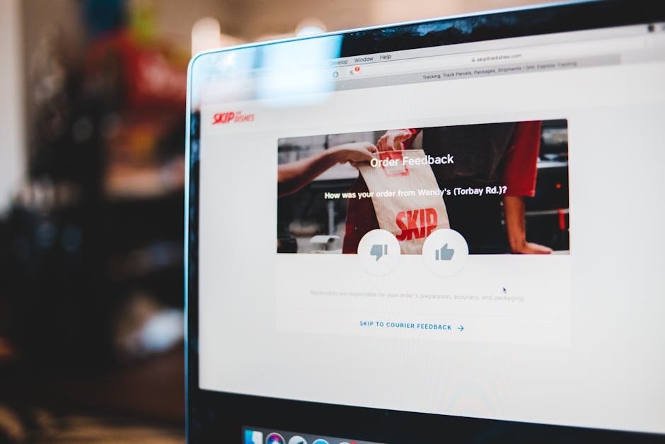
Hero image or video. Visual content should reinforce the headline’s promise. Show the outcome, not the process. A before-and-after image, a happy customer using the product, or a short video testimonial creates emotional connection that text alone cannot achieve. For Singapore service businesses, images featuring local settings and people increase relatability.
Primary CTA. Your main call to action should be visible above the fold without scrolling. Make it a contrasting colour that stands out from the page background, use action-oriented text that includes the benefit, and ensure it is large enough to be immediately noticeable on both desktop and mobile devices.
Message Match
The above-the-fold content must match the ad, email, or link that brought the visitor to the page. If your Google Ad promises “Free SEO Audit for Singapore Businesses,” the landing page headline should echo that exact promise. Message mismatch — where the ad says one thing and the landing page says something different — is one of the most common causes of high bounce rates and wasted ad spend. Ensure consistency between your ad copy and landing page messaging for every digital marketing campaign.
Trust Badges and Credibility Signals
Trust is the foundation of conversion. A visitor who does not trust your page will not convert, regardless of how compelling your offer is. Trust badges and credibility signals serve as psychological shortcuts that reduce perceived risk and accelerate the trust-building process.
Types of Trust Signals
Security badges. SSL certificates, payment security logos (Visa Secure, Mastercard SecureCode), and data protection badges reassure visitors that their information is safe. These are essential on pages that request personal information or payment details. Place security badges near forms and payment fields where anxiety peaks.
Industry certifications and awards. Professional certifications, industry awards, and accreditations from recognised bodies signal competence and legitimacy. For Singapore businesses, certifications from IMDA, Enterprise Singapore, or industry-specific bodies like the Institute of Singapore Chartered Accountants carry significant weight.
Client logos. Displaying logos of well-known clients or partners borrows their credibility. A Singapore B2B landing page showing logos of recognisable local companies — DBS, Singtel, Grab — instantly communicates that established businesses trust this provider. Always obtain permission before displaying client logos.
Media mentions. “As featured in” sections with logos from The Straits Times, CNA, Business Times, or TechInAsia signal that your business has been vetted by credible media outlets. Media mentions are particularly effective for newer businesses that lack extensive client lists.
Guarantees. Money-back guarantees, satisfaction guarantees, and performance guarantees reduce the perceived risk of converting. “100% money-back guarantee if you’re not satisfied within 30 days” removes the visitor’s fear of making a wrong decision. The stronger and more specific your guarantee, the more powerfully it reduces conversion anxiety.
Trust Badge Placement
Place trust badges where anxiety occurs. Security badges belong near forms and payment fields. Client logos work well above or below the fold to establish credibility early. Guarantees are most effective near the CTA, where they address the final moment of hesitation. Scatter trust signals throughout the page rather than clustering them in a single section — each scroll depth should encounter fresh reassurance.
Testimonial Placement Psychology
Testimonials are among the most powerful conversion elements available because they provide social proof from people similar to the visitor. However, the placement, format, and content of testimonials dramatically affect their persuasive impact.
Where to Place Testimonials
Near the CTA. Placing a testimonial immediately above or beside the call to action addresses the final moment of doubt before conversion. A testimonial that says “I was hesitant at first, but the results exceeded my expectations” directly neutralises the visitor’s hesitation at the point of action.
After benefit sections. Following a section that describes a specific benefit with a testimonial that confirms that benefit provides third-party validation. If your page claims “increase leads by 50%,” a testimonial that says “Our leads increased by 63% in the first quarter” transforms a claim into evidence.
Throughout the page. Rather than clustering all testimonials in a single section, distribute them throughout the page so that social proof reinforces the visitor’s confidence at every stage of their reading journey. Each testimonial should be contextually relevant to the content surrounding it.
What Makes Testimonials Persuasive
Specificity. “Great service!” is nearly worthless as a testimonial. “Our Google Ads cost per lead dropped from $45 to $18 within two months of working with them” is highly persuasive because it provides specific, verifiable results that the visitor can relate to their own situation.
Attribution. Full name, job title, company name, and photo make testimonials believable. Anonymous or first-name-only testimonials feel fabricated, even when they are genuine. For Singapore B2B landing pages, including the company name is particularly important because the visitor may recognise or research the company.
Relevance. Testimonials from customers who match your target audience’s profile are more persuasive than testimonials from dissimilar customers. A Singapore SME considering your service is more influenced by a testimonial from another Singapore SME than from a multinational corporation, because they can identify with the context and challenges more closely.
Strong testimonials on landing pages complement your broader content marketing efforts by providing the social validation that moves visitors from consideration to conversion.
CTA Psychology: Buttons That Get Clicked
The CTA button is the conversion mechanism — the element that transforms a persuaded visitor into an actual lead or customer. The psychology of CTA design encompasses colour, copy, size, placement, and the micro-decisions surrounding it.
CTA Copy That Converts
First person framing. CTAs written in first person (“Start My Free Trial,” “Get My Quote”) outperform third person (“Start Your Free Trial,” “Get a Quote”) by 25-35% in conversion testing. First person framing creates psychological ownership — the visitor mentally takes possession of the benefit before clicking.
Benefit-oriented text. Replace generic CTAs with benefit-specific language. “Get My Free SEO Report” outperforms “Submit.” “Book My Strategy Session” outperforms “Contact Us.” “Claim My 20% Discount” outperforms “Shop Now.” The CTA should remind the visitor what they gain by clicking, not just what they are doing.
Reducing perceived risk. Adding risk-reducing text near or within the CTA button increases conversions. “Start Free Trial — No Credit Card Required” eliminates two barriers in one element. “Book a Call — Takes 30 Seconds” reduces perceived time commitment. These micro-assurances address the split-second objections that arise as the visitor’s cursor approaches the button.
CTA Design Principles
Contrast. The CTA button must be the most visually prominent element on the page. Choose a colour that contrasts sharply with the page background and surrounding elements. If your page is predominantly blue, an orange or green CTA stands out. The specific colour matters less than the contrast ratio.
Size. Larger buttons convert better than smaller ones, up to a point. The CTA should be large enough to be immediately noticeable but not so large that it feels aggressive. On mobile, the CTA should be easily tappable with a thumb — at least 48 pixels in height.
Whitespace. Surround your CTA with generous whitespace to isolate it visually and draw the eye. A button crowded by other elements loses prominence. Whitespace creates a visual pause that directs attention to the action you want visitors to take.
Repetition. Place your CTA at multiple points on the page — above the fold, after key benefit sections, and at the bottom. Long landing pages should include the CTA every one to two scroll depths so the visitor never has to search for it when they are ready to convert. Work with your web design team to ensure CTA placement is optimised for both desktop and mobile layouts.
Reducing Form Friction for Higher Completions
Forms are the most common conversion mechanism on landing pages, and they are also the most common source of friction. Every form field represents a micro-decision and a micro-effort that can cause the visitor to abandon the process.
The Field Reduction Principle
Research consistently shows that reducing form fields increases conversion rates. A study of over 40,000 landing pages found that reducing fields from four to three increased conversions by nearly 50%. For Singapore lead generation pages, the essential fields are typically name, email, and phone number — anything beyond that should be collected later in the sales process.
Ask yourself for each field: “Do I genuinely need this information to take the next step with this lead?” If the answer is no, remove it. You can always gather additional details during the follow-up conversation or through progressive profiling in subsequent interactions.
Form Design Best Practices
Single-column layout. Forms arranged in a single column convert better than multi-column layouts because they create a clear, linear path from top to bottom. Multi-column forms require the visitor to decide which column to fill first, creating unnecessary cognitive load.
Inline validation. Show validation messages as the user completes each field rather than after they click submit. Immediate feedback — a green checkmark for valid inputs, a red message for errors — prevents the frustration of submitting a form only to receive multiple error messages.
Smart defaults and auto-fill. Pre-populate fields where possible. Support browser auto-fill by using standard field naming conventions. Use dropdown menus with Singapore-specific defaults (country code +65, country Singapore) to reduce typing effort.
Mobile optimisation. Use appropriate input types so mobile devices display the correct keyboard — numeric keyboard for phone numbers, email keyboard for email fields. Make fields large enough to tap comfortably, and ensure the form is fully functional without horizontal scrolling.
Progress indicators for multi-step forms. If your conversion requires more than three fields, break the form into multiple steps with a progress bar. “Step 1 of 3” sets expectations and leverages the completion effect — once someone has completed step one, they are psychologically motivated to complete the remaining steps.
Exit Intent: Recovering Abandoning Visitors
Exit intent technology detects when a visitor is about to leave the page — typically by tracking mouse movement toward the browser’s close button or address bar — and triggers a final persuasive intervention. When used strategically, exit intent can recover 5-15% of abandoning visitors.
Effective Exit Intent Strategies
Reduced commitment offer. If the visitor was not ready for your primary offer, present a lower-commitment alternative. Instead of “Book a consultation,” try “Download our free guide” or “Get a quick estimate via email.” This captures the lead at a lower commitment level, allowing you to nurture them toward conversion over time.
Objection-addressing message. If visitors commonly leave because of price concerns, an exit intent popup that says “Not sure about the investment? See our flexible payment plans” addresses the likely objection directly. Tailor the exit intent message to your most common objection based on heatmap data and user feedback.
Social proof reinforcement. An exit intent popup featuring a strong testimonial or impressive statistic — “Companies like yours see an average 3x return within 6 months” — provides a final persuasive push that may tip the balance for visitors who were close to converting.
Urgency reminder. If your offer is genuinely time-sensitive, reminding the visitor of the deadline can create enough urgency to convert. “This offer expires in 3 hours — don’t miss your chance to save 25%” creates a clear cost of leaving without acting.
Exit Intent Best Practices
Show the exit intent popup only once per session. Repeated popups feel aggressive and damage brand perception. Ensure the popup is easy to dismiss with a visible close button — trapping visitors erodes trust even if it produces a short-term conversion. On mobile, where traditional exit intent detection is less reliable, consider scroll-based or time-based triggers instead, showing the popup after the visitor has spent a certain amount of time on the page without converting.
Visual Persuasion and Directional Cues
Visual elements on a landing page do more than make it look professional — they actively guide the visitor’s attention and influence their behaviour through directional cues and visual psychology.
Directional Cues That Guide the Eye
Arrow and line cues. Arrows, lines, and visual paths that point toward important elements — particularly your CTA — guide the visitor’s eye naturally. A subtle arrow or line leading from a benefit statement to the CTA button creates a visual flow that increases the likelihood of the visitor following the path to conversion.
Gaze cues. Images of people looking toward your CTA or key content area direct the visitor’s attention in the same direction. This is one of the most well-researched effects in visual persuasion — humans instinctively follow the gaze of others. On Singapore landing pages, use images of people whose gaze directs toward your form, headline, or CTA button rather than looking directly at the camera or off-page.
Encapsulation. Placing your CTA or form inside a visually distinct container — a contrasting background colour, a bordered section, or a card-style element — draws attention through encapsulation. The contained element stands out from the surrounding content, signalling its importance.
Visual Hierarchy for Conversion
Size, colour, contrast, and spacing all contribute to visual hierarchy on landing pages. Your most important elements — headline, key benefit, and CTA — should be the largest, most colourful, highest-contrast elements on the page. Supporting elements like body text, secondary benefits, and navigation should be visually subordinate.
The principle is simple: if a visitor glances at your page for three seconds, they should absorb the headline, the primary benefit, and the CTA location. Everything else is secondary. Audit your landing page by squinting at it — the elements that remain visible when squinting are the ones receiving visual priority. If your CTA disappears when you squint, it needs more visual weight. Align your visual hierarchy with your overall SEO and conversion strategy for pages that both rank and convert.
Measuring and Optimising Landing Page Performance
Persuasive landing page design is an ongoing process of measurement, hypothesis, testing, and iteration. Even well-designed pages have room for improvement, and small optimisations compound over time into significant conversion gains.
Key Metrics to Track
Conversion rate is your primary metric — the percentage of visitors who complete the desired action. Benchmark your conversion rate against industry standards (Singapore lead generation pages typically convert at 3-8%, e-commerce product pages at 1-4%) and track improvement over time.
Bounce rate indicates the percentage of visitors who leave without any interaction. A high bounce rate on a landing page suggests a message mismatch between the traffic source and the page content, or that the above-the-fold experience fails to engage.
Scroll depth reveals how far down the page visitors read before leaving or converting. If most visitors convert without scrolling past the fold, your above-the-fold content is highly effective. If visitors scroll deeply but do not convert, the bottom of the page may need stronger persuasive elements or a more compelling CTA.
Form abandonment rate identifies how many visitors start filling out the form but do not complete it. A high form abandonment rate points to friction within the form itself — too many fields, confusing validation, or a lack of trust signals near the form.
A/B Testing Framework
Test one element at a time to isolate the impact of each change. Prioritise tests based on potential impact:
- Headlines — the highest-impact element, typically producing 10-30% conversion differences between variations
- CTA copy and design — changes to CTA text, colour, and placement frequently produce 5-20% lifts
- Form length — reducing or restructuring forms can produce 15-50% improvements
- 社会证明 — adding or repositioning testimonials and trust badges typically produces 5-15% improvements
- Page layout — restructuring the visual hierarchy and content flow produces variable results but can occasionally unlock major gains
Run each test until you reach statistical significance — typically 100+ conversions per variation for reliable results. For Singapore landing pages with moderate traffic, this may require two to four weeks per test. Be patient; premature conclusions lead to false optimisations that hurt rather than help long-term performance.
常见问题
What is a good landing page conversion rate in Singapore?
Landing page conversion rates vary by industry and offer type. For Singapore businesses, lead generation landing pages typically convert at 3-8%, e-commerce product pages at 1-4%, and free trial or freemium offers at 8-15%. Top-performing landing pages in competitive markets can exceed 15%. Focus on improving your own conversion rate incrementally rather than chasing a specific benchmark.
How many form fields should my landing page have?
For lead generation, three to four fields is optimal — typically name, email, phone number, and optionally one qualifying question. Every additional field beyond the essential minimum reduces conversion rates. If you need more information, use progressive profiling — collect basic details on the landing page and gather additional information through follow-up emails or during the sales conversation.
Should my landing page have navigation menus?
No. Removing navigation from landing pages consistently increases conversion rates by 2-5% because it eliminates exit points. The only links on a conversion-focused landing page should be the CTA, essential legal links (privacy policy, terms), and anchor links within the page itself. Every navigation link is an opportunity for the visitor to leave without converting.
Where should I place testimonials on my landing page?
Place testimonials near your CTA to address final-moment hesitation, after benefit sections to validate specific claims, and throughout the page to provide continuous social proof. Distribute three to five testimonials across the page rather than clustering them in a single section. Each testimonial should be contextually relevant to the content surrounding it.
How do exit intent popups affect user experience?
When used responsibly, exit intent popups can recover 5-15% of abandoning visitors without significantly harming user experience. The key is showing the popup only once per session, making it easy to dismiss, and offering genuine value rather than a desperate sales pitch. Avoid aggressive tactics like making the close button difficult to find or using guilt-tripping language like “No thanks, I don’t want to grow my business.”
How often should I redesign my landing page?
Rather than periodic full redesigns, adopt a continuous optimisation approach. Run A/B tests on individual elements — headlines, CTAs, form design, testimonials — and implement winning variations incrementally. A full redesign is warranted only when your brand positioning changes significantly, your offering fundamentally shifts, or accumulated test data suggests that the overall page structure is limiting performance.