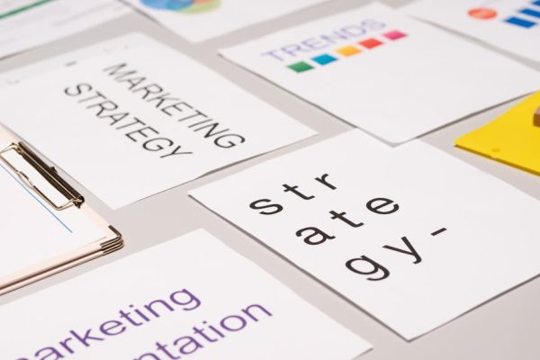
The Paradox of Choice in Marketing: Why Less Is More
Walk into any Singapore electronics store and you will find dozens of nearly identical smartphones at similar price points. Browse a food delivery app and you face hundreds of restaurant options within a three-kilometre radius. Open a SaaS website and you encounter four or five pricing tiers with overlapping features. In every case, what should feel like empowerment through abundance often produces the opposite effect: decision paralysis. The paradox of choice, first articulated by psychologist Barry Schwartz, reveals that too many options do not liberate consumers — they overwhelm them.
For Singapore marketers in 2026, understanding this paradox is commercially critical. Every additional option you present to a potential customer increases their cognitive load, raises their expectations, and makes them more likely to delay, defer, or abandon the decision altogether. Research consistently shows that reducing choices by even 30 to 50 per cent can increase conversion rates by 20 per cent or more. The brands winning in Singapore’s competitive market are not the ones offering the most options — they are the ones making it easiest to choose.
This guide explores how the paradox of choice affects marketing decisions and provides actionable strategies for simplifying product ranges, designing effective choice architecture, implementing guided selling, and structuring your pemasaran digital to help customers decide rather than deliberate. Whether you sell physical products, digital services, or professional expertise, these principles will help you convert more browsers into buyers.
Understanding the Paradox of Choice
Barry Schwartz’s research demonstrated a counterintuitive truth: while some choice is better than none, more choice is not always better than some. In a famous experiment, shoppers presented with 24 varieties of jam were ten times less likely to make a purchase compared to those presented with just six varieties. The larger selection attracted more attention but produced significantly fewer sales. This pattern has been replicated across dozens of product categories and contexts.
The paradox operates through several psychological mechanisms. First, evaluating many options demands significant cognitive effort, leading to decision fatigue. Second, more options raise expectations — with so many choices available, consumers expect to find the perfect option, and anything less feels disappointing. Third, having many alternatives increases regret after purchase, as people wonder whether one of the unchosen options might have been better.
How the paradox of choice manifests in Singapore:
- E-commerce overload: Product categories with hundreds of listings see lower conversion rates than curated selections
- Service package confusion: Agencies and consultancies with too many service tiers lose prospects who cannot differentiate between them
- Restaurant menu fatigue: F&B outlets with extensive menus often find that customers order the same few items or take longer to order
- Subscription decision paralysis: SaaS and subscription services with complex pricing tables experience high page abandonment rates
- Information overload: Websites that present too much information on a single page see higher bounce rates and lower engagement
How Too Many Options Kill Conversions
The commercial impact of choice overload is measurable and significant. When consumers face too many options, three negative outcomes consistently emerge: they delay the decision, they choose the default or cheapest option, or they abandon the purchase entirely. Each of these outcomes represents lost revenue for businesses that fail to manage choice effectively.
In Singapore’s digital landscape, choice overload manifests clearly in website analytics. E-commerce sites with overly complex category structures show higher exit rates on product listing pages. Service websites with more than three to four clearly differentiated packages see higher bounce rates on pricing pages. Landing pages with multiple competing calls to action consistently underperform pages with a single, clear next step.
Data patterns that indicate choice overload on your website:
- High time on pricing or product pages combined with low conversion rates — visitors are comparing endlessly without deciding
- Frequent use of comparison features but few add-to-cart actions
- High engagement with filters and sorting but low purchase completion
- Cart abandonment concentrated among customers who viewed many product variations
- Customer service enquiries dominated by “which option should I choose” questions
A Singapore-based web design project should account for choice architecture from the outset. The structure of your navigation, the layout of your product pages, and the design of your checkout flow all either simplify or complicate the customer’s decision process. Every element should be evaluated through the lens of whether it helps the customer choose or adds to their cognitive burden.
Simplifying Product and Service Ranges
The most direct solution to choice overload is reducing the number of options you present. This does not necessarily mean offering fewer products or services — it means curating what you show to each customer at each stage of their journey. Strategic simplification increases conversions without limiting your actual product range.
Strategies for simplifying your offerings:
- The rule of three: Present three clearly differentiated options — basic, standard, premium — for most purchase decisions
- Best-seller highlighting: Feature your most popular options prominently, using social proof to guide selection
- Category curation: Group products into meaningful categories that align with customer needs rather than internal product taxonomy
- Seasonal rotation: Instead of showing everything at once, rotate featured products seasonally to maintain freshness while reducing overwhelm
- Bundle simplification: Combine frequently co-purchased items into pre-configured bundles that eliminate the need for individual selection
For service-based businesses in Singapore, simplification might mean reducing five service packages to three, or presenting a single recommended package with optional add-ons rather than forcing customers to build their own combination from a long menu of services. An SEO agency, for instance, could offer a Starter, Growth, and Enterprise package rather than asking clients to choose from 15 individual services. The underlying service capabilities remain the same — the presentation becomes dramatically simpler.
Choice Architecture: Designing Better Decisions
Choice architecture is the deliberate design of how options are presented to influence decisions. Unlike manipulation, good choice architecture helps people make decisions they are genuinely happy with by reducing cognitive effort and highlighting relevant differences between options. It is the difference between handing someone a menu and guiding them to a meal they will love.
Key choice architecture principles for marketers:
- Default options: Pre-select the option most customers would choose — defaults are incredibly powerful because people tend to accept them
- Anchoring: Present a high-end option first to make mid-range options feel reasonable by comparison
- Visual hierarchy: Use size, colour, and positioning to draw attention to your recommended option
- Categorisation: Group options into clear categories so customers can eliminate entire groups rather than evaluating every individual option
- Progressive disclosure: Show essential information first and reveal details on demand, reducing initial cognitive load
- Social proof integration: Labels like “Most Popular” or “Chosen by 80% of Singapore customers” simplify decisions through crowd wisdom
On your website, choice architecture applies to every decision point. Your Iklan Google landing pages should present one clear recommendation. Your pricing page should visually emphasise one tier. Your product pages should suggest specific configurations rather than requiring customers to evaluate every combination. Each design decision either simplifies or complicates the customer’s path to purchase.
Menu Engineering for Digital and Physical Businesses
Menu engineering — originally developed for the restaurant industry — applies powerful choice management principles that translate directly to digital product presentation, service catalogues, and pricing pages. The core idea is that how you position, describe, and price items on a menu directly influences what customers choose.
Menu engineering principles applied to marketing:
- Stars: High-margin, high-popularity items deserve prime visual placement and compelling descriptions — these are your hero products
- Cash cows: Popular but lower-margin items can be positioned less prominently without losing volume
- Puzzles: High-margin but low-popularity items need better descriptions, positioning, or bundling to increase selection
- Dogs: Low-margin, low-popularity items should be removed or repositioned to reduce clutter
For Singapore F&B businesses, menu engineering means limiting your printed or digital menu to 30 to 40 items rather than 80, placing your highest-margin dishes in the visual hotspots (top right of each page, first and last items in each category), and using descriptive language and photography for items you want to sell more of.
For digital businesses, the same principles apply to your services page or product catalogue. Place your most profitable offering in the most visually prominent position. Use compelling copywriting to describe it. Add social proof badges. And limit the total number of visible options so that your star offering does not get lost in a sea of alternatives. This is an area where thoughtful pemasaran kandungan meets conversion optimisation.
Guided Selling: Helping Customers Choose
Guided selling takes choice simplification a step further by actively helping customers navigate options through interactive tools, personalised recommendations, and consultative approaches. Instead of presenting all options and hoping the customer figures it out, guided selling asks questions, processes preferences, and recommends specific solutions.
Guided selling tactics for Singapore businesses:
- Product recommendation quizzes: Short questionnaires that narrow hundreds of options to three to five personalised recommendations
- Comparison tools: Interactive comparisons that highlight differences only on criteria the customer cares about
- Chatbot advisors: AI-powered chatbots that ask qualifying questions and suggest specific products or services
- Needs assessment forms: For service businesses, structured forms that translate customer needs into specific package recommendations
- Curated collections: Expert-selected product groups for specific use cases — “Best for HDB apartments,” “Starter kit for new businesses”
In the Singapore context, guided selling aligns with consumer expectations for personalised service. Singaporean shoppers often appreciate knowledgeable recommendations over unassisted browsing. Translating this expectation to digital channels through interactive tools and personalised suggestions creates a service experience that reduces choice anxiety while maintaining the convenience of online shopping.
For professional services firms, guided selling often takes the form of a free consultation or assessment. An email marketing agency might offer a free audit that evaluates the client’s current setup and recommends a specific service tier, eliminating the need for the client to self-diagnose and self-prescribe from a confusing menu of options.
Applying the Paradox of Choice to Digital Marketing
The paradox of choice applies not only to your products and services but to your marketing itself. Every marketing touchpoint presents choices to your audience — which link to click, which page to visit, which offer to pursue. Simplifying these choices at every stage of the marketing funnel dramatically improves performance.
Simplification across marketing channels:
- Landing pages: One page, one offer, one call to action — resist the temptation to present multiple options
- Email campaigns: Each email should drive a single action, not present a catalogue of options
- Social media posts: One clear message per post with one desired response — click, comment, or share
- Ad copy: Focus on a single benefit or offer rather than listing multiple features
- Navigation: Limit main navigation to five to seven items — more causes decision paralysis
- Forms: Ask for only essential information — each additional field reduces completion rates
A/B testing consistently shows that reducing choices in social media marketing and paid advertising improves click-through and conversion rates. An ad with one clear call to action outperforms one with three. A landing page with a single form beats one with multiple options. A checkout process with fewer steps converts more customers. Simplification is not laziness — it is strategic discipline.
Soalan Lazim
What is the paradox of choice in marketing?
The paradox of choice is a psychological principle stating that while some choice is essential, too many options lead to decision paralysis, reduced satisfaction, and lower purchase rates. In marketing, this means that presenting customers with too many products, service tiers, or calls to action can actually decrease conversions. The solution is strategic simplification — curating options, using choice architecture, and guiding customers toward decisions rather than overwhelming them with possibilities.
How many options should I present to customers?
Research suggests three to five options is optimal for most purchase decisions. The classic three-tier pricing model (basic, standard, premium) works well because it provides meaningful choice without overwhelming complexity. For product catalogues, limit visible options per page and use filters or guided selling to help customers narrow down from larger inventories. The key principle is that every option you add should be clearly differentiated and necessary.
Does simplifying options mean offering fewer products?
Not necessarily. Simplification is about how you present options, not how many you stock. You can maintain a large product range while showing curated selections, personalised recommendations, and categorised views that reduce the number of options a customer evaluates at any one time. The goal is to match each customer with the right option efficiently rather than forcing them to evaluate everything.
How does choice architecture differ from manipulation?
Choice architecture helps people make decisions they are genuinely satisfied with by reducing cognitive effort and highlighting relevant information. Manipulation tricks people into decisions they would not otherwise make and later regret. The test is outcome satisfaction — if customers are happier with their decisions because of your choice architecture, it is ethical. If they feel deceived or regretful, it crosses the line into manipulation.
Can too few options also hurt conversions?
Yes. Offering only one option provides no sense of agency or comparison, which can reduce purchase confidence. Extremely limited selections may also fail to meet diverse customer needs. The sweet spot for most Singapore businesses is three clearly differentiated options that cover the primary customer segments you serve. This provides enough choice for autonomy while remaining simple enough for quick, confident decisions.
How do I test whether choice overload is affecting my business?
Run A/B tests reducing the number of options on your pricing page, product listings, or landing pages. Compare conversion rates, time to purchase, and post-purchase satisfaction. Monitor analytics for signs of choice overload — high time on page with low conversion, frequent use of comparison tools without purchases, and customer service enquiries asking for recommendations. If reducing options increases conversions, choice overload was a factor.