Brand Guidelines Template: Keep Your Branding Consistent
Consistency is what separates recognisable brands from forgettable ones. Every time a customer encounters your brand, whether on your website, social media, packaging, or email newsletter, the experience should feel cohesive and intentional. Yet many businesses, particularly SMEs and growing startups, lack the documented guidelines needed to maintain this consistency.
In Singapore’s multichannel, multilingual market, brand consistency is especially challenging. Your brand must look and sound right across English, Mandarin, Malay, and Tamil communications. It must translate seamlessly from a tiny mobile screen to a large-format exhibition banner. It must remain consistent whether your in-house team, a freelance designer, or an agency partner is producing the creative. Without clear brand guidelines, inconsistency creeps in, eroding the professional image and trust you have worked to build.
This article provides a comprehensive brand guidelines template that you can adapt for your business. We cover every essential element, from logo usage rules and colour palettes to typography standards and tone of voice. By the end, you will have a clear framework for creating your own brand guidelines document. For professional support in developing your brand, explore our web design services or reach out to our team.
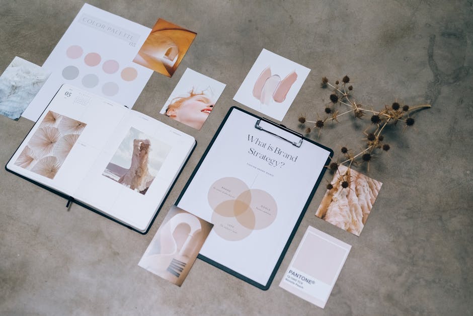
What Brand Guidelines Should Include
A brand guidelines document, sometimes called a brand book or brand style guide, is the definitive reference for how your brand should be presented across all touchpoints. A comprehensive document includes the following sections:
Essential sections (every business needs these):
- Brand overview — mission, vision, values, and brand story
- Logo usage — primary and secondary logos, clear space, minimum sizes, and incorrect usage examples
- Colour palette — primary and secondary colours with hex, RGB, CMYK, and Pantone codes
- Typography — primary and secondary typefaces, sizing hierarchy, and usage rules
- Tone of voice — brand personality, writing style, and language guidelines
Recommended sections (for more established brands):
- Imagery and photography style — photo guidelines, illustration style, and icon usage
- Layout and grid systems — spacing, margins, and composition principles
- Social media guidelines — platform-specific formatting, profile images, and content standards
- Email and digital templates — newsletter layouts, signature formats, and banner standards
- Stationery and print — business card, letterhead, and envelope designs
- Signage and environmental — physical signage and interior branding guidelines
The scope of your brand guidelines should match your business size and complexity. A five-person startup might need a concise 10-page document. A multinational operating across Southeast Asia might need a 50-page guide with market-specific adaptations. Start with the essentials and expand as your brand matures.
Logo Usage Guidelines
Your logo is the most visible element of your brand identity, so its usage rules must be precise and comprehensive. Here is what to include in your logo guidelines section:
Logo variations:
- Primary logo — the full logo used in most applications (typically a combination of symbol and wordmark)
- Secondary logo — an alternative arrangement for spaces where the primary logo does not fit (e.g. stacked version vs horizontal version)
- Icon or symbol — the standalone symbol without the wordmark, for use as social media profile images, app icons, and favicons
- Monochrome versions — single-colour versions for use on dark backgrounds, light backgrounds, and single-colour print applications
Clear space rules:
Define the minimum empty space that must surround the logo. This is typically measured using a consistent unit, such as the height of a specific letter in the wordmark. Clear space ensures the logo is never crowded by other elements.
Minimum size:
Specify the smallest size at which the logo can be reproduced while remaining legible. For digital applications, this is usually expressed in pixels. For print, use millimetres. The icon version should have its own minimum size for profile image and favicon use.
Incorrect usage examples:
Show clear examples of what not to do with your logo. Common incorrect usages include:
- Stretching or distorting the proportions
- Changing the colours
- Adding drop shadows, outlines, or effects
- Placing the logo on a busy background without sufficient contrast
- Rotating the logo
- Rearranging logo elements
- Using outdated versions of the logo
Including a “do not” section prevents well-meaning team members and external partners from making modifications they think look good but actually undermine brand consistency.
Colour Palette Specifications
Colour is one of the fastest ways consumers recognise a brand. Your colour palette must be defined precisely to ensure consistency across digital and print applications.
Primary colours:
Select two to three primary colours that form the core of your brand identity. For each colour, document:
| Colour Name | Hex Code | RGB | CMYK | Pantone |
|---|---|---|---|---|
| Brand Navy | #1B2A4A | 27, 42, 74 | 95, 75, 35, 30 | 289 C |
| Brand Gold | #D4A843 | 212, 168, 67 | 15, 30, 80, 0 | 7407 C |
| Brand White | #FFFFFF | 255, 255, 255 | 0, 0, 0, 0 | — |
Secondary colours:
Add three to five secondary colours that complement your primary palette. These are used for backgrounds, accents, data visualisations, and additional design flexibility. Document the same colour codes for each.
Colour usage ratios:
Specify how much of each colour should typically be used. A common ratio is 60-30-10: 60 percent dominant colour, 30 percent secondary colour, and 10 percent accent colour. This prevents any single colour from overwhelming the design or secondary colours being used disproportionately.
Colour accessibility:
Ensure your colour combinations meet WCAG 2.1 accessibility standards for contrast ratios. Text on background combinations must have a minimum contrast ratio of 4.5:1 for normal text and 3:1 for large text. This is not only good practice but also important for reaching users with visual impairments.
For Singapore businesses, consider how your colours perform across cultural contexts. Red and gold carry positive connotations for Chinese audiences. Green is associated with prosperity in Malay culture. Thoughtful colour choices can strengthen cultural resonance without alienating other segments.
Typography Standards
Typography influences readability, brand perception, and design consistency. Your guidelines should specify:
Primary typeface:
Choose one primary typeface for headings and key brand communications. Include the specific weights (light, regular, medium, bold) and styles (regular, italic) you use. For digital applications, ensure the typeface is available as a web font through Google Fonts, Adobe Fonts, or a similar service.
Secondary typeface:
Select a complementary typeface for body text and longer-form content. This should pair well with your primary typeface and be highly legible at small sizes. A common approach is to pair a serif heading font with a sans-serif body font, or vice versa.
Type hierarchy:
| Element | Typeface | Weight | Size (Desktop) | Size (Mobile) |
|---|---|---|---|---|
| H1 Heading | 기본 | Bold | 36-48px | 28-36px |
| H2 Heading | 기본 | Semi-bold | 28-32px | 22-28px |
| H3 Heading | 기본 | Medium | 22-26px | 18-22px |
| Body text | Secondary | Regular | 16-18px | 16px |
| Small text / Captions | Secondary | Regular | 14px | 14px |
| Button text | 기본 | Semi-bold | 16px | 16px |
Line height and spacing:
Specify line height (typically 1.4 to 1.6 for body text) and paragraph spacing. Consistent spacing creates a clean, professional appearance and improves readability. For 콘텐츠 마케팅 assets like blog posts and whitepapers, generous line spacing improves the reading experience.
Multilingual typography considerations:
For Singapore businesses communicating in multiple languages, ensure your chosen typefaces support the character sets you need. If you publish content in Chinese, your primary web font may not include Chinese characters, requiring a specified fallback font. Document the fallback fonts for each language to maintain visual consistency.
Tone of Voice Guidelines
Your brand’s tone of voice defines how you communicate in writing and speech. It is the verbal equivalent of your visual identity, and it must be equally consistent.
Brand personality traits:
Define three to five personality traits that characterise your brand’s communication style. For example:
- Professional but approachable — we are experts, but we never talk down to our audience
- Clear and direct — we avoid jargon and get to the point
- Confident but not arrogant — we know our value but let results speak
- Warm and inclusive — we welcome everyone and reflect Singapore’s diversity
We are / We are not:
| We Are | We Are Not |
|---|---|
| Helpful and informative | Condescending or preachy |
| Conversational and relatable | Overly casual or slangy |
| Honest and transparent | Evasive or exaggerative |
| Optimistic and solutions-focused | Negative or fear-mongering |
| Respectful of cultural diversity | Culturally insensitive or assuming |
Writing style rules:
- Sentence length — aim for an average of 15 to 20 words per sentence. Mix short and long sentences for rhythm.
- Paragraph length — keep paragraphs to three to four sentences for digital content. Shorter paragraphs improve readability on mobile.
- Active voice — prefer active voice over passive voice in most contexts.
- Contractions — specify whether contractions (it’s, we’re, don’t) are acceptable. For most Singapore brands targeting a local audience, contractions are fine and make content feel more natural.
- Technical terms — define when to use industry terminology and when to use plain language. Always define technical terms on first use.
Channel-specific tone adjustments:
While your core voice should remain consistent, the tone can adjust slightly for different channels. Social media can be slightly more casual. Formal proposals and contracts should be more structured. Customer support communications should prioritise empathy and clarity. Document these channel-specific adjustments so team members know the appropriate register for each context.
Imagery and Photography Style
Visual content makes up a significant proportion of your brand touchpoints. Without clear imagery guidelines, different team members will select wildly different photo styles, creating a disjointed visual experience.
Photography style:
- Lighting — specify whether your brand uses bright, natural lighting or moody, dramatic lighting
- Colour treatment — define any colour grading or filter presets that should be applied consistently
- Composition — set guidelines for framing, such as whether subjects should be centred or off-centre
- Subject matter — define what types of images are on-brand (e.g. real people in authentic settings vs stylised studio shots)
- Diversity — ensure imagery reflects Singapore’s multiracial, multicultural society
Stock photography guidelines:
- Prefer stock photos featuring Asian subjects and Singapore or Southeast Asian settings
- Avoid overly staged or obviously stock-looking imagery
- Maintain a consistent style across all stock photo selections
- Create a curated library of approved stock images to ensure consistency
Graphic elements:
- Icons — specify the icon style (line, filled, flat, detailed) and source library
- Illustrations — if you use illustrations, define the style, colour palette, and level of detail
- Patterns and textures — document any branded patterns or textures and their appropriate usage
- Data visualisation — set standards for charts, graphs, and infographics including colour assignments and labelling conventions
Your social media marketing is often the most image-heavy channel. Consistent imagery across social platforms reinforces brand recognition and creates a professional, curated feed that attracts followers.
Application Examples
The most effective brand guidelines include real-world application examples showing how all elements come together. Include mockups or templates for these key applications:
Digital applications:
- Website homepage and key page layouts
- Social media post templates (Instagram, Facebook, LinkedIn, TikTok)
- Social media profile images and cover photos
- Email newsletter template
- Email signature format
- Digital advertising formats (Google Display, Meta, LinkedIn)
- Presentation template (PowerPoint or Google Slides)
Print applications:
- Business card design
- Letterhead and envelope
- Brochure or flyer layout
- Invoice and proposal template
- Packaging design (if applicable)
- Signage and banner specifications
Environmental applications:
- Office signage and wayfinding
- Reception area branding
- Vehicle branding (if applicable)
- Exhibition booth design
For each application, show both the correct implementation and common mistakes to avoid. This makes the guidelines practical and easy for designers, whether internal or external, to follow.
Template distribution and version control:
Store your brand guidelines in a central, accessible location such as Google Drive, Notion, or a dedicated brand management platform like Frontify or Brandfolder. Include a version number and last-updated date on every page. Notify all stakeholders when updates are made. For externally shared versions, such as those sent to agency partners or freelancers, include a primary contact for brand-related questions.
Maintaining consistent brand guidelines across all your marketing efforts, including your email marketing campaigns, ensures every customer touchpoint reinforces your brand identity and builds cumulative recognition.
자주 묻는 질문
How long should brand guidelines be?
Brand guidelines can range from a concise 10-page document for small businesses to 50 or more pages for larger organisations with complex brand architectures. The length should match your needs. Start with the essentials — logo, colours, typography, and tone of voice — and expand over time. A shorter document that is actually used is far more valuable than an exhaustive one that no one reads.
Who should have access to our brand guidelines?
Anyone who creates content or designs for your brand should have access. This includes marketing team members, designers, copywriters, social media managers, agency partners, freelancers, and even sales teams who create their own presentations. Making guidelines easily accessible reduces the chance of off-brand content being produced.
How often should brand guidelines be updated?
Review your brand guidelines annually at minimum. Update them whenever you make changes to your visual identity, add new brand elements, expand to new channels, or refine your brand positioning. Include a version history log so users always know they are referencing the latest version.
Do I need brand guidelines if I am a small business?
Yes, even small businesses benefit from basic brand guidelines. As soon as more than one person touches your brand communications, whether that is a co-founder, a freelance designer, or a social media intern, you need documented guidelines to ensure consistency. A simple one-page brand overview with your logo files, colour codes, fonts, and key messaging points is a valuable starting point.
What is the difference between brand guidelines and a brand strategy?
A brand strategy defines the foundational elements of your brand: your purpose, positioning, target audience, value proposition, and competitive differentiation. Brand guidelines are the implementation document that specifies how the brand should be visually and verbally expressed. The strategy comes first and informs the guidelines. Without a clear strategy, guidelines are just aesthetic rules with no strategic foundation.
Should brand guidelines cover social media specifically?
Yes. Social media has unique formatting requirements, character limits, and audience expectations that warrant specific guidance. Your social media guidelines should cover profile image and cover photo specifications for each platform, post template designs, hashtag usage, emoji guidelines, response protocols for comments and messages, and content themes or pillars. This ensures your social presence is both on-brand and optimised for each platform.


 Korean
  English
  Chinese
  Malay
Malay